 Menu
Menu
Let's say we have the following test.htm:
<html>
<head>
  <meta http-equiv="Content-Type" content="text/html; charset=utf-8"/>
  <style type="text/css">
.testdiv, .testdivB, .testdivC {
  width: 50%;
  height: 30%;
  margin: 6px;
  border: 2px solid gray;
  font-size: 4em;
}
.testdivB {
  font-size: 12px;
}
.testdivC {
  font-size: 30pt;
}
  </style>
</head>

<body>

  <div class="testdiv">Test one writing</div>
  <div class="testdivB">Test another writing</div>
  <div class="testdivC">Test three writing</div>

</body>
</html>
I've tried testing this in Chromium, with the Developer Tools, which allows me to emulate different devices; here:
* Apple iPhone 4        : device resolution  320 x  480 , a/r 0.666667
* Google Nexus 10       : device resolution  800 x 1280 , a/r 0.625
* Amazon Kindle Fire HDX: device resolution 1600 x 2560 , a/r 0.625
the outcome is this:
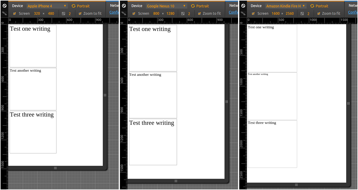
In this example, all the devices are portrait, and have "nearly" the same aspect ratio (~ 0.6+), even if they have wildly differing resolutions.
So, in the two first cases, I'm getting approximately the same font sizes, as relative to the device screen size, which is what I want to achieve (even though, I'm confused how can testdivB also show as nearly the same size, when it should be smaller) - so that's all good.
But, in the third example, which is on a device with the largest resolution, testdivB unsurprisingly (as it is defined in px) is much smaller relative to the device screen size; testdivA is also not really surprising, since em is relative to the "computed font-size" of the browser - and that one, if I remember correctly, is also expressed in pixels.
However, I thought that pt would have taken the device screen resolution into account, but it looks like it doesn't:
http://www.w3.org/Style/Examples/007/units.en.html
In the past, CSS required that implementations display absolute units correctly even on computer screens. But as the number of incorrect implementations outnumbered correct ones and the situation didn't seem to improve, CSS abandoned that requirement in 2011. Currently, absolute units must work correctly only on printed output and on high-resolution devices.
Ok, so what options do I have, to achieve approximately the same font sizes (as relative to device screen sizes) in all three cases:
 456
456
Rem is an absolute unit relative to the root element of the HTML document and is commonly used for font sizes. It is a scalable unit in which the browser renders into pixel values. I recommend it for responsiveness. The default root element font size is 16px.
If the font-size you want is 12px , then you should specify 0.75em (because 12/16 = 0.75). Similarly, if you want a font size of 10px , then specify 0.625em (10/16 = 0.625); for 22px , specify 1.375em (22/16).
Font size specifications may come in points or pixels where: 1 pixel (px) is usually assumed to be 1/96th of an inch. 1 point (pt) is assumed to be 1/72nd of an inch. Therefore 16px = 12pt.
I've written a small tutorial / example on how to achieve this with pure HTML/CSS a while ago:
vmin/vmax)#small {
font-size: calc(1em + 1vmin);
}
#medium {
font-size: calc(1em + 2vmin);
}
#large {
font-size: calc(1em + 3vmin);
}<div id="small">Small text</div>
<div id="medium">Medium text</div>
<div id="large">Large text</div>The rule vmin is quite useful in your context. It takes vmin: 1/100th of the smallest side of your screen. Regardless of orientation. Combining it with the basic 1em in a calc() gives us a great way of applying a small custom responsive aspect on the font-size.
vw/vh)#small {
font-size: calc(1em + 1vw);
}
#medium {
font-size: calc(1em + 2vw);
}
#large {
font-size: calc(1em + 3vw);
}<div id="small">Small text</div>
<div id="medium">Medium text</div>
<div id="large">Large text</div>If you wish to apply more control regarding the actual aspect ratio, I'd advise going with vw over vmin. Viewport width (vw) takes 1/100th of the width of your viewport.
vmin and vmax):#test1 {
font-size: calc((.4em + 1vmin) + (.4em + 1vmax));
}
#test2 {
font-size: calc((.4em + 2vmin) + (.4em + 2vmax));
}
#test3 {
font-size: calc((.4em + 3vmin) + (.4em + 3vmax));
}<div id="test1">Small text</div>
<div id="test2">Medium text</div>
<div id="test3">Large text</div>I'm quite happy with this solution, this way allows us to take both the viewports width, and it's length into account. We divide the base font size in two (.4em in this case) and multiply it with both 1vmin and 1vmax, after that- we add both values to establish the font size.
155
Ok, I think I came to a solution which I can use, which uses JavaScript. With the code pasted below, I now get this when testing in different devices in Chromium Developer Tools:
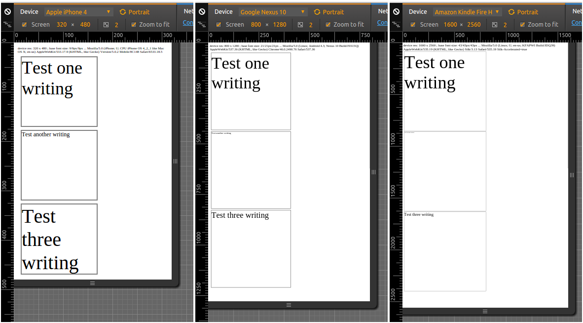
As one can see, the relative size for the first div, .testdiv with a specification in em now is preserved across device sizes (which is what I wanted); px in the second div, as expected doesn't preserve relative size -- and neither does the third case with pt specification.
The first problem I had, was how to get the device resolution. Note that vw, vh - and thus vmin and vmax - are in respect to the viewport size, that is, the window size. This is not so much of a problem in mobile, as the browsers on mobile typically start in "fullscreen" (I'm not even sure it is possible to resize the browser/app window on mobile, iOS or Android) - but it might be a problem if using a browser on the desktop, where the browser might end up not being in full screen.
Thankfully, one can get the device resolution using JavaScript, ( How to detect the screen resolution with JavaScript? ), and in this case, I get the device width and height in pixels - and from them, I calculate devicemin as the smaller of the two (similar to vmin). Then I set a "base font size", font size of the <html> element, to 2.67% of devicemin (this was my own arbitrary choice) in pixels. That would, hopefully, make sure that I have the same font size, relative to device resolution, across devices with different resolution.
Second issue, somewhat unexpected for me, was that you must have a <meta name="viewport" content="width=device-width, initial-scale=1.0"/> entry/directive in the head! Otherwise, without it, iOS browser will just apply their own font-sizes/scaling, and thus we'd get an unexpected result like:
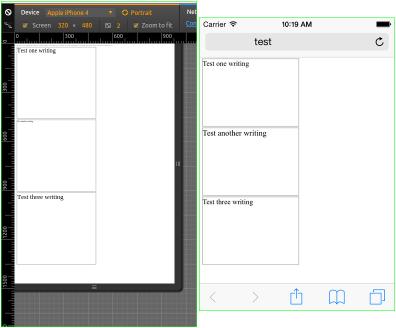
I was in fact so surprised at this result in Chromium Developer Tools, that I had to try the test in an Xcode iOS simulator - and surprisingly enough, the Chromium Developer Tools, actually did simulate this behavior the same as the iOS simulator did (left image is the code below in Developer Tools, right one is OP code in iOS simulator). For more on this, see Some font-size's rendered larger on Safari (iPhone) ...
Anyways, now that I have the "base" font size like this, I can proceed and implement responsive design based on say width <20em, <40em etc - and be sure that these sizes will refer to approximately the same relative area on any screen device...
<html>
<head>
  <meta http-equiv="Content-Type" content="text/html; charset=utf-8"/>
  <meta name="viewport" content="width=device-width, initial-scale=1.0"/> <!-- MUST have, so iPhone doesn't autozoom and change the fontsize! -->
  <script type="text/javascript">
  // https://stackoverflow.com/questions/2242086/how-to-detect-the-screen-resolution-with-javascript
  var devicewidth = window.screen.width;
  var deviceheight = window.screen.height;
  var devicemin = Math.min(devicewidth, deviceheight);
  // say we want base font size: 16px @ 600px (min of 800x600); 16/600 = 0.0266667
  var basefontsize = Math.round(0.0267*devicemin);
  // apply:
  var rootElement = document.documentElement;
  rootElement.style.fontSize = basefontsize;
  // report:
  console.log(navigator.userAgent);
  var report = "device res: " + devicewidth + " x " + deviceheight + " ; base font size: " + basefontsize + "/" + rootElement.style.fontSize;
  console.log(report);
  function reporter() {
    document.getElementById("dreport").innerHTML = report + "/" + document.documentElement.style.fontSize + " ... " + navigator.userAgent;
  }
  window.onload = reporter;
  </script>
  <style type="text/css">
body {
  /* https://stackoverflow.com/questions/3226001 ; no real need/effect in this case, though */
  -webkit-text-size-adjust: none;
}
.testdiv, .testdivB, .testdivC {
  width: 50%;
  height: 30%;
  margin: 6px;
  border: 2px solid gray;
  font-size: 4em;
}
.testdivB {
  font-size: 12px;
}
.testdivC {
  font-size: 30pt;
}
#dreport {
  font-size: 0.76em;
}
  </style>
</head>

<body>
  <div id="dreport"></div>
  <div class="testdiv">Test one writing</div>
  <div class="testdivB">Test another writing</div>
  <div class="testdivC">Test three writing</div>

</body>
</html>
If you love us? You can donate to us via Paypal or buy me a coffee so we can maintain and grow! Thank you!
Donate Us With