 Menu
Menu
I feel obligated to make this question clearer, now that there is a bounty attached.
(Also, I'm pretty sure this will be child's play when the calc() CSS3 unit value is supported, doing something like width: calc(25% - 5px); though we'll probably be browsing the internet in our minds by that point)
I'm working on a CSS framework for a few projects that share design requirements; namely a fluid 12 column layout. Using floated .column elements with percentage widths of (100% / 12) x col_size, this is reasonably easy. However, the issue comes with the addition of fixed margins (or any form of spacing) between columns.
My initial attempt used the fluid columns as described, with a .panel child nested in each. HTML/CSS snippet follows (reduced for brevity):
.column{
    float: left;
    display: inline-block;
}

.width-01{ width:  8.3333%; }
.width-02{ width: 16.6666%; }
.width-03{ width:      25%; }
/* etc */

.panel{
    width: 100%;
    padding: 5px;
    box-sizing: border-box; /* so padding doesn't increase width */
}
<div class="column width-02">
    <div class="panel">Width-02</div>
</div>
<div class="column width-03">
    <div class="panel">Width-03</div>
</div>
<div class="column width-02">
    <div class="panel">Width-02</div>
</div>
<div class="column width-05">
    <div class="panel">Width-05</div>
</div>
This snippet would produce a layout similar to that of the image below, however all .panel elements have 5px padding on all sides. I'm trying to make the content edge of the outside columns flush with the edge of the view-port (or parent container for that matter). Another approach would be to eliminate the .panel class altogether, and just go with columns:
.column{
    float: left;
    display: inline-block;
    padding-left: 10px;
    box-sizing: border-box;
}

.column:first-child{ padding-left: 0px; }

.width-01{ width:  8.3333%; }
.width-02{ width: 16.6666%; }
.width-03{ width:      25%; }
/* etc */
<div class="column width-02">Width-02</div>
<div class="column width-03">Width-03</div>
<div class="column width-02">Width-02</div>
<div class="column width-05">Width-05</div>
Again, this works well, producing results even closer to that of the image below, however now the (actual) problem is that the padding is eating into the width of the columns screwing up the width distribution. The :first-child column has 10 pixels (or whatever the margin size is) greater content area width than it's siblings.
This may seem innocuous, even unnoticeable; however there are a few instances where having exact (as exact as possible) width distribution between elements is either necessary, or would make things altogether easier.
And so, whether using padding, margin, or some combination thereof; is there any solution for fluid columns, fixed margins, with even distribution of gutter space that won't rob "marginal" (***haha*) content area from the adjacent columns?**
Due to the simple lack of results in my searches and attempts, I've concluded this is impossible. If anywhere can yield an answer though, I'm certain it is here.
Is there any way, using pure CSS, to achieve a fluid width columned layout with fixed width margins?
Important note: This figure is only an example, and not the specific layout I'm looking to achieve. A given solution should permit any combination of adjacent columns, the total width distribution totaling 12 or less. Consider the popular 960 grid for reference.)
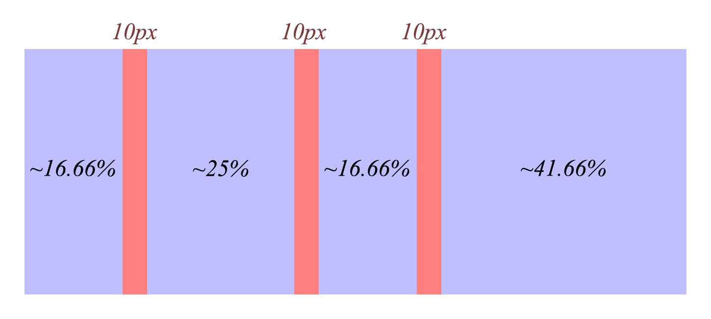
Note: In a 12 column layout, the width distribution of the columns in the image are 2, 3, 2, and 5 respectively.
So far, I've resorted to a grid that, using percentages, nearly accomplishes this. The problem is, in order to achieve the margins, each column requires an additional child (I call them .panel) with:
width: 100%;
box-sizing: border-box;
padding: 10px;
This is, again nearly, fine; the issue is with this approach is that the first and last column have outer "margins" (10px) and the "margins" between each column are doubled (2 x 10px)
Certainly, with the inclusion of the new CSS3 calc() value type, this could be solved much more easily. Something in the direction of:
.width-12 > .panel{ width: 100%; }
.width-09 > .panel{
    width: calc(75% - 10px);
    margin: ...;
}
I've got some Javascript fixes, I've hacked out some stuff that "works", but I'm on a quest. Hopefully the holiest of grails exists.
The following solution, and the one @avall provided (although certainly a good choice on simplifying) unfortunately aren't what I'm looking for. The main issue being, the margins are not distributed evenly among columns.
The only way I can see this working is reducing the .panel padding to 5px and something like:
.column:first-child > .panel {
    padding-left: 0px;
}

.column:last-child > .panel {
    padding-right: 0px;
}

/* not necessary? in any case, haven't tested */
.column:only-child > .panel {
    padding-right: 0px;
    padding-left: 0px;
}
This solution is not acceptable, only because IE8 fails to recognize the :last-child (and for that matter :only-child) pseudo selectors.
 211
211
I finally figured out. After into the hundreds of hours wasted on and off over the last decade (though I'm relying on some css that wouldn't have worked year ago anyway). I solved it without any gotchas. and in IE8+.
Please prepare the 2001: A Space Odyssey Music because I'm landing this boat.
The genius and trick to this method is in using inline-block elements and then using word-spacing to counterbalance using a negative right margin. A negative right margin on it's own will pull elements together, allowing you to have 100% width set and still fit things in between, but leave the elements overlapping. Setting negative margin on the parent just undoes the child margin in regards to the effect on interacting with total width (the magic "100% width" mark we're trying to hit"). Padding only serves to increase the size of the element its on and is useless with regards to counter-acting margin. It is often used with box-sizing in the jury rigged solutions to this problem, at the expense of losing the ability to use padding at all otherwise (and margin) and likely requiring more wrapper elements.
word-spacing provides the magical "third way" to add or remove horizontal distance between two elements, provided they are inline-block, since they will be counted as a single "word" in that case, and any whitespace between will collpapse down to the one single controllable "word-spacing" property. Aside from this trick I'm not aware of another way to get this 100% result.
I humbly present the ultimate answer to the fixed-gutters flex-columns problem. I hereby name my solution "the omega maneuver". It comes with the ability to handle arbitrary mixed width columns (adding up to 100% total width exactly or slightly less for rounding), any gutter size, any predefined amount of columns in width, handles arbitrary amounts of rows with auto-wrapping, and uses inline-block elements so therefore provides the vertical-alignment options that come with inline-block, AND it doesn't require any extra markup and only requires a single class declaration on the container (not counting defining column widths). I think the code speaks for itself. Here's the code implementation for 2-6 columns using 10px gutters and bonus helper classes for percentages.
EDIT: interesting conundrum. I've managed to get two slightly different versions; one for mozilla and ie8+, the other for webkit. It seems the word-spacing trick doesn't work in webkit, and I don't know why the other version works in webkit but not ie8+/mozilla. Combining both gets you coverage over everything and I'm willing to bet there's a way to unify this tactic or something very similar to work around the issue.
EDIT2: Mostly got it! Magical text-align: justify gets WebKit almost there with the word-spacing one. The spacing just seems a tiny bit off, like a matter of pixels on the right and maybe one extra in the gutters. But it's usable and it seems more reliable about keeping the columns than anything I've used before. It never chops down to fewer columns, it'll compress until the browser gets a horizontal scrollbar.
Edit3: Got it a little close to perfect. Setting the font-size to 0 normalizes most of the remaining issues with spacing that's off. Just gotta fix IE9 now which collapses it if it font is size 0.
EDIT4: Got the answer to IE from some other fluid width posts: -ms-text-justify: distribute-all-lines. Tested in IE8-10.
/* The Omega Maneuver */
[class*=cols] { text-align: justify; padding-left: 10px; font-size: 0;
             -ms-text-justify: distribute-all-lines; }

 [class*=cols]>* { display: inline-block; text-align: left; font-size: 13px;
                word-spacing: normal; vertical-align: top;
                -webkit-box-sizing: border-box;
                   -moz-box-sizing: border-box;
                        box-sizing: border-box; }

.cols2 { word-spacing: 20px; padding-right: 20px; }
.cols3 { word-spacing: 30px; padding-right: 30px; }
.cols4 { word-spacing: 40px; padding-right: 40px; }
.cols5 { word-spacing: 50px; padding-right: 50px; }
.cols6 { word-spacing: 60px; padding-right: 60px; }

  .cols2 > * { margin-right: -10px; }
  .cols3 > * { margin-right: -20px; }
  .cols4 > * { margin-right: -30px; }
  .cols5 > * { margin-right: -40px; }
  .cols6 > * { margin-right: -50px; }
Some helpers:
.⅛, .⅛s >* { width: 12.50%; }
.⅙, .⅙s >* { width: 16.66%; }
.⅕, .⅕s >* { width: 20.00%; }
.¼, .¼s >* { width: 25.00%; }
.⅓, .⅓s >* { width: 33.00%; }
.⅜, .⅜s >* { width: 37.50%; }
.⅖, .⅖s >* { width: 40.00%; }
.½, .½s >* { width: 50.00%; }
.⅗, .⅗s >* { width: 60.00%; }
.⅝, .⅝s >* { width: 62.50%; }
.⅔, .⅔s >* { width: 66.00%; }
.¾, .¾s >* { width: 75.00%; }
.⅘, .⅘s >* { width: 80.00%; }
.⅚, .⅚s >* { width: 83.33%; }
.⅞, .⅞s >* { width: 87.50%; }
.blarg-five-twelfs { width: 41.66%; }
You can witness my magnum opus in action amongst a field of glory here: http://jsfiddle.net/xg7nB/15/
<div class="cols4">
    <div class="⅙">This is my magnum opus</div>
    <div class="¼">I finally beat css</div>
    <div class="⅙">⚉ ☺ ☻ ♾ ☢</div>
    <div class="blarg-five-twelfs">I BEAT IT FOREVER</div>
</div>
The absolute minimal implementation, using as an example 4 equal width (25%) width cols and 10px gutters is like so:
.fourEqualCols { word-spacing: 40px; padding: 0 40px 0 10px;
                 text-align: justify; font-size: 0;
                 -ms-text-justify: distribute-all-lines; }

.fourEqualCols>* { margin-right: -30px; width: 25%;
                   display: inline-block; word-spacing: normal;
                   text-align: left; font-size: 13px; }


<div class="fourEqualCols ">
  <div>GLORIOUSLY CLEAN MARKUP</div>
  <div>I hate extra markup and excessive class props</div>
  <div>Naked code</div>
  <div>get intimate</div>
</div>
Soooo this code essentially replaces pretty much any existing grid framework right? If you can arbitrarily set gutters and then just make sets of columns that hit 100% width, that's strictly superior to most/all grid frameworks in fact isn't it? If you're not developing for IE7 anymore like a lot of us then that combined with box-sizing: border-box renders padding and border also a non-issue.
Edit: oh right you wanted to be flush with the sides of the container. No problem with this, I had to specifically add side gutters so we can just change some values by 10 and get rid of the padding and voila. http://jsfiddle.net/bTty3/
[class^=cols] { text-align: justify; font-size: 0;
             -ms-text-justify: distribute-all-lines; }

 [class^=cols] >* { display: inline-block; text-align: left; font-size: 13px;
                word-spacing: normal; vertical-align: top;
                -webkit-box-sizing: border-box;
                   -moz-box-sizing: border-box;
                        box-sizing: border-box; }

.cols2 { word-spacing: 20px; padding-right: 10px; }
.cols3 { word-spacing: 30px; padding-right: 20px; }
.cols4 { word-spacing: 40px; padding-right: 30px; }
.cols5 { word-spacing: 50px; padding-right: 40px; }
.cols6 { word-spacing: 60px; padding-right: 50px; }
 .cols2 >* { margin-right: 0 }
 .cols2 >* { margin-right: -10px; }
 .cols3 >* { margin-right: -20px; }
 .cols4 >* { margin-right: -30px; }
 .cols5 >* { margin-right: -40px; }
 .cols6 >* { margin-right: -50px; }
Same html
<div class="cols4">
    <div class="⅙">This is my magnum opus</div>
    <div class="¼">I finally beat css</div>
    <div class="⅙">⚉ ☺ ☻ ♾ ☢</div>
    <div class="blarg-five-twelfs">I BEAT IT FOREVER</div>
</div>

76
Try this pure CSS2 solution: demo fiddle
Base CSS (fiddle without the cosmetics):
html, body {
    padding: 0;
    margin: 0;
}
#wrap {
    padding-right: 30px;
    overflow: hidden;
}
.col {
    float: left;
    margin-left: 40px;
    margin-right: -30px;
}
.col:first-child {
    margin-left: 0;
}
.small {
    width: 16.66%;
}
.medium {
    width: 25%;
}
.large {
    width: 41.66%;
}
HTML:
<div id="wrap">
    <div class="col small"></div>
    <div class="col medium"></div>
    <div class="col small"></div>
    <div class="col large"></div>
</div>
Tested on Win7 in IE7, IE8, IE9, Opera 11.50, Safari 5.0.5, FF 6.0, Chrome 13.0.
Now, if you like this to work with an arbitrary number of columns, you have to add an extra class to the container specifying the column count:
<div class="cols-12 count-04">
    <div class="col width-02"></div>
    <div class="col width-03"></div>
    <div class="col width-02"></div>
    <div class="col width-05"></div>
</div>
See this updated fiddle demonstrating a number of various column counts.
Possible bug:
Theoretically, imho this solution should work for any number of columns for every possible minimum column width in any browser window width. But it seems, all browsers prove not being able to handle: 1. a large number of 1 column width columns, or 2. a small browser window width.
Note that all browsers with a minimum width of 1440 pixels, which equals 12 times 120 pixels (the space occupied by all 10px margins), handle the solution just fine. And when you use 2 or more column width colums, the requirement for the minimum browser width indeed drops to 720 pixels (6 * 120px). This last case sounds more realistic to be, but still, I cannot explain this browser behaviour.
I tried fixing the issue by introducing an additional last column class as demonstrated by this fiddle, but it does not solve the problem for small browser widths. It dóes solve a tiny rounding error due to the broken width percentages though, but that issue could be ignored I suppose.
I would like to hear from other css experts on this one, so I added a bounty.
33
Why don't you use
.column > .panel {
    padding: 10px 0 10px 10px;
}

.column:first-child > .panel {
    padding-left: 0px;
}
It will make 10px spaces only between boxes and without using last-child.
33
Check out thirtydot's answer in this thread for a pure CSS/HTML (Fluid layout with equally spaced "columns" without JavaScript)...
Fluid width with equally spaced DIVs
http://jsfiddle.net/thirtydot/EDp8R/
Modification of the JSFiddle demonstrates that the "columns" can be made to be different fixed widths and still have equal and fluid margins.
http://jsfiddle.net/EDp8R/43/
Then finally, another example using percentages while still maintaining equal and fluid margins.
http://jsfiddle.net/EDp8R/45/
I realize this may not be an exact solution but it gets you pretty close, I think.
34
In referrence to the Original Question "Is there any way, using pure CSS, to achieve a fluid width columned layout with fixed width margins?"
It is remarkable how extremely difficult CSS becomes with these kind of questions. The past week I've been working on a 'base template' to create my own 'holy grail', including border, margin and paddings... It seems CSS fails for these kind of questions. Though the question in mind is quite easy, it becomes (nearly?) impossible to achieve in CSS, especially cross-browser.
The funny part is that these questions are easily resolved by using tables. I do not understand why we are being forced by the web-society to use div's instead for such vague arguments like 'semantics' and 'easy overview' as most arguments are weak or even false. People saying tables are giving more trouble, clearly have no understanding of the real difficulty that lies within CSS.
Anyway, if you want to have an table-structure (as colums are part of a table) I suggest using 'display:table'.
To achieve the image beneath the original question with pure CSS, the following could be used:
CSS
html,body{
    margin: 0px;
    padding: 0px;
    height: 100%;
    width: 100%;
    overflow: auto;
}
.table{
    background: pink;
    display: table;
    width: 100%;
    height: 100%;
}
.tableRow{
    display: table-row;
}
.tableCell{
    display: table-cell;
    vertical-align: top;
    height: 100%;
}
/*
    Ensures the full size of the table-cell has the behaviour of a block-element.
    This is needed, because 'table-cell' will behave differently in different browsers.
*/
.tableCell>div{
    height: 100%;
}
/*
    Padding has to be used instead of margin in 'border-box' modus.
*/
.tableCell>div>div{
    height: 100%;
    box-sizing:border-box;
    -moz-box-sizing:border-box;
}
/*
    The final content.
*/
.tableCell>div>div>div{
    background: lightblue;
    padding: 5px;
    height: 100%;
    box-sizing:border-box;
    -moz-box-sizing:border-box;
}


#col1{
    width: 16.66%;
}
#col1>div>div{
    padding-right: 10px;
}
#col2{
    width: 25%;
}
#col2>div>div{
    padding-right: 10px;
}
#col3{
    width: 16.66%;
}
#col3>div>div{
    padding-right: 10px;
}
#col4{
    width: 41.66%;
}
HTML
<div class="table">
    <div class="tableRow">
        <div id='col1' class="tableCell">
            <div><div><div>16.66%</div></div></div>
        </div>
        <div id='col2' class="tableCell">
            <div><div><div>25%</div></div></div>
        </div>
        <div id='col3' class="tableCell">
            <div><div><div>16.66%</div></div></div>
        </div>
        <div id='col4' class="tableCell">
            <div><div><div>41.66%</div></div></div>
        </div>
    </div>
</div>
I'd say it is quite overdone using additional divs for just a margin, but unfortunately CSS doesn't have a 'margin-box' model, which would actually solve a billion problems.
This amount of nested code might make you think 'why not using other techniques?' as that may result in less code. For a very specific wish that would be the case. However, other techniques often involve floating or absolute positioning. These techniques can not achieve the same thing: floats for example can achieve colums that are equal in length, but when you want a border or margin you'll find yourself in trouble. For absolute positioning it is more like the opposite: you can solve the margin-problem, but the height can only be based on one column.
In my opinion CSS has failed to meet the requirements. While it is ment to replace tables for positiong, after all these years it is still not possible to get the same results. To achieve 'the holy grail of holy grails' table structures are not just the easiest way, there are also the only way... at least, for as far I know after trying hundreds of possibilities.
The remaining question is: why using divs if you're using them as tables? This I do not fully understand myself, but people seem to have their reasons for that.
2
I use the grid of OOCSS for this
https://github.com/stubbornella/oocss
I recently put a demo online on my own site since there are no proper examples online :(
http://www.leipeshit.com/awesome_stuff/oocss/core/grid/grids_all.html
1
If you love us? You can donate to us via Paypal or buy me a coffee so we can maintain and grow! Thank you!
Donate Us With