 Menu
Menu
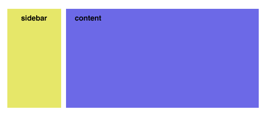
I have a regular layout that looks that this:
This layout is done using CSS floats.
When I switch to mobile, I want my layout to do this:

That is, I want my sidebar to be below the content. I can do this using absolute positioning, but I was wondering, is there a way to do this using floats so that if my content changes the sidebar will adjust for the height difference?
 559
559
Here's how I would do it. The DIVs are floated on your desktop version, but displayed on top of eachother (default block display) on mobile.
CSS:
#sidebar {
    float: left;
    width: 30%;
}

#content {
    float: right;
    width: 70%;
}

.mobile #sidebar,
.mobile #content {
    float: none;
    display: block;
    margin-bottom: 15px;
}
Standard HTML:
<body>
<div id="content">
...
</div>
<div id="sidebar">
...
</div>
</body>
Mobile HTML:
<body class="mobile">
<div id="content">
...
</div>
<div id="sidebar">
...
</div>
</body>
Media query, flex container and its order property should do the trick:
@media(max-width:767px) {
    .container {
        display: flex;
        flex-wrap: wrap;
    }
    .content {
        order: 1;
    }
    .sidebar {
        order: 2;
    }
}
Make sure to replace max-width value with your own mobile breakpoint.
Browser support for flex is also pretty decent now.
35
If you love us? You can donate to us via Paypal or buy me a coffee so we can maintain and grow! Thank you!
Donate Us With