 Menu
Menu
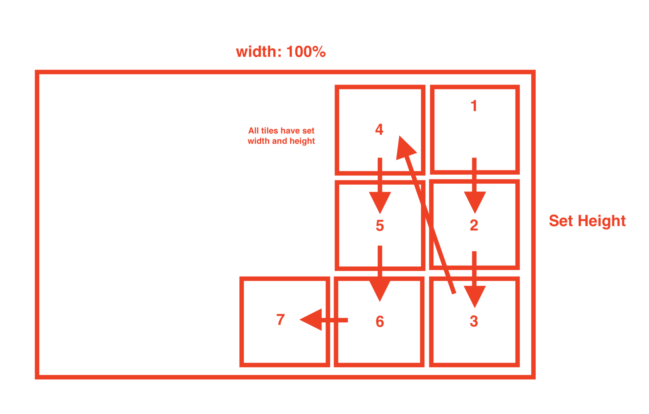
Trying to layout the following tiles in CSS, but can't seem to find the right combination of align/justify.
Here's what I got so far:
    .container {
        border: 3px solid red;
        display: flex;
        flex-direction: column;
        flex-wrap: wrap;
        align-items: flex-end;
        justify-content: flex-end;
        width: 100%;
        height: 500px;
    }
    .item {
        border: 3px solid red;
        width: 150px;
        height: 150px;
    }
<div class="container">
<div class="item">1</div>
<div class="item">2</div>
<div class="item">3</div>
<div class="item">4</div>
<div class="item">5</div>
<div class="item">6</div>
<div class="item">7</div>
</div>The result is not right to left and it's not "pushed" to the right side.
 465
465
The flex columns can be aligned left or right by using the align-content property in the flex container class. The align-content property changes the behavior of the flex-wrap property. It aligns flex lines. It is used to specify the alignment between the lines inside a flexible container.
In simple words, flex-items now expand from right to left as shown in the given figure. When justify-content is set to “flex-end”, it instantly shifts all the flex-items to the end of the flex-container along the main-axis, i.e flex items get right aligned.
Here is what you need:
.container {
  border: 3px solid red;
  display: flex;
  align-content: flex-start;
  flex-direction: column;
  flex-wrap: wrap-reverse;
  justify-content: flex-end;
  width: 100%;
  height: 500px;
}

.item {
  border: 3px solid red;
  width: 150px;
  height: 150px;
}
<div class="container">
<div class="item">1</div>
<div class="item">2</div>
<div class="item">3</div>
<div class="item">4</div>
<div class="item">5</div>
<div class="item">6</div>
<div class="item">7</div>
</div>Instead of using:
flex-direction: column;
flex-wrap: wrap-reverse;
You could also use:
flex-flow: column wrap-reverse;
.container {
        border: 3px solid red;
        display: flex;
        flex-direction: column;
        flex-wrap: wrap-reverse;
        align-items: flex-end;
        justify-content: flex-end;
        width: 100%;
        height: 500px;
    }
    .item {
        border: 3px solid red;
        width: 150px;
        height: 150px;
    }
<div class="container">
<div class="item">1</div>
<div class="item">2</div>
<div class="item">3</div>
<div class="item">4</div>
<div class="item">5</div>
<div class="item">6</div>
<div class="item">7</div>
</div>Super close, just need to change your wrap direction
24
you can add one thing to your parent :
direction:rtl;
and it will be ok ;)
1
If you love us? You can donate to us via Paypal or buy me a coffee so we can maintain and grow! Thank you!
Donate Us With