 Menu
Menu
I use flexboxes to organize elements on my page.
I want the flexboxes to use all available horizontal space, so I add flex-grow:1.
Then I want each item on the same line to be of the same size (e.g. 50% each if there is two items, 33% if there is three, etc), so I add flex-basis:0.
But at the third step, the items don't wrap anymore. If I change the window width, the number of items per line stays always the same, and their content is squeezed. I don't want that. I want an item to be put on the next line when their width become smaller than it's content, as it works in the first two steps. I tried playing with flex-shrink and other things, without success.
What can I do ? Thanks !
Answer TL;DR: Adding min-width: fit-content works !
JSFiddle
 817
817
Although you have flex-wrap set to wrap, there is no width defined for the flex items (li), and you have flex-basis set to 0. This means that the initial main size of the flex items is 0. It won't wrap because it can shrink to zero (even if the flex-shrink property is 0).
One thing you can do is set the flex-basis property to content or auto.
li { flex-basis: auto; }
This tells the flex item to factor in the width of its content.
jsfiddle demo
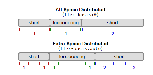
flex-basisThe initial main size of the flex item.
autoWhen specified on a flex item, the
autokeyword retrieves the value of the main size property as the usedflex-basis. If that value is alsoauto, then the used value iscontent.
contentIndicates automatic sizing, based on the flex item’s content.
Note: Note that
contentwas not present in the initial release of Flexible Box Layout, and thus some older implementations will not support it. The equivalent effect can be had by usingautotogether with a main size (width or height) ofauto.
This diagram from the flexbox spec tries to explain the difference between flex-basis: 0 and flex-basis: auto. Here's a more complete explanation.
Another method to vertically stack flex items on smaller screens is to change the flex-direction in a media query:
@media screen and ( max-width: 500px ) {
    ul { flex-direction: column; }
    li { flex-basis: auto; }
}
jsfiddle demo
67
I would use media queries to change the flex-direction of the element to column if the items are too big for the window width. This will put the items of a list below each other.
HTML
<ul class="grid__row grid__row--sm">
    <li>1 small</li>
    <li>1 wide wide wide wide wide wide</li>
</ul>
<ul class="grid__row grid__row--sm">
    <li>2 medium medium</li>
    <li>2 small</li>
</ul>
<ul class="grid__row grid__row--md">
    <li>3 small</li>
    <li>3 wide wide wide wide wide wide</li>
    <li>3 medium medium</li>
</ul>
CSS
.grid__row {
    margin: auto;
    padding: 0;
    list-style-type: none;
    display: flex;
    flex-direction: column;
}

.grid__row li {
    background: green;
    color: white;
    margin: 1px;
    padding: 15px;
    display:flex;
    flex: 1;
}

@media (min-width: 480px) {
    .grid__row--sm {
        flex-direction: row;
    }
}

@media (min-width: 768px) {
    .grid__row--md {
        flex-direction: row;
    }
}
JSFiddle
22
If you love us? You can donate to us via Paypal or buy me a coffee so we can maintain and grow! Thank you!
Donate Us With