 Menu
Menu
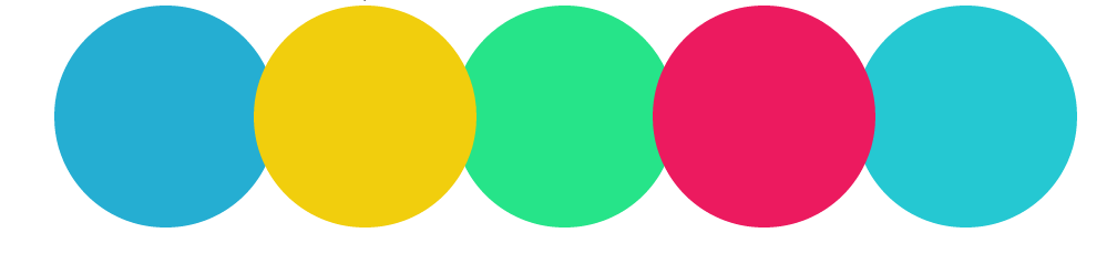
Hey all i like to create a css circles which looks like 
and i created the circles using css border-radius styles within a class a and i separted the colors by id
my sass looks like is class for circle
 .works_section{
        margin-top: 80px;
        .work_circles{
            float: left;
            width: 201px;
            height: 201px;
            border-radius: 101px;
            display: block;
            position: relative;
            img{
                display: block;
                margin: 0 auto;
                margin-top: 65px;
            }
            p{
                margin-top: 15px;
                color: white;
                text-align: center;
                font-weight: bold;
            }
        }
//id's dat separate the colors
      #firstblu_circle{
            @extend .work_circles;
            background-color:$blue;
            z-index: 1;

        }
        #yello_circle{
            @extend .work_circles;
            background-color:$pale_yello;
            z-index: 2;
            left: -21px;
        }
        #radiumgreen_circle{
            @extend .work_circles;
            background-color:$green;
            z-index: 1;
            left: -42px;
        }
        #pink_circle{
            @extend .work_circles;
            background-color:$pnk;
            z-index: 2;
            left: -63px;
        }
        #lastblu_circle{
            @extend .work_circles;
            background-color:$del_blue;
             z-index: 1;
             margin-left: -82px;
        }

    }

And circle is look like
Now the problem i need to add white color in the intersected areas of the circle as i described by image earlier.is there any possible way to get it by css?
myfiddle is
fiddle
 437
437
A bit simpler version: Fiddle
<div class='circle-holder'>
    <div id='circle-1' class='circle'></div>
    <div id='circle-2' class='circle'></div>
    <div id='circle-3' class='circle'></div>
    <div id='circle-4' class='circle'></div>
    <div id='circle-5' class='circle'></div>
</div>
CSS:
.circle {
    width: 201px;
    height: 201px;
    border-radius: 101px;
    float: left;
    position: relative;
    overflow: hidden;
    margin-right: -30px;
}

.circle + .circle::before {
    content: '';
    position: absolute;
    width: 100%;
    height: 100%;
    top: 0;
    left: -170px;
    background: #fff;
    border-radius: 101px;
}
DEMO : http://jsfiddle.net/Rfnca/7/
HTML
 <div id="main">
   <span class="works_section" id="upload_circle">


   </span>
    <span class="works_section" id="team_circle">


   </span>
    <span class="works_section" id="development_circle">

   </span>
    <span class="works_section" id="testing_circle">


   </span>

   </div>
CSS
.works_section{
     float: left;
  width: 100px;
  height: 100px;
  border-radius: 101px;
  display: block;
  position: relative;
}
 #upload_circle {
  background-color: #25aed2;
  z-index: 0;
}
 #team_circle {
  background-color: white;
  z-index: 1;
  left: -21px;
    background-image: -moz-radial-gradient(
        -37px 50%, /* the -37px left position varies by your "gap" */
        circle closest-corner, /* keep radius to half height */
        transparent 0, /* transparent at center */
        transparent 55px, /*transparent at edge of gap */
        #f1ce0d 56px, /* start circle "border" */
        #f1ce0d 57px /* end circle border and begin color of rest of background */
    );
}
 #development_circle {
  background-color: #fff;
  z-index: 1;
  left: -42px;
    background-image: -moz-radial-gradient(
        -37px 50%, /* the -37px left position varies by your "gap" */
        circle closest-corner, /* keep radius to half height */
        transparent 0, /* transparent at center */
        transparent 55px, /*transparent at edge of gap */
        #26e489 56px, /* start circle "border" */
        #26e489 57px /* end circle border and begin color of rest of background */
    );
}
 #testing_circle {
  background-color: #fff;
  z-index: 2;
  left: -63px;
    background-image: -moz-radial-gradient(
        -37px 50%, /* the -37px left position varies by your "gap" */
        circle closest-corner, /* keep radius to half height */
        transparent 0, /* transparent at center */
        transparent 55px, /*transparent at edge of gap */
        #EC1A5F 56px, /* start circle "border" */
        #EC1A5F 57px /* end circle border and begin color of rest of background */
    );

}
Credits to Scotts for his answer to this question : CSS 3 Shape: "Inverse Circle" or "Cut Out Circle"
I just used his code with some modifications.
I have just added the property for firefox. You can get the properties for the rest of the browsers from scotts's answer
35
If you love us? You can donate to us via Paypal or buy me a coffee so we can maintain and grow! Thank you!
Donate Us With