 Menu
Menu
Imagine I have any block or inline block with text in it. Like a paragraph or li or whatever. If that tag has the "separator" class, I want it to appear as follows:
All content is centred (text-align:center; will suffice). Here's the tricky part: on either side of the centred content, a (vertically-centred) line appears.
The following image illustrates my idea:

If I have to introduce more HTML, then forget about it - not interested.
I'm a long time CSS user, but I can't figure this one out... Anyone else got an idea? As much as I love it, preferably no CSS3 (for work... can't use new stuff because of compatibility)..
Example problem: <p class="separator">CENTRE ME</p>
 410
410
This works in Firefox:
.separator {
    text-align: center;
    height: 0.5em;
    border-bottom: 2px solid black;
    margin-bottom: 0.5em;
}
.separator:first-line {
    background-color: white;
}
JSFiddle Demo
193
I have developed a solution that does not rely on a background: white, that is, you can see whats behind the separator's text. Just run the sample and you will see this:
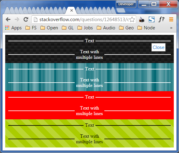
Disregard all those messy tabs in this illustration... this is a CSS sample, not an organization sample.
.separator>*{
  display: inline-block;
  vertical-align: middle;
}
.separator {
    text-align: center;
    border: 0;
    white-space: nowrap;
    display: block;
    overflow: hidden;
    padding: 0;
    margin: 0;
}
.separator:before, .separator:after {
    content: "";
    height: 2px;
    width: 50%;
    background-color: gray;
    margin: 0 5px 0 5px;
    display: inline-block;
    vertical-align: middle;
}
.separator:before {
    margin-left: -100%;
}
.separator:after {
    margin-right: -100%;
}
<div class="texture texture1 dark-theme">
<p class="separator">Text</p>
<br/>
<p class="separator"><span>Text with<br/>multiple lines</span></p>
</div>
<div class="texture texture2 dark-theme">
<p class="separator">Text</p>
<br/>
<p class="separator"><span>Text with<br/>multiple lines</span></p>
</div>
<div class="texture texture3 dark-theme">
<p class="separator">Text</p>
<br/>
<p class="separator"><span>Text with<br/>multiple lines</span></p>
</div>
<div class="texture texture4 light-theme">
<p class="separator">Text</p>
<br/>
<p class="separator"><span>Text with<br/>multiple lines</span></p>
</div>
<style>
/**
STYLES TO MAKE THE BACKGROUND HAVE PATTERNS WHICH ARE NOT SOLID WHITE,
SO THAT YOU CAN SEE THAT IT IS VISIBLE BEHIND THE SEPARATOR.
**/
.light-theme .separator:before, .light-theme .separator:after {
background-color: black;
}
.light-theme .separator, .light-theme .separator {
color: black;
}
.dark-theme .separator:before, .dark-theme .separator:after {
background-color: white;
}
.dark-theme .separator, .dark-theme .separator {
color: white;
}
.texture {
padding: 10px;
}
.texture3 {
background-color: red;
color: white;
}
.texture1 {
//-webkit-box-sizing: content-box;
//-moz-box-sizing: content-box;
//box-sizing: content-box;
//width: 320px;
//height: 320px;
//border: none;
//font: normal 100%/normal Arial, Helvetica, sans-serif;
//color: rgb(255, 255, 255);
//-o-text-overflow: clip;
//text-overflow: clip;
background: -webkit-linear-gradient(63deg, rgb(21,21,21) 5px, rgba(0,0,0,0) 5px), -webkit-linear-gradient(-117deg, rgb(21,21,21) 5px, rgba(0,0,0,0) 5px), -webkit-linear-gradient(63deg, rgb(34,34,34) 5px, rgba(0,0,0,0) 5px), -webkit-linear-gradient(-117deg, rgb(34,34,34) 5px, rgba(0,0,0,0) 5px), -webkit-linear-gradient(0deg, rgb(27,27,27) 10px, rgba(0,0,0,0) 10px), -webkit-linear-gradient(-90deg, rgb(29,29,29) 25%, rgb(26,26,26) 25%, rgb(26,26,26) 50%, rgba(0,0,0,0) 50%, rgba(0,0,0,0) 75%, rgb(36,36,36) 75%, rgb(36,36,36) 100%), rgb(19, 19, 19);
background: -moz-linear-gradient(27deg, rgb(21,21,21) 5px, rgba(0,0,0,0) 5px), -moz-linear-gradient(207deg, rgb(21,21,21) 5px, rgba(0,0,0,0) 5px), -moz-linear-gradient(27deg, rgb(34,34,34) 5px, rgba(0,0,0,0) 5px), -moz-linear-gradient(207deg, rgb(34,34,34) 5px, rgba(0,0,0,0) 5px), -moz-linear-gradient(90deg, rgb(27,27,27) 10px, rgba(0,0,0,0) 10px), -moz-linear-gradient(180deg, rgb(29,29,29) 25%, rgb(26,26,26) 25%, rgb(26,26,26) 50%, rgba(0,0,0,0) 50%, rgba(0,0,0,0) 75%, rgb(36,36,36) 75%, rgb(36,36,36) 100%), rgb(19, 19, 19);
background: linear-gradient(27deg, rgb(21,21,21) 5px, rgba(0,0,0,0) 5px), linear-gradient(207deg, rgb(21,21,21) 5px, rgba(0,0,0,0) 5px), linear-gradient(27deg, rgb(34,34,34) 5px, rgba(0,0,0,0) 5px), linear-gradient(207deg, rgb(34,34,34) 5px, rgba(0,0,0,0) 5px), linear-gradient(90deg, rgb(27,27,27) 10px, rgba(0,0,0,0) 10px), linear-gradient(180deg, rgb(29,29,29) 25%, rgb(26,26,26) 25%, rgb(26,26,26) 50%, rgba(0,0,0,0) 50%, rgba(0,0,0,0) 75%, rgb(36,36,36) 75%, rgb(36,36,36) 100%), rgb(19, 19, 19);
background-position: 0 5px, 10px 0, 0 10px, 10px 5px, 0 0, 0 0;
-webkit-background-origin: padding-box;
background-origin: padding-box;
-webkit-background-clip: border-box;
background-clip: border-box;
-webkit-background-size: 20px 20px;
background-size: 20px 20px;
}
.texture2 {
//-webkit-box-sizing: content-box;
//-moz-box-sizing: content-box;
//box-sizing: content-box;
//width: 320px;
//height: 320px;
//border: none;
//font: normal 100%/normal Arial, Helvetica, sans-serif;
//color: rgb(255, 255, 255);
//-o-text-overflow: clip;
//text-overflow: clip;
background: -webkit-linear-gradient(0deg, rgba(255,255,255,0.0666667) 50%, rgba(0,0,0,0) 50%), -webkit-linear-gradient(0deg, rgba(255,255,255,0.129412) 50%, rgba(0,0,0,0) 50%), -webkit-linear-gradient(0deg, rgba(0,0,0,0) 50%, rgba(255,255,255,0.168627) 50%), -webkit-linear-gradient(0deg, rgba(0,0,0,0) 50%, rgba(255,255,255,0.188235) 50%), rgb(2, 104, 115);
background: -moz-linear-gradient(90deg, rgba(255,255,255,0.0666667) 50%, rgba(0,0,0,0) 50%), -moz-linear-gradient(90deg, rgba(255,255,255,0.129412) 50%, rgba(0,0,0,0) 50%), -moz-linear-gradient(90deg, rgba(0,0,0,0) 50%, rgba(255,255,255,0.168627) 50%), -moz-linear-gradient(90deg, rgba(0,0,0,0) 50%, rgba(255,255,255,0.188235) 50%), rgb(2, 104, 115);
background: linear-gradient(90deg, rgba(255,255,255,0.0666667) 50%, rgba(0,0,0,0) 50%), linear-gradient(90deg, rgba(255,255,255,0.129412) 50%, rgba(0,0,0,0) 50%), linear-gradient(90deg, rgba(0,0,0,0) 50%, rgba(255,255,255,0.168627) 50%), linear-gradient(90deg, rgba(0,0,0,0) 50%, rgba(255,255,255,0.188235) 50%), rgb(2, 104, 115);
-webkit-background-origin: padding-box;
background-origin: padding-box;
-webkit-background-clip: border-box;
background-clip: border-box;
-webkit-background-size: 13px 13px, 29px 29px, 37px 37px, 53px 53px;
background-size: 13px 13px, 29px 29px, 37px 37px, 53px 53px;
}
.texture4 {
//-webkit-box-sizing: content-box;
//-moz-box-sizing: content-box;
//box-sizing: content-box;
//width: 320px;
//height: 320px;
//border: none;
//font: normal 100%/normal Arial, Helvetica, sans-serif;
//color: rgba(255,255,255,1);
//-o-text-overflow: clip;
//text-overflow: clip;
background: -webkit-linear-gradient(45deg, rgba(255,255,255,0.2) 25%, rgba(0,0,0,0) 25%, rgba(0,0,0,0) 50%, rgba(255,255,255,0.2) 50%, rgba(255,255,255,0.2) 75%, rgba(0,0,0,0) 75%, rgba(0,0,0,0) 0), rgb(170, 204, 0);
background: -moz-linear-gradient(45deg, rgba(255,255,255,0.2) 25%, rgba(0,0,0,0) 25%, rgba(0,0,0,0) 50%, rgba(255,255,255,0.2) 50%, rgba(255,255,255,0.2) 75%, rgba(0,0,0,0) 75%, rgba(0,0,0,0) 0), rgb(170, 204, 0);
background: linear-gradient(45deg, rgba(255,255,255,0.2) 25%, rgba(0,0,0,0) 25%, rgba(0,0,0,0) 50%, rgba(255,255,255,0.2) 50%, rgba(255,255,255,0.2) 75%, rgba(0,0,0,0) 75%, rgba(0,0,0,0) 0), rgb(170, 204, 0);
background-position: auto auto;
-webkit-background-origin: padding-box;
background-origin: padding-box;
-webkit-background-clip: border-box;
background-clip: border-box;
-webkit-background-size: 50px 50px;
background-size: 50px 50px;
}
</style>P.S.: The background examples I used are not my creations. I got them at enjoycss.com. The red background, well, it's also not my creation, neither their... nobody's creation, maybe. Who created red... I don't know. If you did, and I didn't give credit, please leave a note in the comments.
37
If you love us? You can donate to us via Paypal or buy me a coffee so we can maintain and grow! Thank you!
Donate Us With


