 Menu
Menu
I have a button with a linear-gradient background, orange border, and some text. When I hover over the button, I want the background to become transparent without changing the other properties of the button.
I've tried to transition the opacity to 0, but obviously, this will hide the border and text. I've also tried transitioning the background, but it does not work because I don't have an endpoint to transition to since it needs to be transparent.
body {
    background-color: darkblue;
}

.button {
    background-image: linear-gradient(red,yellow);
    border: solid orange 2px;
    border-radius: 10px;
    color: white;
    padding: 15px 25px;
    text-align: center;
    text-decoration: none;
    display: inline-block;
    font-size: 24px;
}
<button class="button">Submit</button> 809
809
Use a pseudo element for the background and you can easily do this:
body {
  background-color: darkblue;
}

.button {
  border: solid orange 2px;
  border-radius: 10px;
  color: white;
  padding: 15px 25px;
  text-align: center;
  text-decoration: none;
  display: inline-block;
  font-size: 24px;
  position: relative;
  overflow: hidden;
  z-index:0;
  background:transparent;
}

.button::before {
  content: "";
  position: absolute;
  z-index:-1;
  top: 0;
  left: 0;
  right: 0;
  bottom: 0;
  background-image: linear-gradient(red, yellow);
  transition:1s;
}
.button:hover::before {
  opacity:0;
}
<button class="button">Submit</button>Here is another idea without the use of pseudo element where you can rely on changing the background-color and background-size. The trick is to keep one of the gradient color transparent so we can see the background-color (you can have transition on this one to transparent). Then you increase the background-size to hide the bottom color and we only see the transparent.
body {
  background-color: darkblue;
}

.button {
  border: solid orange 2px;
  background-image: linear-gradient(transparent, yellow);
  background-size:100% 100%;
  background-color:red;
  border-radius: 10px;
  color: white;
  padding: 15px 25px;
  text-align: center;
  text-decoration: none;
  display: inline-block;
  font-size: 24px;
  transition:1s;
}

.button:hover {
  background-color:transparent;
  background-size:100% 500%;
}
<button class="button">Submit</button>Or consider adjusting background-size to have another kind of transition:
body {
background-color: darkblue;
}
.button {
border: solid orange 2px;
background:
linear-gradient(red, yellow),
transparent;
background-size:100% 100%;
background-position:left; /*change this to change the way the transtion happen*/
background-repeat:no-repeat;
border-radius: 10px;
color: white;
padding: 15px 25px;
text-align: center;
text-decoration: none;
display: inline-block;
font-size: 24px;
transition:1s;
}
.button:hover {
background-size:0% 100%;
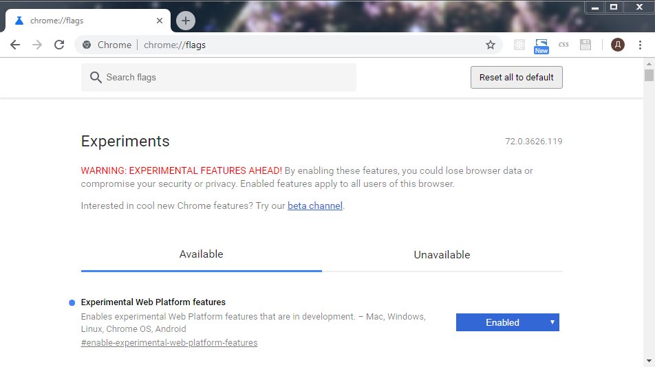
}<button class="button">Submit</button>In Chrome with Experimental Web Platform features enabled (see) we can use:
CSS.registerProperty({
  name: '--alpha',
  syntax: '<number>',
  initialValue: 1,
  inherits: true,
})
body {
background-color: darkblue;
}
.button {
--alpha: 1;
background: linear-gradient(rgba(255,0,0,var(--alpha)), rgba(255,255,0,var(--alpha))) transparent;
border: solid orange 2px;
border-radius: 10px;
color: white;
padding: 15px 25px;
text-align: center;
text-decoration: none;
display: inline-block;
font-size: 24px;
transition: --alpha 1s linear;
}
.button:hover {
--alpha: 0;
}<button class="button">Submit</button>Now we can use new @property. See the support table.
@property --alpha {
  syntax: '<number>';
  inherits: false;
  initial-value: 1;
}

body {
  background-color: darkblue;
}

.button {
  background-image: linear-gradient(rgba(255, 0, 0, var(--alpha)), rgba(255, 255, 0, var(--alpha)));
  transition: --alpha 1s;
  background-color: transparent;
  border: solid orange 2px;
  border-radius: 10px;
  color: white;
  padding: 15px 25px;
  text-align: center;
  text-decoration: none;
  display: inline-block;
  font-size: 24px;
}

.button:hover {
  --alpha: 0;
}
<button class="button">Submit</button>If you love us? You can donate to us via Paypal or buy me a coffee so we can maintain and grow! Thank you!
Donate Us With