 Menu
Menu
I would like to use the CSS property "border-image": https://developer.mozilla.org/de/docs/Web/CSS/border-image
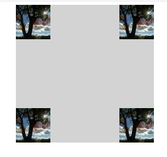
But for some reason it fills only the four corners of the element:
My code:
.wrap {
  width: 400px;
  height: 300px;
  margin: 50px auto;
  position: relative;
}

.item {
  width: 100px;
  height: 100px;
  background-color: lightGray;
  border: 50px solid transparent;
  border-image: url(http://lorempixel.com/50/50/) 50 50 50 50 stretch stretch;
}
<div class="wrap">
<div class="item"></div>
</div>What do I wrong?
I would expect the little image to be repeated as well vertically as horizontally.
So that the grey box is enclosed with the image pattern.
Any help very much appreciated.
 558
558
No, it won't because your image is a 50x50 image and the border-image-slice is set as 50 too.
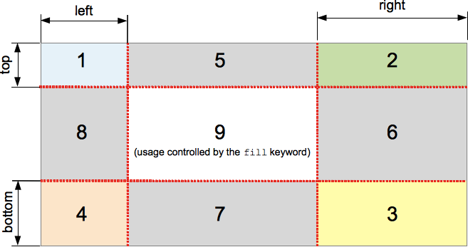
The way border-image-slice works is that the UA will split the image into 9 pieces based on offsets indicated in the slice. In your case, once you slice the image by 50px, there is nothing left in middle to set for the areas marked as 5, 6, 7 and 8 in the below image (Image is copied from MDN).
From the W3C Spec on border-image-slice:
The regions given by the ‘border-image-slice’ values may overlap. However if the sum of the right and left widths is equal to or greater than the width of the image, the images for the top and bottom edge and the middle part are empty, which has the same effect as if a nonempty transparent image had been specified for those parts. Analogously for the top and bottom values.
You'd have to set the border-image-slice as something lesser than 25 for the areas in the middle to get covered with the image.
Note: Though the spec says top and bottom edge image are also considered as empty, I am not sure why browsers show the image on all four corners. That may be down to browser implementation. Plus browsers seem to work fine even when we specify the border-image-slice as 25. It is slightly contradicting with the spec but you atleast get the reason :)
145
Not sure what works, but using an image of larger size sort of fixed it.
Please note that usually the images that are used for border-image are images with graphics at their edges. It's not that entire image is repeated along the edges. It's sort of all four corners of the image are aligned to the corners of our div and then rest of the image is adjusted according to specified properties.
.wrap {
  width: 400px;
  height: 300px;
  margin: 50px auto;
  position: relative;
}

.item {
  width: 100px;
  height: 100px;
  background-color: lightGray;
  border: 50px solid;
  border-image: url(http://lorempixel.com/150/150/) 25;
}
<div class="wrap">
<div class="item"></div>
</div>If you love us? You can donate to us via Paypal or buy me a coffee so we can maintain and grow! Thank you!
Donate Us With