 Menu
Menu
I'm trying to make a circle out of images with different sizes and different shapes (some rectangle, some sqaure, some portrait, some landscape).
When I'm using: clip-path: circle(50% at 50% 50%); or border-radius: 50%;, it turns the image into a perfect circle, only if the image is square:
Is there a way to crop an image into a square and then use one of these methods to make it a perfect circle:
background-image (most images are given the background image from server side), border-radius or clip-path)(Images size may vary).Here's a code snippet to show a square image and a rectangle image:
.clipped {
    clip-path: circle(50% at 50% 50%);
}
Square<br>
<img src='http://i.imgur.com/d5byNNR.jpg' width="100" class='clipped' /><br><br>
Rectangle<br>
<img src='http://i.imgur.com/22W12EQ.jpg' width="100" class='clipped' /> 799
799
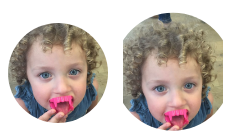
You can use circle() but without the parameters:
.clipped {
   clip-path: circle();
}
It appears to use the smaller side of your image as the circle's circumference.
Working sample here.
It works on Chrome and FireFox. IE and Edge still does not support clip-path
129
If you love us? You can donate to us via Paypal or buy me a coffee so we can maintain and grow! Thank you!
Donate Us With