 Menu
Menu
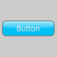
I'd like to create the glossy button below with Qt Quick (preferably with pure QML, no C++):
It needs to be scalable, so I can't use PNGs, etc.
My code so far:
import QtQuick 2.3
import QtQuick.Controls 1.2
import QtQuick.Controls.Styles 1.2

ApplicationWindow {
    id: window
    color: "#cccccc"
    width: 200
    height: 200

    Button {
        id: button
        width: Math.min(window.width, window.height) - 20
        height: width * 0.3
        anchors.centerIn: parent
        text: "Button"

        style: ButtonStyle {
            background: Rectangle {
                gradient: Gradient {
                    GradientStop {
                        position: 0
                        color: "#bbffffff"
                    }
                    GradientStop {
                        position: 0.6
                        color: "#00c0f5"
                    }
                }

                border.color: "grey"
                border.width: height * 0.05
                radius: height / 5
            }

            label: Label {
                text: button.text
                color: "#ddd"
                font.pixelSize: button.height * 0.5
                horizontalAlignment: Text.AlignHCenter
                verticalAlignment: Text.AlignVCenter
            }
        }
    }
}
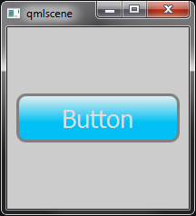
I've got two problems:
 288
288
This is not possible using Rectangle. You can use Canvas, however. I'll walk you through the process.
Since there are several "layers", we must create an Item to contain them all. We'll add the layers according to their Z order, starting with the flat colours:
import QtQuick 2.3
import QtQuick.Controls 1.2
import QtQuick.Controls.Styles 1.2

ApplicationWindow {
    id: window
    color: "#cccccc"
    width: 200
    height: 200

    Button {
        id: button
        width: Math.min(window.width, window.height) - 20
        height: width * 0.3
        anchors.centerIn: parent
        text: "Button"

        readonly property real radius: height / 5

        style: ButtonStyle {
            background: Item {
                Canvas {
                    anchors.fill: parent

                    onPaint: {
                        var ctx = getContext("2d");
                        ctx.reset();

                        ctx.beginPath();
                        ctx.lineWidth = height * 0.1;
                        ctx.roundedRect(ctx.lineWidth / 2, ctx.lineWidth / 2,
                            width - ctx.lineWidth, height - ctx.lineWidth, button.radius, button.radius);
                        ctx.strokeStyle = "grey";
                        ctx.stroke();
                        ctx.fillStyle = "#00c0f5";
                        ctx.fill();
                    }
                }
            }

            label: Label {
                text: button.text
                color: "white"
                font.pixelSize: button.height * 0.5
                horizontalAlignment: Text.AlignHCenter
                verticalAlignment: Text.AlignVCenter
            }
        }
    }
}
The Canvas item should fill the button, so we write anchors.fill: parent.
We then get the 2D context that we use to draw on the canvas with. We also call reset(), which clears the canvas before each paint.
The button has rounded corners, so we define the read-only radius property and set it to our desired value, which in this case is 20% of the height of the button.
Next, we call beginPath(). This starts a new path, and also closes any previous paths.
We set the line width for our stroke to 10% of the height of the button.
Canvas uses QPainter internally. QPainter strokes 50% on the inside of the target and 50% on the outside. We must account for this when drawing our rounded rectangle, otherwise the stroke will be hidden outside the canvas. We can do so by drawing the rectangle with margins equal to half the line width.
After the rounded rectangle path has been defined, we're left with a path that we need to stroke and fill.
The result of this step is:

As we want the text to be under the shine of the button, we must define it next:
import QtQuick 2.3
import QtQuick.Controls 1.2
import QtQuick.Controls.Styles 1.2

ApplicationWindow {
    id: window
    color: "#cccccc"
    width: 200
    height: 200

    Button {
        id: button
        width: Math.min(window.width, window.height) - 20
        height: width * 0.3
        anchors.centerIn: parent
        text: "Button"

        readonly property real radius: height / 5

        style: ButtonStyle {
            background: Item {
                Canvas {
                    anchors.fill: parent

                    onPaint: {
                        var ctx = getContext("2d");
                        ctx.reset();

                        ctx.beginPath();
                        ctx.lineWidth = height * 0.1;
                        ctx.roundedRect(ctx.lineWidth / 2, ctx.lineWidth / 2,
                            width - ctx.lineWidth, height - ctx.lineWidth, button.radius, button.radius);
                        ctx.strokeStyle = "grey";
                        ctx.stroke();
                        ctx.fillStyle = "#00c0f5";
                        ctx.fill();
                    }
                }

                Label {
                    text: button.text
                    color: "white"
                    font.pixelSize: button.height * 0.5
                    anchors.centerIn: parent
                }
            }

            label: null
        }
    }
}
Notice that the label component of the style is set to null. This is because we don't want the text to be above everything else. If ButtonStyle had a foreground component, this wouldn't be necessary. Instead, we add the Label item as a child of background.
The visual result of this code is identical to the previous step.
Canvas can draw linear, radial and conical gradients. We'll use a linear gradient to draw the "shine" effect on our button:
import QtQuick 2.3
import QtQuick.Controls 1.2
import QtQuick.Controls.Styles 1.2

ApplicationWindow {
    id: window
    color: "#cccccc"
    width: 200
    height: 200

    Button {
        id: button
        width: Math.min(window.width, window.height) - 20
        height: width * 0.3
        anchors.centerIn: parent
        text: "Button"

        readonly property real radius: height / 5

        style: ButtonStyle {
            background: Item {
                Canvas {
                    anchors.fill: parent

                    onPaint: {
                        var ctx = getContext("2d");
                        ctx.reset();

                        ctx.beginPath();
                        ctx.lineWidth = height * 0.1;
                        ctx.roundedRect(ctx.lineWidth / 2, ctx.lineWidth / 2,
                            width - ctx.lineWidth, height - ctx.lineWidth, button.radius, button.radius);
                        ctx.strokeStyle = "grey";
                        ctx.stroke();
                        ctx.fillStyle = "#00c0f5";
                        ctx.fill();
                    }
                }

                Label {
                    text: button.text
                    color: "white"
                    font.pixelSize: button.height * 0.5
                    anchors.centerIn: parent
                }

                Canvas {
                    anchors.fill: parent
                    onPaint: {
                        var ctx = getContext("2d");
                        ctx.reset();

                        ctx.beginPath();
                        ctx.lineWidth = height * 0.1;
                        ctx.roundedRect(ctx.lineWidth / 2, ctx.lineWidth / 2,
                            width - ctx.lineWidth, height - ctx.lineWidth, button.radius, button.radius);
                        ctx.moveTo(0, height * 0.4);
                        ctx.bezierCurveTo(width * 0.25, height * 0.6, width * 0.75, height * 0.6, width, height * 0.4);
                        ctx.lineTo(width, height);
                        ctx.lineTo(0, height);
                        ctx.lineTo(0, height * 0.4);
                        ctx.clip();

                        ctx.beginPath();
                        ctx.roundedRect(ctx.lineWidth / 2, ctx.lineWidth / 2,
                            width - ctx.lineWidth, height - ctx.lineWidth,
                            button.radius, button.radius);
                        var gradient = ctx.createLinearGradient(0, 0, 0, height);
                        gradient.addColorStop(0, "#bbffffff");
                        gradient.addColorStop(0.6, "#00ffffff");
                        ctx.fillStyle = gradient;
                        ctx.fill();
                    }
                }
            }

            label: null
        }
    }
}
We draw the same rounded rectangle as in step #1, except this time, we fill it with a transparent gradient from top to bottom.

Looking good, but not quite there yet. The shine effect stops halfway down the button, and in order to achieve that with Canvas, we need to do some clipping before we draw the gradient rectangle. You can think of clipping with Canvas as similar to the "subtractive" Rectangular Marquee Tool in Photoshop, except using any shape that you define.
If we were lucky and the shine's curve was concave, we could simply add the following lines before we draw the gradient rectangle:
ctx.beginPath();
ctx.roundedRect(ctx.lineWidth / 2, ctx.lineWidth / 2, width - ctx.lineWidth, height - ctx.lineWidth,
    button.radius, button.radius);
ctx.moveTo(0, height / 2);
ctx.ellipse(-width / 2, height / 2, width * 2, height);
ctx.clip();

Instead, we'll draw the curve manually using bezierCurveTo().
Determining the values to pass to bezierCurveTo() is not easy, which is why I'd suggest finding the curve you want with a great tool like Craig Buckler's Canvas Bézier Curve Example. This will let you manipulate the curves until you find what you're after, but best of all, it will give you the code that creates those curves. If you'd like to do the opposite, and edit the code to see the curves in realtime, check out the HTML5 Canvas Bezier Curve Tutorial.
Below, I've made a small example that strokes the clipping path to make it easier to visualise:
import QtQuick 2.3
import QtQuick.Controls 1.2
import QtQuick.Controls.Styles 1.2

ApplicationWindow {
    id: window
    color: "#cccccc"
    width: 200
    height: 200

    Button {
        id: button
        width: Math.min(window.width, window.height) - 20
        height: width * 0.3
        anchors.centerIn: parent
        text: "Button"

        readonly property real radius: height / 5

        style: ButtonStyle {
            background: Item {
                Rectangle {
                    anchors.fill: parent
                    color: "transparent"
                    border.color: "black"
                    opacity: 0.25
                }

                Canvas {
                    anchors.fill: parent
                    onPaint: {
                        var ctx = getContext("2d");
                        ctx.reset();

                        var cornerRadius = height / 5;

                        ctx.beginPath();
                        ctx.moveTo(0, height * 0.4);
                        ctx.bezierCurveTo(width * 0.25, height * 0.6, width * 0.75, height * 0.6, width, height * 0.4);
                        ctx.lineTo(width, height);
                        ctx.lineTo(0, height);
                        ctx.lineTo(0, height * 0.4);
                        ctx.strokeStyle = "red";
                        ctx.stroke();
                    }
                }
            }

            label: null
        }
    }
}

The inverse of the red area is the area that we will be drawing the shine within.
So, the code to do the clipping is as follows:
import QtQuick 2.3
import QtQuick.Controls 1.2
import QtQuick.Controls.Styles 1.2

ApplicationWindow {
    id: window
    color: "#cccccc"
    width: 200
    height: 200

    Button {
        id: button
        width: Math.min(window.width, window.height) - 20
        height: width * 0.3
        anchors.centerIn: parent
        text: "Button"

        readonly property real radius: height / 5

        style: ButtonStyle {
            background: Item {
                Canvas {
                    anchors.fill: parent

                    onPaint: {
                        var ctx = getContext("2d");
                        ctx.reset();

                        ctx.beginPath();
                        ctx.lineWidth = height * 0.1;
                        ctx.roundedRect(ctx.lineWidth / 2, ctx.lineWidth / 2,
                            width - ctx.lineWidth, height - ctx.lineWidth, button.radius, button.radius);
                        ctx.strokeStyle = "grey";
                        ctx.stroke();
                        ctx.fillStyle = "#00c0f5";
                        ctx.fill();
                    }
                }

                Label {
                    text: button.text
                    color: "#ddd"
                    font.pixelSize: button.height * 0.5
                    anchors.centerIn: parent
                }

                Canvas {
                    anchors.fill: parent
                    onPaint: {
                        var ctx = getContext("2d");
                        ctx.reset();

                        ctx.beginPath();
                        ctx.lineWidth = height * 0.1;
                        ctx.roundedRect(ctx.lineWidth / 2, ctx.lineWidth / 2,
                            width - ctx.lineWidth, height - ctx.lineWidth, button.radius, button.radius);
                        ctx.moveTo(0, height * 0.4);
                        ctx.bezierCurveTo(width * 0.25, height * 0.6, width * 0.75, height * 0.6, width, height * 0.4);
                        ctx.lineTo(width, height);
                        ctx.lineTo(0, height);
                        ctx.lineTo(0, height * 0.4);
                        ctx.clip();

                        ctx.beginPath();
                        ctx.roundedRect(ctx.lineWidth / 2, ctx.lineWidth / 2,
                            width - ctx.lineWidth, height - ctx.lineWidth,
                            button.radius, button.radius);
                        var gradient = ctx.createLinearGradient(0, 0, 0, height);
                        gradient.addColorStop(0, "#bbffffff");
                        gradient.addColorStop(0.6, "#00ffffff");
                        ctx.fillStyle = gradient;
                        ctx.fill();
                    }
                }
            }

            label: null
        }
    }
}

The button now looks the part, and can be clicked, but it doesn't have any visual indication of mouse interaction. Let's add that as well.
It only takes two lines of code to achieve this. The first line makes the shine canvas partially transparent:
opacity: !button.pressed ? 1 : 0.75
The second increases the brightness of the text when the button is hovered:
color: button.hovered && !button.pressed ? "white" : "#ddd"
You could take this even further and separate the style out into its own QML file, provide a colour property and conveniently allow different coloured buttons.
93
QML Image supports SVG natively, then should be as simple as creating your image with an SVG tool...
36
If you love us? You can donate to us via Paypal or buy me a coffee so we can maintain and grow! Thank you!
Donate Us With