 Menu
Menu
Here's my source image:

And my source image zoomed in:
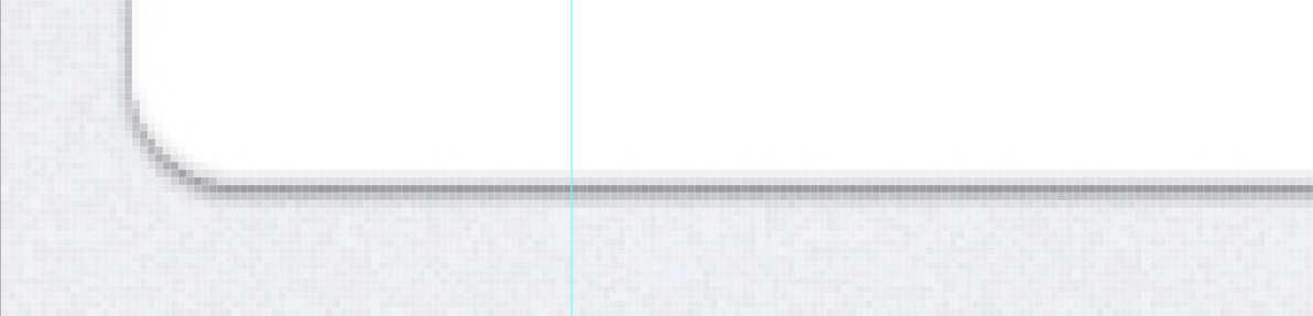
Any thoughts on how to accomplish this with only CSS3? Notice the slight bleed upwards into the element.
 236
236
Update: I've removed the vendor prefixes, since almost every browser that supports these properties do not need them. Dropping them is considered a best practice at this point.
See Caniuse page for
border-radiusandbox-shadow.
the best (and only) way to do this is to use multiple box-shadows:
element {
    box-shadow: rgba(0,0,0,0.2) 0px 2px 3px, inset rgba(0,0,0,0.2) 0px -1px 2px;
    border-radius: 20px;
}
box-shadow works like this:
box-shadow: [direction (inset)] [color] [Horizontal Distance] [Vertical Distance] [size];
border-radius works like this:
border-radius: [size];

/*or*/

border-radius: [topleft/bottomright size] [topright/bottomleft size];

/*or*/

border-radius: [topleft] [topright] [bottomright] [bottomleft];
you can specify the Height an length of the curve like this:
border-radius: [tl-width] [tr-width] [br-width] [bl-width] / [tl-height] [tr-height] [br-height] [bl-height];
If you love us? You can donate to us via Paypal or buy me a coffee so we can maintain and grow! Thank you!
Donate Us With

