 Menu
Menu
I’m looking for some advice on a project I am working on and would be appreciative of any assistance.
To make a drag and drop CMS which allows a user to draw elements on a grid and move them into the desired position. The changes are recorded in JSON format and converted into HTML/CSS when the user presses a publish button. The resultant HTML should be clean and flexible (i.e. cater for content that will vary in height/length). The system should be able to handle creating e-Commerce sites as well as simple information sites.
The logical way to achieve a drag and drop system in HTML is to use absolute positioning with set widths and heights; this method doesn't lend itself to the finished site as the content is likely to be of variable lengths and as absolutely positioned elements are taken out of the flow of the document they are unaware of the elements around them.
Create a system which converts the absolutely positioned elements into floated elements.
In the CMS system the user creates the following layout by drawing boxes on a grid:
Absolute layout:
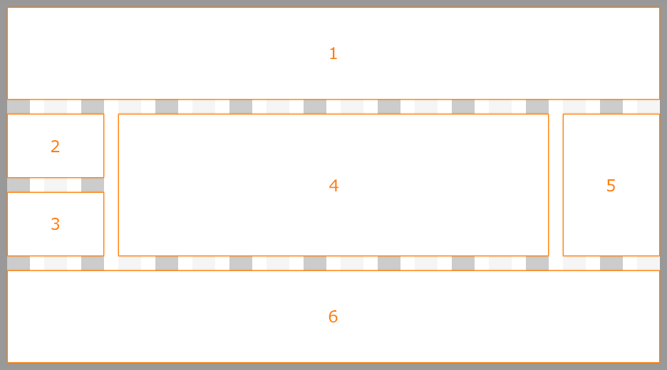
The HTML/CSS would be something like this:
body { background-color: #999999; font-family: verdana, arial, helvetica, sans-serif; font-size: 70%; margin: 15px 0; padding: 0; } #mainContainer { background-color: #FFFFFF; height: 500px; margin: 0 auto; position: relative; width: 916px; } .contentBlock { border: 1px solid orange; box-sizing: border-box; color: orange; font-size: 2em; text-align: center; } .contentBlock:after { content: ""; display: inline-block; height: 100%; vertical-align: middle; } #contentBlock1 { height: 120px; left: 0; position: absolute; top: 0; width: 916px; } #contentBlock2 { height: 100px; left: 0; position: absolute; top: 140px; width: 136px; } #contentBlock3 { height: 100px; left: 0; position: absolute; top: 260px; width: 136px; } #contentBlock4 { height: 220px; left: 156px; position: absolute; top: 140px; width: 604px; } #contentBlock5 { height: 220px; left: 780px; position: absolute; top: 140px; width: 136px; } #contentBlock6 { height: 120px; left: 0; position: absolute; top: 380px; width: 916px; }<div id="mainContainer"> <div class="contentBlock" id="contentBlock1">1</div> <div class="contentBlock" id="contentBlock2">2</div> <div class="contentBlock" id="contentBlock3">3</div> <div class="contentBlock" id="contentBlock4">4</div> <div class="contentBlock" id="contentBlock5">5</div> <div class="contentBlock" id="contentBlock6">6</div> </div>The user now hits the publish button and the layout will be converted to use floats instead absolute positioning. The resultant HTML cannot use absolute positioning because if the content in 2 or 4 expands they will go over/under 3 and 6. Floats keep the elements in the flow and aware of each other so the following would cater for the dynamic content in 2 and 4:
Floated layout:
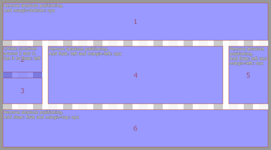
The HTML/CSS would be something like this:
body { background-color: #999999; font-family: verdana, arial, helvetica, sans-serif; font-size: 70%; margin: 15px 0; padding: 0; } #mainContainer { background-color: #FFFFFF; margin: 0 auto; width: 916px; } .contentBlock { border: 1px solid orange; box-sizing: border-box; color: orange; font-size: 2em; text-align: center; } .contentBlock:after { content: ""; display: inline-block; height: 100%; vertical-align: middle; } #contentBlock1 { margin-bottom: 20px; height: 120px; } #contentBlock2 { height: 100px; margin-bottom: 20px; width: 136px; } #contentBlock3 { height: 100px; margin-bottom: 20px; width: 136px; } #contentBlock4 { float: left; height: 220px; margin-bottom: 20px; margin-left: 20px; width: 604px; } #contentBlock5 { float: left; height: 220px; margin-bottom: 20px; margin-left: 20px; width: 136px; } #contentBlock6 { clear: left; height: 120px; } #contentContainer1 { float: left; width: 136px; }<div id="mainContainer"> <div class="contentBlock" id="contentBlock1">1</div> <div id="contentContainer1"> <div class="contentBlock" id="contentBlock2">2</div> <div class="contentBlock" id="contentBlock3">3</div> </div> <div class="contentBlock" id="contentBlock4">4</div> <div class="contentBlock" id="contentBlock5">5</div> <div class="contentBlock" id="contentBlock6">6</div> </div>It cannot be expected for the user to understand how floating elements work, so this process would need to be automatic when the changes are published.
This particular example is quite simple, although more advanced layouts would need to be handled as well.
As far as I can tell, most CMS systems either fix the user into a set template or build the page using JavaScript to set the heights/position of absolutely positioned elements (which I would like to avoid).
Thanks.
 846
846
Generally speaking, float is a relative positioning statement, since it specifies the position of the element relative to its parent container (floating to the right or left). This means it's incompatible with the position:absolute property, because position:absolute is an absolute positioning statement.
Floats are meant to be used in images that you want the text to wrap around. Position absolute is meant to place elements with some kind of x and y coordinates.
Absolute layouts are less flexible and harder to maintain than other types of layouts without absolute positioning.
Although you can not make a div absolute to a specific div, one way to get the results you are looking for is to add overflow:visible; to the row and left:100%; to content container. I changed the section height to 300px for demonstration purposes but it will behave the same with 100% .
First : I don't think "converting" an absolute layout to float is the best approach. You should think floats from the beginning and hint/teach the user to build the layout accordingly.
Second : I believe the tool you want to build will need the users to learn how to use it. This said you want to make it simple enough for people not familiar with HTML/CSS concepts to be able to use it. So you need to base the use of this tool on simple and understandable concepts that users can use to build the "look" and you to generate the code behind it.
Ones I can think of are :
Now using these concepts you could enable the user to create blocks with properties : number of columns for the content width/height margin/padding. The user can then nest blocks indefinitly with these properties and drag-drop content inside them.
Here is how it could work for your example :
Header :
The user creates a block and gives it these properties :
Main :
The user creates a new block under the header with these properties :
Footer
New block with same properties as the header.
The use can then start again inside each block/column and can nest new ones with the same properties
Generating the code :
You know the number of columns of each block and their widths so you can easily create a div for each and use floats/width to position them side by side. For the heights : the user can set a fixed height and it won't be difficult for him to understand that the content can overflow. So if he doesn't want that he must select the "adaptive" height (height : auto; in css).
Conclusion :
This is a very general idea and simple concept. The main work will be on the UI design and the way you will hint/teach the user to build layouts with your tool. Keep in mind who you are disigning for and how they would react in different situations. Use your best UI skills to hint/teach the use in the right direction.
92
There's a website creator tool called Weebly that has the same functionality you're looking for. It's free of charge, so you can have a look to learn more about its features.
What you're asking for is really vague, so I divided the answers into several parts:
1- For the Drag-and-Drop feature:
This is exactly what you're looking for: Gridster
You can let the user resize the boxes while keeping constraints.
2- If you're looking for a clean CSS Framework:
3- If you're looking for a fluid layout which covers the whole page (vertically and horizontally):
html, body {height:100%; margin:0px; padding:0px;} .wrapper {position:relative; height:100%; width:100%; display:block;} .header {position:relative; height:22%; width:100%; display:inline-block; margin-bottom:3%; background:red;} .footer {position:relative; height:22%; width:100%; display:inline-block; margin-top:3%; background:green;} .content {position:relative; height:50%; width:100%; display:inline-block;} .content .left_sidebar {float:left; width:17%; height:100%; position:relative; margin-right:3%; background:yellow;} .content .right_sidebar {float:right; width:17%; height:100%; position:relative; margin-left:3%; background:purple;} .content .middle {float:left; width:60%; height:100%; position:relative; background:cyan;} /** * @info Clearfix: clear all the floated elements */ .clearfix:after {visibility:hidden; display:block; font-size:0; content:" "; clear:both; height:0;} .clearfix {display:inline-table;} /** * @hack Display the Clearfix as a block element * @hackfor Every browser except IE for Macintosh */ /* Hides from IE-mac \*/ * html .clearfix {height:1%;} .clearfix {display:block;} /* End hide from IE-mac */<div class="wrapper"> <div class="header">Header</div> <div class="content"> <div class="left_sidebar">Left Sidebar</div> <div class="middle">Middle</div> <div class="right_sidebar">Right Sidebar</div> <div class="clearfix"></div> </div> <div class="footer">Footer</div> </div>Keep in mind that doing so will destroy the user experience on mobile devices.
35
If you love us? You can donate to us via Paypal or buy me a coffee so we can maintain and grow! Thank you!
Donate Us With