 Menu
Menu
I am coding a site with AngularJS and SCSS. I am in the mobile-phase of development and I quickly discovered (for this project) that I needed a way to target multiple breakpoints using a @media query. So I found via this SO answer and this CSS Tricks Post as well as multiple other answers on SO. Then I implemented the solutions I found into a test-case, see snippet below for the test.
main {
    background-color: grey;
    height: 100%;
    min-height: 1000px;

    @media (max-width: 992px) {
        background-color: red
    }

    @media (max-width: 768px) {
        background-color: lightcoral
    }

    @media (max-width: 992px), (max-width: 992px) and (orientation: landscape) {
        background-color: lightgreen;
    }

    @media (max-width: 768px),
    (max-width: 768px) and (orientation: landscape) {
        background-color: lightblue;
        // Reset the min-height here, because we no longer have the sticky search bar.
        min-height: 450px;
    }
}
<main>
    <h1>Page Title</h1>
    <h2>Some Descriptive information</h2>

    <div>Content</div>
</main>
But I haven't been able to get it to work. What I am trying to do, ultimately, is have styles that are applied when the user is in landscape on a tablet, or phone. However, I don't know if I am doing it right, or using the or operator correctly.
It plain doesn't work, well, the first statement (for example: (max-width: 992px)) works, but the second one doesn't evaluate to true. According to Mozilla:
Comma-separated lists behave like the logical operator or when used in media queries. When using a comma-separated list of media queries, if any of the media queries returns true, the styles or style sheets get applied. Each media query in a comma-separated list is treated as an individual query, and any operator applied to one media query does not affect the others. --- Mozilla Documentation
Even if I break the code into two separate media queries:
@media (max-width: 992px) {
     background-color: lightgreen;
}
@media (max-width: 992px) and (orientation: landscape) {
     background-color: lightgreen;
}
It still doesn't work. So I don't know if I am targeting the wrong width (when in landscape) or what I am doing wrong. Can any other Front-End developers out there tell me why my comma seperated media queries aren't working?
EDIT: Here is the native SCSS code:
main {
    background-color: $mono-90;
    height: 100%;
    min-height: 1000px;

    @media screen and (max-width: map_get($grid-breakpoints, 'md')) {
        // Reset the min-height here, because we no longer have the sticky search bar.
        min-height: 450px;
    }

    @media
    (max-width: map_get($grid-breakpoints, 'lg')),
    (max-width: map_get($grid-breakpoints, 'lg')) and (orientation: landscape){
        background-color: lightgreen;
    }

    @media
    (max-width: map_get($grid-breakpoints, 'md')),
    (max-width: map_get($grid-breakpoints, 'md')) and (orientation: landscape){
        background-color: lightblue;
    }

    @media
    (max-width: map_get($grid-breakpoints, 'sm')),
    (max-width: map_get($grid-breakpoints, 'sm')) and (orientation: landscape){
        background-color: lightcoral;
    }
}
EDIT: Per the recommendation of @Godwin, I simplified my @media queries to this:
main {
    background-color: $mono-90;
    height: 100%;
    min-height: 1000px;

    @media screen and (max-width: map_get($grid-breakpoints, 'md')) {
        // Reset the min-height here, because we no longer have the sticky search bar.
        min-height: 450px;
    }

    @media screen and (max-width: map_get($grid-breakpoints, 'lg')) {
        background-color: lightgreen;
    }

    @media screen and (max-width: map_get($grid-breakpoints, 'md')) {
        background-color: lightblue;
    }

    @media screen and (max-width: map_get($grid-breakpoints, 'sm')) {
        background-color: lightcoral;
    }
}
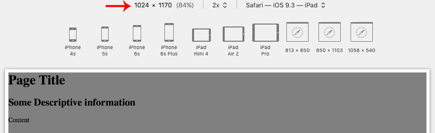
However, it doesn't work on iPad Landscape (1024x768). I don't want it to show on Laptops, but do want it to show on iPads in Landscape position.
 687
687
However, it doesn't work on iPad Landscape (1024x768). I don't want it to show on Laptops, but do want it to show on iPads in Landscape position.
I'm not sure what you're defining by it since you're not hiding anything in your examples so I'm gonna refer to:
What I am trying to do, ultimately, is have styles that are applied when the user is in landscape on a tablet, or phone.
Orientation on MDM is defined as the following:
This value does not correspond to actual device orientation.
It just indicates whether the viewport is in landscape (the display is wider than it is tall) or portrait (the display is taller than it is wide) mode.
You said your iPad in landscape has a resolution of 1024x768, so to target an iPad or a phone in landscape mode, you can set a media query targeting all devices having a maximum width of 1024px and being in landscape mode (the display is wider than it is tall):
main {
  background-color: grey;
  height: 100%;
  min-height: 1000px;
  width: 100%;

  @media screen and (max-width: 1024px) and (orientation: landscape) {
    background-color: lightblue;
  }
}
You can check an example on this codepen.
If your viewport has a width greater than 1024px, the main element will be grey no matter what.
If you resize your browser window to have a viewport with a width equal or less than 1024px, and have a viewport considered in landscape (the display is wider than it is tall), for example an iPad in landscape mode (1024x768), the media query will trigger and apply a blue background:

If you resize your browser window to still have a viewport with a with equal or less than 1024px but have an height greater than your width, the viewport is no longer considered to be in landscape mode but switch to portrait mode. At this time, the media query is no longer be triggered and we fallback to a grey element:
So regarding your question, the example is a media query to apply styles to the user using a tablet or phone in landscape mode.
179
If you love us? You can donate to us via Paypal or buy me a coffee so we can maintain and grow! Thank you!
Donate Us With