 Menu
Menu
I am referring to Cheesesquare app. I have slightly different design requirement at the moment..
Something like this (ignore the part below image and name)
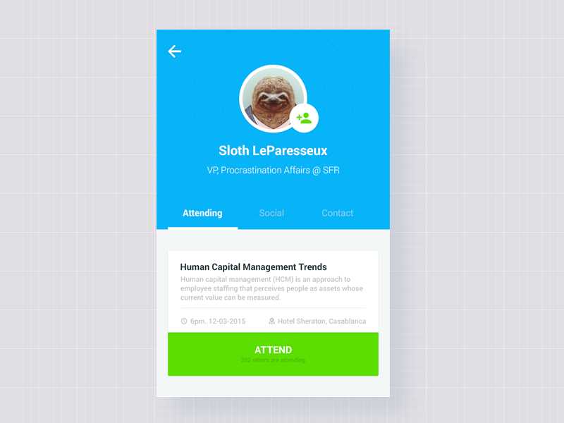
I want floating action button on right bottom corner of circular image and Name of the person below it (which will be CollapsingToolbarLayout title).
So far, I am able to achieve this -

Problem in this layout is, I am not able to pull down the title below image and I can't re-position floating action button..
This is the layout I am using (slightly modified from cheesesquare app)
<android.support.design.widget.CoordinatorLayout xmlns:android="http://schemas.android.com/apk/res/android"
xmlns:app="http://schemas.android.com/apk/res-auto"
xmlns:custom="http://schemas.android.com/apk/res-auto"
android:id="@+id/main_content"
android:layout_width="match_parent"
android:layout_height="match_parent"
android:fitsSystemWindows="true">

<android.support.design.widget.AppBarLayout
    android:id="@+id/appbar"
    android:layout_width="match_parent"
    android:layout_height="@dimen/detail_backdrop_height"
    android:theme="@style/ThemeOverlay.AppCompat.Dark.ActionBar"
    android:fitsSystemWindows="true">

    <android.support.design.widget.CollapsingToolbarLayout
        android:id="@+id/collapsing_toolbar"
        android:layout_width="match_parent"
        android:layout_height="match_parent"
        android:gravity="bottom"
        app:layout_scrollFlags="scroll|exitUntilCollapsed"
        android:fitsSystemWindows="true"
        app:contentScrim="?attr/colorPrimary"
        app:expandedTitleMarginStart="48dp"
        app:expandedTitleTextAppearance="@style/HeaderTitleStyle"
        app:expandedTitleMarginEnd="64dp">


      <FrameLayout
                    android:layout_width="match_parent"
                    android:layout_height="wrap_content"
                    app:layout_collapseMode="parallax"
                    android:fitsSystemWindows="true">

          <ImageView
              android:layout_width="match_parent"
              android:layout_height="match_parent"
              android:id="@+id/imgProfileUserImage"
              android:adjustViewBounds="true"
              android:scaleType="fitXY"
              android:src="@drawable/cheese_1"
              android:alpha="0.35" />


        <Cheesesquare.Utils.CircleImageView
                android:layout_width="180dp"
                android:layout_height="180.0dp"
                android:id="@+id/imgProfileCircleImage"
                android:src="@drawable/cheese_2"
                custom:border="true"
                custom:border_color="#d5d5d5"
                custom:border_width="4dp"
                custom:shadow="true"
                android:layout_gravity="center"
                android:minHeight="80dp"
                android:minWidth="80dp" />


      </FrameLayout>


        <android.support.v7.widget.Toolbar
            android:id="@+id/toolbar"
            android:layout_width="match_parent"
            android:layout_height="?attr/actionBarSize"
            app:popupTheme="@style/ThemeOverlay.AppCompat.Light"
            app:layout_collapseMode="pin" />

    </android.support.design.widget.CollapsingToolbarLayout>

</android.support.design.widget.AppBarLayout>

<android.support.v4.widget.NestedScrollView
    android:layout_width="match_parent"
    android:layout_height="match_parent"
    app:layout_behavior="@string/appbar_scrolling_view_behavior">

    <LinearLayout
        android:layout_width="match_parent"
        android:layout_height="match_parent"
        android:orientation="vertical"
        android:paddingTop="24dp">

        <android.support.v7.widget.CardView
            android:layout_width="match_parent"
            android:layout_height="wrap_content"
            android:layout_margin="@dimen/card_margin">

            <LinearLayout
                style="@style/Widget.CardContent"
                android:layout_width="match_parent"
                android:layout_height="wrap_content">

                <TextView
                    android:layout_width="match_parent"
                    android:layout_height="wrap_content"
                    android:text="Info"
                    android:textAppearance="@style/TextAppearance.AppCompat.Title" />

                <TextView
                    android:layout_width="match_parent"
                    android:layout_height="wrap_content"
                    android:text="@string/cheese_ipsum" />

            </LinearLayout>

        </android.support.v7.widget.CardView>

        <android.support.v7.widget.CardView
            android:layout_width="match_parent"
            android:layout_height="wrap_content"
            android:layout_marginBottom="@dimen/card_margin"
            android:layout_marginLeft="@dimen/card_margin"
            android:layout_marginRight="@dimen/card_margin">

            <LinearLayout
                style="@style/Widget.CardContent"
                android:layout_width="match_parent"
                android:layout_height="wrap_content">

                <TextView
                    android:layout_width="match_parent"
                    android:layout_height="wrap_content"
                    android:text="Friends"
                    android:textAppearance="@style/TextAppearance.AppCompat.Title" />

                <TextView
                    android:layout_width="match_parent"
                    android:layout_height="wrap_content"
                    android:text="@string/cheese_ipsum" />

            </LinearLayout>

        </android.support.v7.widget.CardView>

        <android.support.v7.widget.CardView
            android:layout_width="match_parent"
            android:layout_height="wrap_content"
            android:layout_marginBottom="@dimen/card_margin"
            android:layout_marginLeft="@dimen/card_margin"
            android:layout_marginRight="@dimen/card_margin">

            <LinearLayout
                style="@style/Widget.CardContent"
                android:layout_width="match_parent"
                android:layout_height="wrap_content">

                <TextView
                    android:layout_width="match_parent"
                    android:layout_height="wrap_content"
                    android:text="Related"
                    android:textAppearance="@style/TextAppearance.AppCompat.Title" />

                <TextView
                    android:layout_width="match_parent"
                    android:layout_height="wrap_content"
                    android:text="@string/cheese_ipsum" />

            </LinearLayout>

        </android.support.v7.widget.CardView>

    </LinearLayout>

</android.support.v4.widget.NestedScrollView>

        <android.support.design.widget.FloatingActionButton
              android:layout_height="wrap_content"
              android:id="@+id/uploadPhotoButton"
              android:layout_width="wrap_content"
              app:layout_anchor="@id/appbar"
              app:layout_anchorGravity="bottom|right|end"
              android:src="@drawable/ic_discuss"
              android:layout_margin="@dimen/fab_margin"
              android:clickable="true"/>
Little help would be appreciated :-)
Update

 672
672
Question 1. Hide anchored view on collapsing the associated view.
As far as i noticed, an anchor attribute really has some weird influence on possibility of the view to be hidden on collapsing. So well-tried solution is to perform it programmatically:
appBarLayout.addOnOffsetChangedListener(new AppBarLayout.OnOffsetChangedListener() {
    @Override
    public void onOffsetChanged(AppBarLayout appBarLayout, int verticalOffset) {
        /**
         * verticalOffset changes in diapason
         * from 0 - appBar is fully unwrapped
         * to -appBarLayout's height - appBar is totally collapsed
         * so in example we hide FAB when user folds half of the appBarLayout
         */
        if (appBarLayout.getHeight() / 2 < -verticalOffset) {
            fab.setVisibility(View.GONE);
        } else {
            fab.setVisibility(View.VISIBLE);
        }
    }
});
Question 2. How to bind view directly to border of circle image.
Unfortunately "CircleView" is an ordinary view with the usual rectangular shape. You can easily verify this by setting it's background parameter.
So in your case FAB is anchored to view's corner but not the point at circular border. The solution I can suggest is as follows:
Here we use the wrapper layout in order to avoid potential issues with relocation of anchored view through its margins.
Value 0.2928 is a coefficient to calculate the distance from square's corner to the closest point of circle which is inscribed to it.
After all this magic FAB should turn into something like this (assume that we bind the FAB to the circle image with width == 180dp as in the question):
<FrameLayout
    android:layout_width="wrap_content"
    android:layout_height="wrap_content"
    android:paddingBottom="53dp"
    android:paddingRight="53dp"
    app:layout_anchor="@+id/imgProfileCircleImage"
    app:layout_anchorGravity="bottom|right">

    <android.support.design.widget.FloatingActionButton
        android:id="@+id/uploadPhotoButton"
        android:layout_width="wrap_content"
        android:layout_height="wrap_content"
        android:clickable="true"
        android:src="@drawable/ic_discuss" />
</FrameLayout>
Edited
The second solution can be improved to avoid manual calculation of paddings. We just need the custom layout which can perform them itself:
public class CustomFrameLayout extends FrameLayout {
    public CustomFrameLayout(Context context) {
        super(context);
    }

    public CustomFrameLayout(Context context, AttributeSet attrs) {
        super(context, attrs);
        setupPaddings(context, attrs);
    }

    public CustomFrameLayout(Context context, AttributeSet attrs, int defStyleAttr) {
        super(context, attrs, defStyleAttr);
        setupPaddings(context, attrs);
    }

    private void setupPaddings(Context context, AttributeSet attrs) {
        int diameter = 0;
        TypedArray attrArray = context.getTheme().obtainStyledAttributes(
                attrs,
                R.styleable.FabLayout,
                0, 0);
        try {
            diameter = attrArray.getInteger(R.styleable.FabLayout_anchor_diameter, 0);
        } finally {
            attrArray.recycle();
        }

        int padding = (int) Math.round((double) diameter * (1d - 1d / (Math.sqrt(2d)))); // in dips
        int paddingPx = Math.round(TypedValue.applyDimension(TypedValue.COMPLEX_UNIT_DIP, padding, getResources().getDisplayMetrics()));

        String xmlAnchorGravity = attrs.getAttributeValue("http://schemas.android.com/apk/res-auto", "layout_anchorGravity");
        int gravity = Integer.parseInt(xmlAnchorGravity.substring(2), 16);

        int top = ((gravity & 0x30) == 0x30) ? 1 : 0;
        int bottom = ((gravity & 0x50) == 0x50) ? 1 : 0;
        int left = ((gravity & 0x03) == 0x03) ? 1 : 0;
        int right = ((gravity & 0x05) == 0x05) ? 1 : 0;

        setPadding(left * paddingPx,
                top * paddingPx,
                right * paddingPx,
                bottom * paddingPx);
    }
}
And declare additional attribute for it in declare-styleable:
<declare-styleable name="FabLayout">
    <attr name="anchor_diameter" format="integer" />
</declare-styleable>
And after that we are able to replace this:
<FrameLayout
    android:layout_width="wrap_content"
    android:layout_height="wrap_content"
    android:paddingBottom="53dp"
    android:paddingRight="53dp"
    ...
with more suitable form:
<com.example.CustomFrameLayout
    android:layout_width="wrap_content"
    android:layout_height="wrap_content"
    app:anchor_diameter="180"
    ...
If you love us? You can donate to us via Paypal or buy me a coffee so we can maintain and grow! Thank you!
Donate Us With