 Menu
Menu
It's been bugging me for a while whenever I try to use the CSS circle() function to do some clipping as in:
.red {
  	width: 200px;
        height: 300px;
        background: red;
        border: 2px solid black;
        clip-path: circle(69%);  /*barely cuts off the corners of the .red div */
}

/*  the full circle will enclose the entire box at around 71% or (sqrt(2)/2 * 100%)
 per Mozilla documentation and not at 100% as one might expect */
<div class='red'></div>the radius never seem to be calculated as I would expect it to. Upon looking into the Mozilla MDN reference (https://developer.mozilla.org/en-US/docs/Web/CSS/basic-shape) it appears they calculate it as follows:

which to me just doesn't seem correct. I would imagine they would calculate the radius of the circumference that encloses the elements rectangle (div, img, etc) as follows:
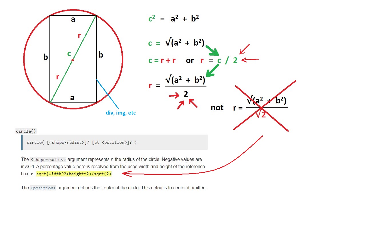
but that just doesn't seem to be the case. Can anyone shed some light on this. Is this a bug of sorts or am I just not understanding something here?
 833
833
It's defined to be like that, they never meant to calculate the radius you are showing. It's also in the specification.
To better understand let's consider a square. You can have a perfect circle if you consider 50% as value
.red {
  width: 200px;
  height: 200px;
  background: red;
  clip-path: circle(50%);
  border:2px solid;
  box-sizing:border-box;
}
<div class='red'></div>The idea behind is to consider the following figure:

R is the 'c' you are calculating (the Green lines) and r is the reference used (the puple line). You can easily see that r = R/sqrt(2) and R = sqrt(w² + h²). Combining both will give us:
r = sqrt(w² + h²)/sqrt(2)
Which is the formula you see in the MDN page.
Using 50% of this value inside a square will give us the logical circle:
r/2 = sqrt(w² + h²)/(2*sqrt(2)) = sqrt(2*w²)/(2*sqrt(2)) = w/2 (or h/2)
To cover the whole square we need a value equal to R/2 which is r/sqrt(2) = r/1.41 and since r is 100% you will have the 71% you discovered
.red {
  width: 200px;
  height: 200px;
  background: red;
  clip-path: circle(calc(100% / 1.44)); /* a little bogger  than 1.4 to better see*/
  border:2px solid;
  box-sizing:border-box;
}
<div class='red'></div>The same logic apply to a non-square shape where the width and height are different but the reference remain the same:
r = sqrt(w² + h²)/sqrt(2)
From the above we can conclude that the 71% is a magic value that will produce the same output whataver the shape since it rely on the radius of the circumference that encloses the elements rectangle wheraes 50% (or any other value) will give different results:
.red {
  width: 200px;
  height: 200px;
  background: red;
  box-shadow:0 0 0 100px yellow;
  display:inline-block;
  clip-path: circle(71%);
  margin: 70px;
}
<div class='red'></div>
<div class='red' style="width:300px;"></div>
<div class='red' style="width:100px;"></div>
<div class='red' style="width:50px;"></div>Using 50%
.red {
  width: 200px;
  height: 200px;
  background: red;
  clip-path: circle(50%);
  border:2px solid;
  box-sizing:border-box;
}
<div class='red'></div>
<div class='red' style="width:300px;"></div>
<div class='red' style="width:100px;"></div>
<div class='red' style="width:50px;"></div>We may also think that any value bigger than 71% is useless since it we will always give a circle bigger than our element. This is true but we should not forget that we have also the position.
Example of output using 100%,200% and even 300%!
.red {
  width: 200px;
  height: 200px;
  background: red;
  border:2px solid;
  box-sizing:border-box;
}
<div class='red' style="clip-path: circle(100% at 0 50%)"></div>
<div class='red' style="clip-path: circle(200% at -100% 50%)"></div>
<div class='red' style="clip-path: circle(300% at -200% 50%)"></div>I will consider a different property to better clear the confusion which is radial-gradient.
.box {
  width:200px;
  height:200px;
  border:1px solid;
  background:radial-gradient(circle 50%, red ,blue);
}
<div class="box">
</div>The below code is meant to define a circle with a radius equal to 50% but it's invalid because we don't know the reference:
Note: Percentages are not allowed here; they can only be used to specify the size of an elliptical gradient, not a circular one. This restriction exists because there is are multiple reasonable answers as to which dimension the percentage should be relative to. A future level of this module may provide the ability to size circles with percentages, perhaps with more explicit controls over which dimension is used.ref
We are dealing with rectangular shapes so we can use the height, the width, the radius you are calculating, etc, etc. A lot of options so they simply decided to make it invalid but for the clip-path they took a decision and defined a reference for the use of percetange.
By the way, you can have better control over your circle considering values like closest-side/farthest-side.
The below will always give us circle touching the closest sides (the same way as contain with background)
.red {
  width: 200px;
  height: 200px;
  background: red;
  clip-path:circle(closest-side);
  border:2px solid;
  box-sizing:border-box;
}
<div class='red'></div>
<div class='red' style="width:300px;"></div>
<div class='red' style="width:100px;"></div>
<div class='red' style="width:50px;"></div>The below will always give us circles touching the farthest sides (the same way as cover with background)
.red {
  width: 200px;
  height: 200px;
  background: red;
  clip-path:circle(farthest-side);
  border:2px solid;
  box-sizing:border-box;
}
<div class='red'></div>
<div class='red' style="width:300px;"></div>
<div class='red' style="width:100px;"></div>
<div class='red' style="width:50px;"></div>Combined with position they can give some intresting results:
.red {
  width: 200px;
  height: 200px;
  background: red;
  border:2px solid;
  box-sizing:border-box;
  transition:1s all;
}
<div class='red' style="clip-path:circle(farthest-side at left); "></div>
<div class='red' style="clip-path:circle(closest-side at 10% 10%); "></div>
<div class='red' style="clip-path:circle(farthest-side at top left); "></div>
<div class='red' style="clip-path:circle(closest-side at 40% 50%); "></div>If you love us? You can donate to us via Paypal or buy me a coffee so we can maintain and grow! Thank you!
Donate Us With

