 Menu
Menu
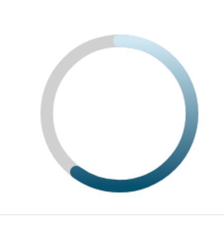
I need to make a circular progress indicator with a color gradient. I also need the 'ends' of the progress circle to be rounded. This image has everything Im trying to achieve:
This code is close but doesnt have the color gradient:
https://codepen.io/adsfdsfhdsafkhdsafjkdhafskjds/pen/OJybqza
var control = document.getElementById('control');
var progressValue = document.querySelector('.progress__value');

var RADIUS = 54;
var CIRCUMFERENCE = 2 * Math.PI * RADIUS;

function progress(value) {
  var progress = value / 100;
  var dashoffset = CIRCUMFERENCE * (1 - progress);

  console.log('progress:', value + '%', '|', 'offset:', dashoffset)

  progressValue.style.strokeDashoffset = dashoffset;
}

control.addEventListener('input', function(event) {
  progress(event.target.valueAsNumber);
});

progressValue.style.strokeDasharray = CIRCUMFERENCE;
progress(60);
.demo {
flex-direction: column;
display: flex;
width: 120px;
}
.progress {
transform: rotate(-90deg);
}
.progress__meter,
.progress__value {
fill: none;
}
.progress__meter {
stroke: grey;
}
.progress__value {
stroke: blue;
stroke-linecap: round;
}<div class="demo">
<svg class="progress" width="120" height="120" viewBox="0 0 120 120">
<circle class="progress__meter" cx="60" cy="60" r="54" stroke-width="12" />
<circle class="progress__value" cx="60" cy="60" r="54" stroke-width="12" stroke="url(#gradient)" />
</svg>
<input id="control" type="range" value="60" />
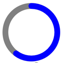
</div>It looks like this:
Ive tried adding a linear-gradient to the stroke but it has no effect:
stroke: linear-gradient(red, yellow);
I also tried stroke="url(#linearColors)", but it also has no affect.
<div class="demo">
  <svg class="progress" width="120" height="120" viewBox="0 0 120 120">
    <linearGradient id="linearColors" x1="0" y1="0" x2="1" y2="1">
      <stop offset="5%" stop-color="#01E400"></stop>
      <stop offset="25%" stop-color="#FEFF01"></stop>
      <stop offset="40%" stop-color="#FF7E00"></stop>
      <stop offset="60%" stop-color="#FB0300"></stop>
      <stop offset="80%" stop-color="#9B004A"></stop>
      <stop offset="100%" stop-color="#7D0022"></stop>
    </linearGradient>
    <circle class="progress__meter" cx="60" cy="60" r="54" stroke-width="12" />
    <circle class="progress__value" cx="60" cy="60" r="54" stroke-width="12" stroke="url(#linearColors)" />
  </svg>
  <input id="control" type="range" value="60" />
</div>
https://jsfiddle.net/yzqmvd16/
 651
651
In the SVG circle, the cx and cy attributes define the x and y coordinates of the circle. If cx and cy are not taken to the circle's center, it is set to (0,0). The r attribute defines the radius of the circle. Span is an inline character container used to mark up a part of a text.
SVG provides for two types of gradients: linear gradients and radial gradients. Once defined, gradients are then referenced using 'fill' or 'stroke' properties on a given graphics element to indicate that the given element shall be filled or stroked with the referenced gradient.
To use a gradient, we have to reference it from an object's fill or stroke attributes. This is done the same way you reference elements in CSS, using a url . In this case, the url is just a reference to our gradient, which I've given the creative ID, "Gradient". To attach it, set the fill to url(#Gradient) , and voila!
The basic concept of a circular economy depicts a production and consumption system that relies on the recycling, re-use, repair, remanufacturing, sharing of products, changing the consumption patterns and new business models and systems.
Instead of using a gradient you can give the illusion of a gradient by using 100 circles each with a different fill. I'm using the fill-opacity attribute to set the element either fully opaque or fully transparent.
I hope it helps.
const SVG_NS = 'http://www.w3.org/2000/svg';
const CIRCUMFERENCE = base.getTotalLength()
const UNIT = CIRCUMFERENCE / 100;
let circles=[];//the array of circles

//create 100 circles each with a different fill color to create the illusion of a gradient
for(let i = 0; i<100; i++){
  let pos = base.getPointAtLength(i*UNIT);
  let o = {cx:pos.x,cy:pos.y,r:5.5,'fill-opacity':0,fill:`hsl(220,100%,${50 + (100-i)/2}%)`}
  circles.push(drawCircle(o, progress__value));
}

progress();

control.addEventListener('input', progress);

function progress(){
  let val = control.valueAsNumber;
  for(let i = 0; i<circles.length; i++){
    if(i<=val){
    circles[i].setAttributeNS(null,'fill-opacity',1)
    }else{
    circles[i].setAttributeNS(null,'fill-opacity',0)
    }
  }
}

// a function to create a circle
function drawCircle(o, parent) {
  var circle = document.createElementNS(SVG_NS, 'circle');
  for (var name in o) {
    if (o.hasOwnProperty(name)) {
      circle.setAttributeNS(null, name, o[name]);
    }
  }
  parent.appendChild(circle);
  return circle;
}
svg{border:solid}
.demo {
flex-direction: column;
display: flex;
width: 120px;
}
.progress__meter{
fill: none;
}
.progress__meter {
stroke: grey;
}<div class="demo">
<svg class="progress" viewBox="-2 -2 124 124">
<path class="progress__meter" id="base" d="M60,6A54,54 0 0 1 60,114A54,54 0 0 1 60,6z" stroke-width="12" />
<g id="progress__value"></g>
</svg>
<input id="control" type="range" value="60" />
</div>Your original code nearly worked. The problem was that the stroke color of the progress circle was being overridden by the stroke: blue; in the CSS. Removing this allows the gradient to apply to the circle's stroke, as desired.
var control = document.getElementById('control');
var progressValue = document.querySelector('.progress__value');

var RADIUS = 54;
var CIRCUMFERENCE = 2 * Math.PI * RADIUS;

function progress(value) {
  var progress = value / 100;
  var dashoffset = CIRCUMFERENCE * (1 - progress);

  // console.log('progress:', value + '%', '|', 'offset:', dashoffset)

  progressValue.style.strokeDashoffset = dashoffset;
}

control.addEventListener('input', function(event) {
  progress(event.target.valueAsNumber);
});

progressValue.style.strokeDasharray = CIRCUMFERENCE;
progress(60);
.demo {
flex-direction: column;
display: flex;
width: 120px;
}
.progress {
transform: rotate(-90deg);
}
.progress__meter,
.progress__value {
fill: none;
}
.progress__meter {
stroke: grey;
}
.progress__value {
/* stroke: blue; */
stroke-linecap: round;
}<div class="demo">
<svg class="progress" width="120" height="120" viewBox="0 0 120 120">
<defs>
<linearGradient id="linearColors" x1="1" y1="0" x2="0" y2="1">
<stop offset="5%" stop-color="#01E400"></stop>
<stop offset="25%" stop-color="#FEFF01"></stop>
<stop offset="40%" stop-color="#FF7E00"></stop>
<stop offset="60%" stop-color="#FB0300"></stop>
<stop offset="80%" stop-color="#9B004A"></stop>
<stop offset="100%" stop-color="#7D0022"></stop>
</linearGradient>
</defs>
<circle class="progress__meter" cx="60" cy="60" r="54" stroke-width="12" />
<circle class="progress__value" cx="60" cy="60" r="54" stroke-width="12" stroke="url(#linearColors)" />
</svg>
<input id="control" type="range" value="60" />
</div>If you love us? You can donate to us via Paypal or buy me a coffee so we can maintain and grow! Thank you!
Donate Us With


