 Menu
Menu
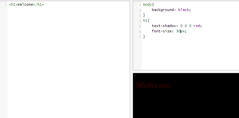
So, I'm in the process of building a website designer and I have come across something strange, if you set the text-shadow: 0 0 0 someColor on a element the shadow is actually applied, I have made a fiddle where this is very clear here FIDDLE.
Is this a bug?
 501
501
It's not a bug in that it's not an incorrect implementation of the spec; the spec implies that a shadow is generated as long as the computed value is something other than none. The only values that can compute to none are none or initial.
Text shadows are drawn similarly to box shadows. Because of this, most of the behavior of text shadows follows the spec for box shadows. Nowhere in either spec is it stated that a value with all zeros should generate no shadow. All it says is that either property can take one of two possible values: none, or a comma-separated list of one or more <shadow> value groups, each of which corresponds to a set of values: in the case of text-shadow, it's [ <length>{2,3} && <color>? ]# as given in its own spec. As long as you have a value that isn't none, either spec assumes a shadow will be drawn and specifies all the behavior based on that assumption.
For both properties, even if you don't specify a color, both specs state that currentColor should be used (it says in prose that it's "taken from the color property" or "the resulting color of the ink that it shadows"; the result in code is currentColor).
Since the shadow is always drawn for a value other than none, and zero lengths result in a shadow that's exactly the same size as the text, what happens here then is probably the result of compositing two or more layers of semitransparent pixels due to anti-aliasing of the glyphs as well as the shadow (as stated in the comments). This applies not only to text shadows, but also box shadows, an archetypal example of which would be in a box with rounded corners, where the only hints of anti-aliasing are on the rounded corners themselves, and not the straight edges of the box. This also happens in all browsers, at least based on testing and prior experiences.
With all that said, if you absolutely cannot accept none as a value, you can always specify transparent for the color. The shadow will still be drawn, but since it's completely transparent, you won't see it.
62
If you want to remove a text-shadow, I suggest setting text-shadow: none;
text-shadow:none;
If you love us? You can donate to us via Paypal or buy me a coffee so we can maintain and grow! Thank you!
Donate Us With