 Menu
Menu
I am seeing strange behaviour after applying a couple of transforms to elements with background images in Chrome.
I'm trying to build a game with a background over the entire screen and a scaled character that moves around that background. The character has multiple frames of animation and I'm showing each frame by shifting the background position x or y along in a similar fashion to common CSS spriting techniques.
The problem is that I'm seeing the top edge or left edge of adjacent frames in my character's image. Now, this only happens at certain scales, but it is clearly visible and distracting. For the purposes of a demonstration, I'm using a 364x1328 image with two frames. The top frame contains a black box with no red in its 364x664 boundaries. The bottom frame is solid red. The top frame with boundaries selected is shown in my image editor on the left and the output from Chrome is pasted on the right:
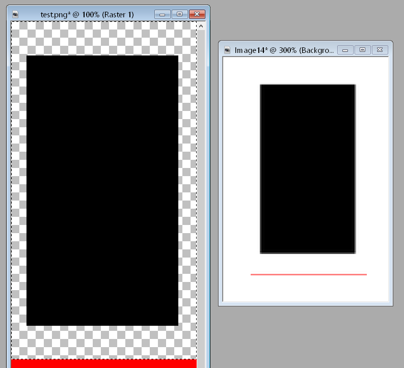
In the output from Chrome, you can clearly see a red border along the bottom. Given that my background image is contained in a 364x664 box, I would expect only pixels visible in that box to show. In other words, I'd like to see what I see at scale(1), but scaled down. It seems that Chrome is resampling the background image for whatever reason.
To make demonstrating simple, I've included a JS Fiddle: http://jsfiddle.net/CL5Gh/
<!DOCTYPE html>
<html>
<head>
<style>

#b
{
    -webkit-transform: scale(0.4775);
    -webkit-transform-origin: 0 0;
}

#d
{
    height: 664px;
    width: 364px;
    background-image: url(data:image/png,%89PNG%0D%0A%1A%0A%00%00%00%0DIHDR%00%00%01l%00%00%050%02%03%00%00%00%1A%F2%87%B5%00%00%00%2CtEXtCreation%20Time%00Sun%2017%20Feb%202013%2022%3A08%3A49%20%2B1000%FC%E8%C07%00%00%00%07tIME%07%DD%02%11%0B%1B%0B%C2%A0%3B8%00%00%00%09pHYs%00%00%1E%C1%00%00%1E%C1%01%C3iTS%00%00%00%04gAMA%00%00%B1%8F%0B%FCa%05%00%00%00%09PLTE%00%00%00%00%00%00%FF%00%00%3D%FB%DD-%00%00%00%01tRNS%00%40%E6%D8f%00%00%01%A4IDATx%DA%ED%CC1%0D%000%08%000%9EI%C4%24*11%C8%92%B5%02%1A%01%00%00%00%00%00%FC%E4%E45n%B7%DB%EDv%BB%DDn%B7%DB%EDv%BB%DDn%B7%DB%EDv%BB%DDn%B7%DB%EDv%BB%DDn%B7%DB%EDv%BB%DDn%B7%DB%EDv%BB%DDn%B7%DB%EDv%BB%DDn%B7%DB%EDv%BB%DDn%B7%DB%EDv%BB%DDn%B7%DB%EDv%BB%DDn%B7%DB%EDv%BB%DDn%B7%DB%EDv%BB%DDn%B7%DB%EDv%BB%DDn%B7%DB%EDv%BB%DDn%B7%DB%EDv%BB%DDn%B7%DB%EDv%BB%DDn%B7%DB%EDv%BB%DDn%B7%DB%EDv%BB%DDn%B7%DB%EDv%BB%DDn%B7%DB%EDv%BB%DDn%B7%DB%EDv%BB%DDn%B7%DB%EDv%BB%DDn%B7%DB%EDv%BB%DDn%B7%DB%ED%06%00%00%00%00%00%DESs%DCn%B7%DB%EDv%BB%DDn%B7%DB%EDv%BB%DDn%B7%DB%EDv%BB%DDn%B7%DB%EDv%BB%DDn%B7%DB%EDv%BB%DDn%B7%DB%EDv%BB%DDn%B7%DB%EDv%BB%DDn%B7%DB%EDv%BB%DDn%B7%DB%EDv%BB%DDn%B7%DB%EDv%BB%DDn%B7%DB%EDv%BB%DDn%B7%DB%EDv%BB%DDn%B7%DB%EDv%BB%DDn%B7%DB%EDv%BB%DDn%B7%DB%EDv%BB%DDn%B7%DB%EDv%BB%DDn%B7%DB%EDv%BB%DDn%B7%DB%EDv%BB%DDn%B7%DB%EDv%BB%DDn%B7%DB%EDv%BB%DDn%B7%DB%EDv%BB%DDn%B7%DB%EDv%BB%DDn%B7%DB%EDv%BB%DDn%B7%DB%EDv%BB%DDn%B7%DB%EDv%BB%DDn%B7%DB%EDv%BB%DDn%B7%DB%EDv%BB%DDn%B7%DB%EDv%BB%DDn%B7%DB%EDv%BB%DDn%B7%7B%F3n%80%3C%CA%A7%B6%23%99%BC%00%00%00%00IEND%AEB%60%82);
    -webkit-transform: scale(0.4375);
}

</style>
</head>
<body>
  <div id="b">
    <div id="d">
    </div>
  </div>
</body>
</html>
Now, I'm not sure if this is video card or machine dependent in some way. In the fiddle, you'll see two scale transforms applied. This is emulating what's happening in my game. The first is the scaling for the background and the second the scaling for the main character.
I would appreciate any help. I've considered padding each frame with 50px (how much is enough?) padding to eliminate the problem, but that seems awfully hacky and I'd like a real answer.
 849
849
It seems it's because CSS transformations can interpolate at sub-pixel positions, so if your element 's position doesn't fit pixels, you see a "dubstep effect" (see http://paulirish.com/2012/why-moving-elements-with-translate-is-better-than-posabs-topleft/).
As scale cannot be emulated with CSS2 (unlike translate in the article) I'm afraid there is no solution.
Unless a specific CSS3 rule does or will exist, I'm searching for it.
EDIT: -webkit-backface-visibility: hidden; do the trick on Chromium, don't know why...
174
If you love us? You can donate to us via Paypal or buy me a coffee so we can maintain and grow! Thank you!
Donate Us With

