 Menu
Menu
Late to party but this is how I did
Style
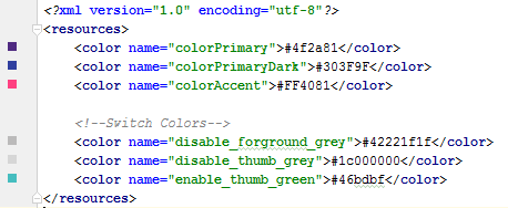
 <style name="SCBSwitch" parent="Theme.AppCompat.Light">
        <!-- active thumb & track color (30% transparency) -->
        <item name="colorControlActivated">#46bdbf</item>

        <!-- inactive thumb color -->
        <item name="colorSwitchThumbNormal">#f1f1f1
        </item>

        <!-- inactive track color (30% transparency) -->
        <item name="android:colorForeground">#42221f1f
        </item>
    </style>
Colors
Layout
<android.support.v7.widget.SwitchCompat
    android:layout_width="wrap_content"
    android:layout_height="wrap_content"
    android:layout_alignParentRight="true"
    android:checked="false"
    android:theme="@style/SCBSwitch" />
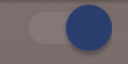
Result
See change of colors for enables and disabled switch

As of now it is better to use SwitchCompat from the AppCompat.v7 library. You can then use simple styling to change the color of your components.
values/themes.xml:

<style name="Theme.MyTheme" parent="Theme.AppCompat.Light">
    <!-- colorPrimary is used for the default action bar background -->
    <item name="colorPrimary">@color/my_awesome_color</item>

    <!-- colorPrimaryDark is used for the status bar -->
    <item name="colorPrimaryDark">@color/my_awesome_darker_color</item>

    <!-- colorAccent is used as the default value for colorControlActivated,
         which is used to tint widgets -->
    <item name="colorAccent">@color/accent</item>

    <!-- You can also set colorControlNormal, colorControlActivated
         colorControlHighlight, and colorSwitchThumbNormal. -->

</style>
ref: Android Developers Blog
EDIT:
The way in which it should be correctly applied is through android:theme="@style/Theme.MyTheme"
and also this can be applied to parent styles such as EditTexts, RadioButtons, Switches, CheckBoxes and ProgressBars:
<style name="My.Widget.ProgressBar" parent="Widget.AppCompat.ProgressBar">

<style name="My.Widget.Checkbox" parent="Widget.AppCompat.CompoundButton.CheckBox">
This is working for me (requires Android 4.1):
Switch switchInput = new Switch(this);
int colorOn = 0xFF323E46;
int colorOff = 0xFF666666;
int colorDisabled = 0xFF333333;
StateListDrawable thumbStates = new StateListDrawable();
thumbStates.addState(new int[]{android.R.attr.state_checked}, new ColorDrawable(colorOn));
thumbStates.addState(new int[]{-android.R.attr.state_enabled}, new ColorDrawable(colorDisabled));
thumbStates.addState(new int[]{}, new ColorDrawable(colorOff)); // this one has to come last
switchInput.setThumbDrawable(thumbStates);
Note that the "default" state needs to be added last as shown here.
The only problem I see is that the "thumb" of the switch now appears larger than the background or "track" of the switch. I think that's because I'm still using the default track image, which has some empty space around it. However, when I attempted to customize the track image using this technique, my switch appeared to have a height of 1 pixel with just a sliver of the on/off text appearing. There must be a solution for that, but I haven't found it yet...
Update for Android 5
In Android 5, the code above makes the switch disappear completely. We should be able to use the new setButtonTintList method, but this seems to be ignored for switches. But this works:
ColorStateList buttonStates = new ColorStateList(
        new int[][]{
                new int[]{-android.R.attr.state_enabled},
                new int[]{android.R.attr.state_checked},
                new int[]{}
        },
        new int[]{
                Color.BLUE,
                Color.RED,
                Color.GREEN
        }
);
switchInput.getThumbDrawable().setTintList(buttonStates);
switchInput.getTrackDrawable().setTintList(buttonStates);
Update for Android 6-7
As Cheruby stated in the comments, we can use the new setThumbTintList and that worked as expected for me. We can also use setTrackTintList, but that applies the color as a blend, with a result that's darker than expected in dark color themes and lighter than expected in light color themes, sometimes to the point of being invisible. In Android 7, I was able to minimize that change that by overriding the track tint mode, but I couldn't get decent results from that in Android 6. You might need to define extra colors that compensate for the blending. (Do you ever get the feeling that Google doesn't want us to customize the appearance of our apps?)
ColorStateList thumbStates = new ColorStateList(
        new int[][]{
                new int[]{-android.R.attr.state_enabled},
                new int[]{android.R.attr.state_checked},
                new int[]{}
        },
        new int[]{
                Color.BLUE,
                Color.RED,
                Color.GREEN
        }
);
switchInput.setThumbTintList(thumbStates);
if (Build.VERSION.SDK_INT >= 24) {
    ColorStateList trackStates = new ColorStateList(
            new int[][]{
                    new int[]{-android.R.attr.state_enabled},
                    new int[]{}
            },
            new int[]{
                    Color.GRAY,
                    Color.LTGRAY
            }
    );
    switchInput.setTrackTintList(trackStates);
    switchInput.setTrackTintMode(PorterDuff.Mode.OVERLAY);
}
To change Switch style without using style.xml or Java code, you can customize switch into layout XML :
<Switch
        android:id="@+id/checkbox"
        android:layout_width="wrap_content"
        android:thumbTint="@color/blue"
        android:trackTint="@color/white"
        android:checked="true"
        android:layout_height="wrap_content" />
It's attribute android:thumbTint and android:trackTint that allowed you to customize color
This is the visual result for this XML :
If you love us? You can donate to us via Paypal or buy me a coffee so we can maintain and grow! Thank you!
Donate Us With