 Menu
Menu
I got a complex web form that has many fields in a single line. Bootstrap inline form worked great on larger screens. However, the requirement is to make the page responsive so that the inline form will transform into a 3-column grid layout on smaller screens such as tablets and phones.
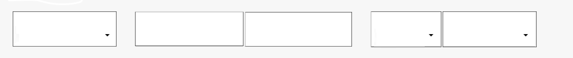
Inline form on large screen:
Required layout on mobile screen

Is it possible? This is for Bootstrap 3.
Any tips are greatly appreciated!
Code Snippet:
<div class="container">

<form class="form-horizontal" data-toggle="validator" role="form" action="" method="post" id="form1">


    <fieldset style="background-color:#F7F7F7">

        <div class="row">
          <div class="form-inline" style="text-align:left">

            <div class="form-group"   style="margin-right:30px;">
                <div class="floating-label-form-group" style="top:-5px;width:180px">
                    <label class="control-label" for="Selection1">Selection1</label>
                    <select id="Selection1" name="Selection1" class="form-control relationship selectpicker" required>
                        <option value="" disabled selected>Selection1 *</option>
                        <option value="1">option 1</option>
                        <option value="2">option 2/option>
                        <option value="3">option 3</option>
                    </select>
                </div>
                <span class="help-block with-errors"></span>
            </div>

            <div class="form-group ">
                <div class="floating-label-form-group">
                    <label class="control-label" for="fName">1st Name</label>
                    <input id="fName" name="fName" type="text" required>
                </div>
                <span class="help-block with-errors"></span>
            </div>
            <div class="form-group "  style="margin-right:30px">
                <div class="floating-label-form-group">
                    <label class="control-label" for="lName">Last Name</label>
                    <input id="lName" name="lName" type="text" required>
                </div>
                <span class="help-block with-errors"></span>
            </div>

            <div class="form-group">
                <div class="floating-label-form-group" style="top:-5px;width:120px">
                    <label class="control-label" for="gender">Gender</label>
                    <select id="gender" name="gender" class="form-control selectpicker" required>
                        <option value="" disabled selected>gender *</option>
                        <option value="1">M</option>
                        <option value="2">F</option>
                    </select>
                </div>
                <span class="help-block with-errors"></span>
            </div>

            <div class="form-group">
                <div class="floating-label-form-group" style="top:-5px;width:160px">
                    <label class="control-label" for="selection2">Selection2</label>
                    <select id="selection2" name="selection2" class="form-control selectpicker" required>
                        <option value="" disabled selected>Selection2 *</option>
                        <option value="1">option 1</option>
                        <option value="2">option 2</option>
                    </select>
                </div>
                <span class="help-block with-errors"></span>
            </div>

          </div>
        </div><!-- /row -->

    </fieldset>
</form>
 571
571
It is a design as per web application helping bootstrap classes. There are three types of form layout in bootstrap3 which are the vertical layout, horizontal layout, and inline layout. There are two types of form layout in bootstrap4 which are vertical layout (Stacked form) and inline layout.
The basic bootstrap classes’ form-group and form-control include in the horizontal bootstrap form layout. The class form-horizontal is used in <form> tag to set up a horizontal bootstrap form layout. The class= “control-label” is used in the <label> tag to control label for their <input> tag.
Bootstrap Inline Form. In an inline form, all of the elements are inline, left-aligned, and the labels are alongside. Note: This only applies to forms within viewports that are at least 768px wide! Additional rule for an inline form: Add class .form-inline to the <form> element.
Form controls automatically receive some global styling with Bootstrap: All textual <input> , <textarea> , and <select> elements with class .form-control have a width of 100%. Bootstrap Form Layouts
I modified some of your HTML markup, removed some inline styles and added some classes.
Here's what you're looking for:
.myform {
  margin-top: 10px;
}
.myform fieldset {
  padding: 10px 20px;
  background-color: #F7F7F7;
}
.myform .form-group {
  display: block;
}
.myform input,
.myform select {
  min-width: 100%;
  border-radius: 0;
}
.myform .double-input {
  margin: 0;
}
.myform .double-input div[class^='col-'],
.myform .double-input div[class*=' col-'] {
  padding-left: 0;
}
.myform .double-input:first-child div[class^='col-'],
.myform .double-input:first-child div[class*=' col-'] {
  padding: 0;
}
@media (min-width: 992px) {
  .control-label {
    text-align: left;
    display: block;
  }
  .myform .double-input:first-child div[class^='col-'],
  .myform .double-input:first-child div[class*=' col-'] {
    padding-right: 3px;
  }
}
@media (max-width: 992px) {
  .myform input,
  .myform select {
    border-top: 0;
    border-right: 0;
    border-left: 0;
  }
  #fName {
    border-right: 1px solid #ccc;
  }
  #gender {
    border-right: 1px solid #ccc;
  }
}
<link href="https://maxcdn.bootstrapcdn.com/bootstrap/3.3.6/css/bootstrap.min.css" rel="stylesheet" />
<div class="container">
<form class="myform" data-toggle="validator" role="form" action="" method="post" id="form1">
<fieldset>
<div class="row">
<div class="col-md-2">
<div class="form-group">
<div class="floating-label-form-group">
<label class="control-label" for="Selection1">Selection1</label>
<select id="Selection1" name="Selection1" class="form-control relationship selectpicker" required>
<option value="" disabled selected>Selection1 *</option>
<option value="1">option 1</option>
<option value="2">option 2/option>
<option value="3">option 3</option>
</select>
</div>
<span class="help-block with-errors"></span>
</div>
</div>
<div class="col-md-5">
<div class="row double-input">
<div class="col-xs-6">
<div class="form-group">
<div class="floating-label-form-group">
<label class="control-label" for="fName">1st Name</label>
<input id="fName" class="form-control" name="fName" type="text" required>
</div>
<span class="help-block with-errors"></span>
</div>
</div>
<div class="col-xs-6">
<div class="form-group ">
<div class="floating-label-form-group">
<label class="control-label" for="lName">Last Name</label>
<input id="lName" class="form-control" name="lName" type="text" required>
</div>
<span class="help-block with-errors"></span>
</div>
</div>
</div>
</div>
<div class="col-md-5">
<div class="row double-input">
<div class="col-xs-6">
<div class="form-group">
<div class="floating-label-form-group">
<label class="control-label" for="gender">Gender</label>
<select id="gender" name="gender" class="form-control selectpicker" required>
<option value="" disabled selected>gender *</option>
<option value="1">M</option>
<option value="2">F</option>
</select>
</div>
<span class="help-block with-errors"></span>
</div>
</div>
<div class="col-xs-6">
<div class="form-group">
<div class="floating-label-form-group">
<label class="control-label" for="selection2">Selection2</label>
<select id="selection2" name="selection2" class="form-control selectpicker" required>
<option value="" disabled selected>Selection2 *</option>
<option value="1">option 1</option>
<option value="2">option 2</option>
</select>
</div>
<span class="help-block with-errors"></span>
</div>
</div>
</div>
</div>
</div>
<!-- /row -->
</fieldset>
</form>If you love us? You can donate to us via Paypal or buy me a coffee so we can maintain and grow! Thank you!
Donate Us With