 Menu
Menu
I have a user-variable string, which can range from one word to a couple sentences (and might contain any valid Unicode character), which I'd like to display within a variable width box.
In code, I'd like HTML that looks like this w/ any other CSS or JS:
<div style="width: 100%; height: 80%" id="text">
    <!--<some more divs or something>-->
        {{content}}
    <!--</some more divs or something>-->
</div>
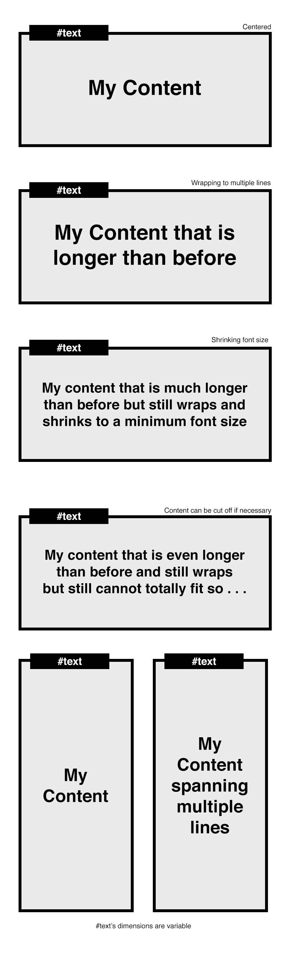
{{content}} should get bigger when it can be, up to some maximum font size (variable); smaller when it's longer down to some minimum (variable) and then just get cut off after that point.
In either case, I need it to be visually centered and words longer than the box should get hyphenated.
I've tried hacking something together with a combination of flexboxes and JavaScript, but couldn't figure out how to get all the bugs worked out.
Browser support doesn't really matter aside from the latest versions of mobile/desktop Chrome/Safari/Firefox.
 492
492
Alright I believe this is what you were wanting to accomplish. Code is below with descriptions in the comment blocks. In chrome you'll be using the -webkit-line-clamp property, in firefox you'll be using the fadeout method since firefox doesn't support the clamp property. You can adjust the fadeout in the css to your liking. The "..." at the cutoff point will also still be present in firefox (see the .clamp:after property in the css).
Here is the updated jsFiddle
HTML (To see the changes, just remove the text until one line is shown in the div)
<div id="textparent">
    <div id="text">
        {{content}}  adkf kfjg; ;akdfg fbfbf egdf hajkh
        kajfhdg lakjfg  kafd gjkahf   jahfkjadlfh alkgj akjdhg fkafg
    </div>
</div>
CSS
Note: -webkit-line-clamp:3; ( this is the amount of lines you want to be shown)
#text{
    width:100%;
    position:relative;
    height:auto;
    text-overflow:ellipsis;
    font-size:25px;
    line-height:1.1;
    display:block;
    display: -webkit-box;
    -webkit-box-orient: vertical;
    -webkit-line-clamp:3;
    overflow:hidden;
    margin:0 auto;
    box-sizing:border-box;
}

#textparent{
    margin:0 auto;
    width:300px;
    background:#eee;
    top:50px;
    padding:10px;
    height:auto;
    text-align:center;
    position:relative;
    height:100px;
    display:-webkit-box;
    -webkit-box-pack:center;
    -webkit-box-align:center;
}

/*FIREFOX will make use of the clamp class*/
.clamp:after {
    background: linear-gradient(to right, rgba(255, 255, 255, 0), #eeeeee 50%) repeat scroll 0 0 rgba(0, 0, 0, 0);
    bottom: 0;
    content: "...";
    padding: 0 5px 1px 25px;
    position: absolute;
    right: 0;
}

.clamp {
    height: 5.6em;
    line-height: 1.4em;
    overflow: hidden;
    position: relative;
}
Javascript/JQUERY: The main variable you might want to change or play around with is [min_font_size] and [num_line_to_show] although [num_line_to_show] is already set in the CSS.
var t = $('#text');

// get the font-size of the div
var font_size = Number(t.css('font-size').replace('px', ''));

// get the line-height of the div (Note: in Chrome this returns the actual height)
var line_height = Number(t.css('line-height').replace('px', ''));

// minimum height of #text div
//
// Note: if you were in a browser and the line-height var didn't return the full
// height as it does in chrome, you would need to do this:
// var min_h = font-size * line_height
var min_h = line_height;

// number of lines to show. basically just retrieving the "-webkit-line-clamp"
// property in the css, otherwise will default to 3, which you can change.
var num_line_to_show = Number(t.css('-webkit-line-clamp')) || 3;

// the maximum height for the #text div. (the added 5 at the end is just
// personal preference)
var max_h = line_height * num_line_to_show * font_size + 5;

// get the height of the div
var h = $('#text').height();

// set this if you want the font to be set at a minimum size
// when the text is longer than one line
var min_font_size = 20;
Note: you could also try setting the minimum font size dynamically, something like this:
// change this to make the font smaller
var shrink_rate = 3;
var min_font_size = font_size - (Math.round((h/min_h)) * shrink_rate;
Continuing:
// for detecting firefox
var is_ff = navigator.userAgent.toLowerCase().indexOf('firefox');

// if the height of the div is larger than the minimum height, meaning there
// is more than one line now, the font size of the div becomes smaller.
if (h > min_h){
    t.css({'font-size' : min_font_size});

    // if in Firefox browser
    if(is_ff > -1){
        // get the new max height of #text based on the number of lines
        // with the new minimum font-size
        var txt_max_h = ((line_height-font_size) / num_line_to_show) * min_font_size * num_line_to_show;

        // the new height is greater than the maximum height allowed for the
        // smaller font size
        if (t.height() > txt_max_h){
            // reset the height of #text div to a fixed height
            t.height((min_font_size * num_line_to_show) + 5);

            // add the clamp class and css will the rest
            t.addClass('clamp');
        }
    }
}

// if firefox, always run this to center the #text div based on its height
if(is_ff > -1){
    t.css({top: ($('#textparent').height() - t.height()) / 2});
}
Hope this helps!
87
just in time.
See this Fiddle.
I think I succeed to do what you want. It works with Chrome, Firefox and Safari.
HTML :
<div id="container">
    <div id="text">my Text !!</div>
</div>
JS :
var maxFontSize=68; // I think we cannot have bigger than that.
var minFontSize=12;
$('#text').on({
    // setting an event to resize text
    resize:function(e){
        // if no text => return false;
        if (!$(this).html().trim()) return;

        // if already running => return false;
        if (this.running) return;

        this.running = true;

        // get max-height = height of the parent element
        var h = $(this).parent().height();

        // clone the text element and apply some css
        var clone = $(this).clone()
                               .removeAttr('id')
                               .css({'font-size':0,
                                     'width':$(this).width(),
                                     'opacity':0,
                                     'position':'fixed',
                                     'left':-1000})
                               .appendTo($('body'));

        // Set the max font size for the clone to fit the max height;
        var fontSize = minFontSize;
        do {
            $(this).css('font-size', fontSize+'px');
            fontSize=fontSize+1;
            clone.css('font-size', fontSize+'px');
        } while (h > clone.height() && maxFontSize > fontSize) ;

        // Set the '...' if still bigger
        //start by setting back the good size to the clone.
        fontSize=fontSize-1;
        clone.css('font-size', fontSize+'px');

        // while max-height still bigger than clone height
        if (h < clone.height() && minFontSize == fontSize) {
            var content = clone.html();
            // try to remove the last words, one by one.
            while (h < clone.height()) {
                content = content.replace(/(\s[^\s]*)$/g,'...');
                clone.html(content);
            }
            // then replace the #text content
            $(this).html(clone.html());
        }

        // then remove the clone
        clone.remove();

        this.running = false;
    }
})
.trigger('resize');
If you love us? You can donate to us via Paypal or buy me a coffee so we can maintain and grow! Thank you!
Donate Us With