 Menu
Menu
I am looking for a pure CSS solution to what I have here done using jQuery to help.
Basically I have 3 divs that spread evenly in width in a container. They maintain a 3/4 ration with the height being calculated off of the width. Furthermore, each div has a background image that stays proportional and some text that is centered horizontally and vertically.
$(document).ready(function() {
  function setw() {
    var footdivwidth = $('footer div').width();
    var footdivheight = footdivwidth * .75;
    $('footer div').css({
      'height': footdivheight + 'px'
    });
    $('footer div span').html('w: ' + footdivwidth + '<br>h: ' + footdivheight);
  }
  setw();
  $(window).resize(function() {
    setw();
  })
});
FOOTER {
max-width: 1000px;
margin: 0 auto;
background-color: rgba(0, 0, 0, 0.171);
display: flex;
flex-wrap: wrap;
justify-content: space-between;
}
FOOTER DIV {
background-image: url('https://learnwebdesign.online/img/bg.jpg');
background-position: center;
background-size: cover;
background-repeat: no-repeat;
flex: 1;
text-align: center;
display: flex;
align-items: center;
justify-content: center;
}
FOOTER DIV SPAN {
display: inline-block;
text-align: center;
background-color: rgba(165, 165, 165, 0.282);
padding: 7px 15px;
border-radius: 3px;
color: #FFFFFF;
text-transform: uppercase;
font-weight: bold;
letter-spacing: 2px;
font-size: 21px;
}<script src="https://cdnjs.cloudflare.com/ajax/libs/jquery/3.3.1/jquery.min.js"></script>
<footer>
<div><span>left photo</span></div>
<div><span>center photo</span></div>
<div><span>right photo and more text</span></div>
</footer>Here is a pen showing what I have. https://codepen.io/nom3d/pen/arGpBV
Here is a gif showing the effect when resized. Note the background image staying proportional and text staying centered.
Also wondering if it's not possible with just CSS, how to do this with plain javascript, would I need to add id's to my divs?
Update: here is a plain javaScript function to handle this task
function setHeight(el,val){
    var box = document.querySelectorAll(el);
    var i;
    for(i = 0;i < box.length;i++){
        var width = box[i].offsetWidth;
        var height = width * val;
        box[i].style.height = height + 'px';
    }
}
// set your element to target and the ratio value
setHeight('footer div',.75);
window.onresize = function(event) {
    setHeight('footer div',.75);
};
 820
820
You can use 2 properties, clientHeight and offsetHeight to get the height of the div. clientHeight includes padding of the div. offsetHeight includes padding, scrollBar, and borders of the div.
Use offsetWidth & offsetHeight properties of the DOM element to get its the width and height.
Unfortunately, it is not possible to "get" the height of an element via CSS because CSS is not a language that returns any sort of data other than rules for the browser to adjust its styling. Your resolution can be achieved with jQuery, or alternatively, you can fake it with CSS3's transform:translateY(); rule.
Here's a more generic way to go about this for anyone who doesn't want to dig through the OP's code and just needs a solution to responsive fixed ratio elements with CSS.
The basic idea is that padding as a percentage is calculated based on the element's width. This means that padding-bottom: 100% == element.width (In this case a square). We can hijack that trick by calculating the ratio and using that for padding.
Images are a bit odd in that they already have an aspect ratio so you could simply set the height: auto and be good to go.
Ratio: 4:3
img {
  --aspectRatio: calc(3/4 * 100%);
  display:block;
  width: 300px; // this one needs a width to work.
  height:var(--aspectRatio);
}
<img src="https://images.unsplash.com/photo-1559666126-84f389727b9a" />But let's say you want the container to manage the size regardless of the original content ratio? Simply use a background image.
This one is 16:9 (typical widescreen)
.fixedAspect {
  --aspectRatio: calc(9/16 * 100%);
  height: 0;
  padding-bottom: var(--aspectRatio);
  background-size: cover;
  background-position: center center;
}
<div class="fixedAspect" style="background-image: url(https://images.unsplash.com/photo-1559662780-c3bab6f7e00b)"></div>Adding content to an element with a height:0 and a bunch of padding is probably not the best solution. But we can solve this by using a pseudo-class. To force a "minimum height".
Bonus: This won't break if your content is bigger than the aspect ratio you've defined the way a position: absolute; wrapper would.
.fixedAspect {
  margin: 20px;
  background-color: #f6f3f0;
}

p {
  font-family: Helvetica, Arial, Sans-Serif;
  padding: 10px;
}

.fixedAspect:before {
  --aspectRatio: calc(5/20 * 100%);
  content: "";
  height:0;
  padding-top: var(--aspectRatio);

  /* so you can see the element */
  background-color: #F47E20;

  /* get this out of the way */
  float: left;
  width: 1px;
  margin-left:-1px;
}

.fixedAspect:after {
  /* we need to clear the float so its container respects height */
  content: "";
  display: table;
  clear: both;
}
<div class="fixedAspect">
<p>My default size is a ratio of 20:5 but I'll grow if there's too much content.</p>
</div>Maintaining specific height:width ratios in CSS is usually done by exploiting the fact that padding percentage is always calculated based on the element's width.
For example, let's say you had an element with width: 500px, height: 300px and padding: 10%. Now you might expect the top and bottom paddings to be 10% of height, and the left and right paddings to be 10% of width. However this would give unequal vertical and horizontal paddings which is counter-intuitive to what is intended - equal paddings of 10%. To make sense of this we need to base the padding percentage on the save dimension, and that dimension has been chosen to be the width.
Thus to have an element with height:width ratio of 3:4 at all times we can set the height to 0 and the bottom (or top) padding to 3/4 of the width.
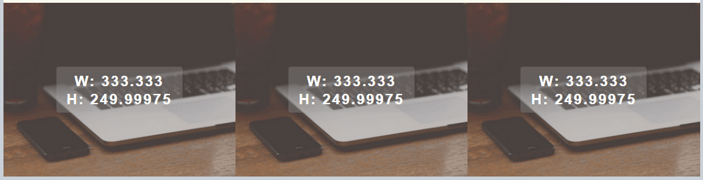
In your example each item is given a width of 33% by Flex. For a ratio of 3:4 the bottom padding should be 33% * 3 / 4, or 24.74%. Your CSS might look like:
width: 33%;
height: 0;
padding-bottom: 24.75%;
Note that since the height is 0, the element will need to be relatively positioned with an absolutely positioned wrapper inside it. If you attempt to put content directly in the div, it will break the ratio. Your code above could be modified thus:
footer {
  max-width: 1000px;
  margin: 0 auto;
  background-color: rgba(0, 0, 0, 0.171);
  display: flex;
  flex-wrap: wrap;
  justify-content: space-between;
}
footer div {
  background-image: url('https://learnwebdesign.online/img/bg.jpg');
  background-position: center;
  background-size: cover;
  background-repeat: no-repeat;
  position: relative;
  width: 33%;
  height: 0;
  padding-bottom: 24.75%;
}
footer div span {
  /* Used as content wrapper, with flex to centre content */
  position: absolute;
  top: 0; bottom: 0;
  left: 0; right: 0;
  display: flex;
  align-items: center;
  justify-content: center;
  text-align: center;
  background-color: rgba(165, 165, 165, 0.282);
  padding: 7px 15px;
  border-radius: 3px;
  color: #FFFFFF;
  text-transform: uppercase;
  font-weight: bold;
  letter-spacing: 2px;
  font-size: 21px;
}
<footer>
<div><span>left photo</span></div>
<div><span>center photo</span></div>
<div><span>right photo and more text</span></div>
</footer>If you love us? You can donate to us via Paypal or buy me a coffee so we can maintain and grow! Thank you!
Donate Us With