 Menu
Menu
Here is the result I would get:
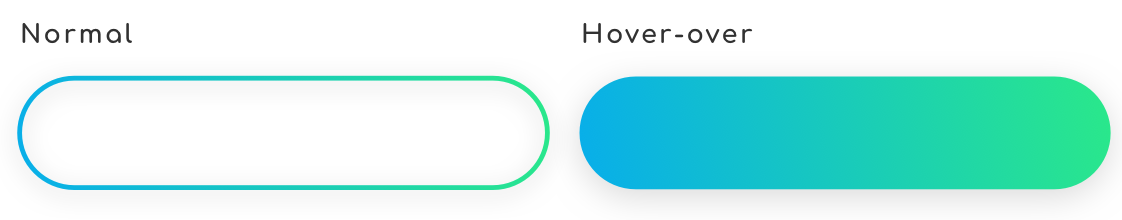
So the default button has gradient border with transparent background (as I want to see the parent's background through it). When the user hover over the button I want to fill it with the same gradient has the borders.
So first I tried with border-image property and with an .svg image of my border:
button {
  background: transparent;
  background-repeat: no-repeat;
  border: 3px;
  border-style: solid;
  border-color: transparent;
  border-image-source: url(assets/images/icons/border.svg);
  border-image-repeat: stretch stretch;
  border-image-slice: 49;
  border-image-width: 100px;
  border-image-outset: 6px;
  padding: 16px 28px;
  border-radius: 100px;
}
So I have more or less the result I was waiting for:

Now, how to manage the hover-over animation and fill the background with no size changes !?
Maybe border-image isn't the best way to do it ?
Thanks for your help, Cheers !
 822
822
An idea is to rely on background-attachement:fixed since you are using a background image and we can simulate the transparent effect BUT you will have the scrolling effect on the background:
.container {
  padding:100px 0;
  background:
    url(https://picsum.photos/800/300?image=1069) fixed;
}
.button {
  width:200px;
  height:50px;
  cursor:pointer;
  color:#fff;
  margin: auto;
  border:3px solid transparent;
  border-radius:50px;
  text-align:center;
  font-size:30px;
  background:
    url(https://picsum.photos/800/300?image=1069) padding-box fixed,
    linear-gradient(-45deg, #2ae88a 0%, #08aeea 100%) border-box;
}
.button:hover {
  background:
    linear-gradient(-45deg, #2ae88a 0%, #08aeea 100%) border-box;
}
<div class="container">
<div class="button">Some text</div>
</div>SOLUTION
Ok finally I found a workaround to accomplish my desire, it almost all come from the SVG file. I tweak a little my SVG in order to get two different path on with the gradient stroke but not filled, and the other one gradient filled but no stroke. One over an other and the opacity is the master key :)
<a type="button" href="#">
<svg class="icon" viewBox="0 0 250 100" version="1.1" xmlns="http://www.w3.org/2000/svg" xmlns:xlink="http://www.w3.org/1999/xlink">
  <defs>
      <linearGradient x1="0%" y1="100%" x2="100%" y2="0%" id="linearGradient-1">
          <stop stop-color="#08AEEA" offset="0%"></stop>
          <stop stop-color="#2AE88A" offset="100%"></stop>
      </linearGradient>
  </defs>
  <path fill="none" d='M50,95 a45,45 0 0,1 0,-90 h150 a45,45 0 1,1 0,90 h-150' />
  <path class="icon--plain" fill="url(#linearGradient-1)" d='M50,95 a45,45 0 0,1 0,-90 h150 a45,45 0 1,1 0,90 h-150' />
</svg>
Invest now
Here comes the CSS (I am using SCSS btw):
a[type="button"] {
  position: relative;
  padding: 1rem 1.75rem;
  z-index: 0;

  .icon {
    position: absolute;
    top: 0px;
    left: 0px;
    height: 100%;
    width: 100%;
    z-index: -1;

    path {
      transition: opacity 0.4s ease;

      &:first-of-type {
        fill: transparent;
        stroke: url(#linearGradient-1);
        stroke-width: 3;
        opacity: 1;
      }

      &.icon--plain {
        opacity: 0;
        stroke: none;
        stroke-width: 0;
      }
    }
  }

  &:hover {
    path {
      &:first-of-type {
        opacity: 0;
      }

      &.icon--plain {
        opacity: 1;
      }
    }
  }
}
If you love us? You can donate to us via Paypal or buy me a coffee so we can maintain and grow! Thank you!
Donate Us With

