 Menu
Menu
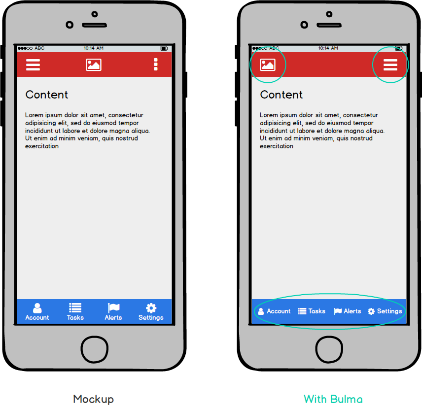
I'm trying to implement this mobile layout using the Bulma CSS Framework (the red header and the blue footer are both fixed) :
Here is the corresponding code :
<nav class="navbar is-danger is-fixed-top" role="navigation">
    <div class="navbar-brand">
        <a class="navbar-item" href="index.php">
            <img src="http://via.placeholder.com/28x28" width="28" height="28">
        </a>
        <div class="navbar-burger burger">
            <span></span>
            <span></span>
            <span></span>
        </div>
    </div>
</nav>
<nav class="navbar is-link is-fixed-bottom" role="navigation">
    <div class="navbar-brand">
        <a class="navbar-item is-expanded">
            <i class="fa fa-user"></i>
            <p class="is-size-7">Account</p>
        </a>
        <a class="navbar-item is-expanded">
            <i class="fa fa-list"></i>
            <p class="is-size-7">Tasks</p>
        </a>
        <a class="navbar-item is-expanded">
            <i class="fa fa-flag"></i>
            <p class="is-size-7">Alerts</p>
        </a>
        <a class="navbar-item is-expanded">
            <i class="fa fa-cog"></i>
            <p class="is-size-7">Settings</p>
        </a>
    </div>
</nav>
<div class="section">
    <h1>Content</h1>
    <p>Lorem ipsum dolor sit amet...</p>
</div>
Is this mockup achievable out of the box ? I do not mind doing it manually in CSS but since this mobile layout seems pretty common I was hoping that there would be a natural way to do it.
 228
228
Is this mockup achievable out of the box?
Yes and No.
You will need to do a small bit of HTML restructuring and add a few lines of CSS to move the burger to the left side.
The layout for the footer can be achieved using Bulma modifier classes.
fiddle
Header
<div class="navbar-brand">
    <div class="navbar-burger burger">
      <span></span>
      <span></span>
      <span></span>
    </div>
    <a class="navbar-item" href="index.php">
      <img src="...">
    </a>
</div>
Switch the order of elements in .navbar-brand - The burger comes first, the logo second.
Add the following CSS
.navbar-burger {
  margin-left: 0;
  margin-right: auto;
}
Footer
Add the .is-block and has-text-centered modifying classes to .navbar-item:
<a class="navbar-item is-expanded is-block has-text-centered">
   <i class="fa fa-user"></i>
   <p class="is-size-7">Account</p>
</a>
For more info, see here and here
Snippet
js added to make menu functional in demo
// Get all "navbar-burger" elements
var $navbarBurgers = Array.prototype.slice.call(document.querySelectorAll('.navbar-burger'), 0);

// Check if there are any navbar burgers
if ($navbarBurgers.length > 0) {

  // Add a click event on each of them
  $navbarBurgers.forEach(function($el) {
    $el.addEventListener('click', function() {

      // Get the target from the "data-target" attribute
      var target = $el.dataset.target;
      var $target = document.getElementById(target);

      // Toggle the class on both the "navbar-burger" and the "navbar-menu"
      $el.classList.toggle('is-active');
      $target.classList.toggle('is-active');

    });
  });
}
.navbar-burger {
margin-left: 0 !important;
margin-right: auto;
}<link href="https://cdnjs.cloudflare.com/ajax/libs/bulma/0.6.1/css/bulma.css" rel="stylesheet"/>
<link href="https://maxcdn.bootstrapcdn.com/font-awesome/4.7.0/css/font-awesome.min.css" rel="stylesheet"/>
<nav class="navbar is-danger is-fixed-top" role="navigation">
<div class="navbar-brand">
<div class="navbar-burger burger" data-target="navMenu">
<span></span>
<span></span>
<span></span>
</div>
<a class="navbar-item" href="index.php">
<img src="https://via.placeholder.com/28x28" width="28" height="28">
</a>
</div>
<div class="navbar-menu" id="navMenu">
<div class="navbar-start">
<a class="navbar-item">Example 1</a>
<a class="navbar-item">Example 2</a>
<a class="navbar-item">Example 3</a>
</div>
<div class="navbar-end">
</div>
</div>
</nav>
<nav class="navbar is-link is-fixed-bottom" role="navigation">
<div class="navbar-brand">
<a class="navbar-item is-expanded is-block has-text-centered">
<i class="fa fa-user"></i>
<p class="is-size-7">Account</p>
</a>
<a class="navbar-item is-expanded is-block has-text-centered">
<i class="fa fa-list"></i>
<p class="is-size-7">Tasks</p>
</a>
<a class="navbar-item is-expanded is-block has-text-centered">
<i class="fa fa-flag"></i>
<p class="is-size-7">Alerts</p>
</a>
<a class="navbar-item is-expanded is-block has-text-centered">
<i class="fa fa-cog"></i>
<p class="is-size-7">Settings</p>
</a>
</div>
</nav>
<div class="section">
<h1>Content</h1>
<p>Lorem ipsum dolor sit amet...</p>
</div>If you love us? You can donate to us via Paypal or buy me a coffee so we can maintain and grow! Thank you!
Donate Us With