 Menu
Menu
I'm working on a project for iphone and android browsers that requires that I build a thermometer-like progress meter that can react with browser resizing and easily be able to change the progress. It needs to be like the design as much as possible. That is, it needs the fancy gradients, inset highlighting, the border.
The Meter:
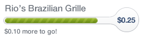
Notice the white inset shadow and border
The progress should extend into the circular portion as well and continue to have the fancy effects.
I went ahead and got a rough prototype working (tested in chrome) http://jsfiddle.net/xduQ9/3/
html,
body {
  padding: 25px;
}

.circle {
  margin-left: -6px;
  width: 48px;
  height: 48px;
  border-radius: 25px 25px 25px 24px;
  border: solid rgba(178, 181, 188, 0.8) 1px;
  box-shadow: inset 1px 2px 0 #fff, inset 1px -2px 0 #fff, inset -2px 0 0 #fff, inset -2px -2px 0 #fff, inset 0 3px 0 rgba(255, 255, 255, 0.35), -20px -20px 0 #fff, 20px -20px 0 #fff, 20px 20px 0 #fff, -20px 20px 0 #fff;
}

.circle-wrap {
  overflow: hidden;
  width: 48px;
  height: 51px;
  position: absolute;
  right: 0;
}

.wrap {
  display: -webkit-box;
  width: 100%;
  position: relative;
  height: 51px;
  overflow: hidden;
}

.progress {
  position: absolute;
  z-index: 0;
  height: 100%;
  width: 70%;
  background: url("http://dl.dropbox.com/u/905197/white-stripe-diagonal.png"), -webkit-linear-gradient(top, rgba(183, 237, 21, 1) 0%, rgba(140, 186, 24, 1) 28%, rgba(78, 126, 11, 1) 65%, rgba(59, 86, 0, 1) 99%);
}

.meter.complete .progress {
  width: 100%;
  -webkit-animation: progress-slide 0.6s linear infinite;
}

@-webkit-keyframes progress-slide {
  0% {
    background-position: 0 0;
  }
  100% {
    background-position: 25px 25px;
  }
}

.progress-cover {
  position: absolute;
  top: 19px;
  width: 70%;
  height: 12px;
  border-radius: 9px 0 0 9px;
  border: solid #70901b 1px;
  border-right: 0;
  z-index: 2;
}

.top-mask {
  position: absolute;
  box-sizing: border-box;
  width: 100%;
  height: 18px;
  padding-left: 45px;
  margin-left: -45px;
  background: white;
  border-bottom: solid #b2b5bc 1px;
  border-radius: 0 0 33px 0;
  box-shadow: 1px 2px 0 #fff, 0 3px 0 rgba(255, 255, 255, 0.35);
}

.bottom-mask {
  position: absolute;
  bottom: 0;
  box-sizing: border-box;
  width: 100%;
  height: 17px;
  padding-left: 45px;
  margin-left: -45px;
  background: white;
  border-top: solid #b2b5bc 1px;
  border-radius: 0 19px 0 0;
  box-shadow: 1px -2px 0 #fff;
}

.inner {
  position: absolute;
  top: 0;
  left: 2px;
  width: 3px;
  height: 12px;
  border: solid 3px #fff;
  border-right: none;
  border-radius: 5px 0 0 5px;
}

.meter {
  position: relative;
}

.left-border {
  position: absolute;
  top: 17px;
  left: -4px;
  width: 10px;
  height: 16px;
  border-radius: 12px 0 0 12px;
  border: solid 1px #b2b5bc;
  border-right: none;
  z-index: 3;
}
<div class="meter complete">
<!-- Remove .complete to stop animation -->
<div class="left-border">
<div class="inner"></div>
</div>
<div class="wrap">
<div class="progress"></div>
<div class="top-mask"></div>
<div class="bottom-mask"></div>
<div class="circle-wrap">
<div class="circle"></div>
</div>
</div>
</div>The technique basically clips a rectangle with a striped green background with a few divs with rounded corners until the desired shape comes out. Then I use a bunch of shadows to add padding and the inset around the meter.
My question: What would you do? I mean, I can optimize this solution a little. I could add more markup to get the design just right, but it feels so dirty. And I have a feeling it won't be easy to cross-browser test. I thought about using canvas, but having to redraw the shapes if the browser resizes is sucky.
I'd like to avoid using images as much as possible, but if an elegant solution is possible with them, I'll definitely use it.
While having the ability to change the color of the progress bar isn't a requirement of the implementation, I'd like a solution that has that ability.
 740
740
CSS | polygon() Function The polygon() function is an inbuilt function in CSS which is used with the filter property to create a polygon of images or text. Syntax: polygon( percentage | length); Parameter: This function accepts two parameter percentage or length which is used to hold the value of polygon size.
Your fiddle don't work in firefox (Aurora) or IE.
I know you prefer not using images but I think this would be alot cleaner in the code if you use just images.
Why? because you can create a sprite with 3 parts: First part has the outer piece of the meter with the part of the bar transparent, second part has the "bar" and third part is just white to hide the bar and give the impression of percentages.
Then you do a simple javascript code for hidinging percentages of the bar starting right (like if user has 24 percent then position -76px).
I would have drawn the bar exactly as it shows full and use z-index to put the meter on top, then the white part to fake progress. And a big circle in the beginning.
The circle will fill the round part in the end (i dont know what the current meter looks like there, if you have the line straight there then go with a square instead of circle).
Did a sketch in paint:

This version will be easier than pure CSS and will look alike on all browsers. Resizing is also doable with some scripting in a fluid div and fluid image sizes.
Once you have a ratio you want to work with the rest is simple-ish.
172
If you love us? You can donate to us via Paypal or buy me a coffee so we can maintain and grow! Thank you!
Donate Us With

