 Menu
Menu
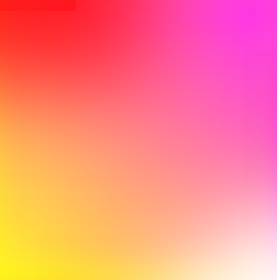
Is it possible to produce the following gradient in CSS :

 816
816
CSS gradients let you display smooth transitions between two or more specified colors. CSS defines three types of gradients: Linear Gradients (goes down/up/left/right/diagonally) Radial Gradients (defined by their center)
Gradients are background-image While declaring the a solid color uses background-color property in CSS, gradients use background-image .
To create the most basic type of gradient, all you need is to specify two colors. These are called color stops. You must have at least two, but you can have as many as you want.
in your case
Method 1:
jsFiddle Demo
div{ overflow: hidden; background: #f06; background: linear-gradient(45deg, #fff722, #ff26f9); min-height: 100%; width: 256px; height: 256px; position: relative; z-index: 1; box-shadow: inset -20px 0 38px -18px #ff26f9,inset -3px -13px 65px -18px yellow; } div:before,div:after{ content:''; position:absolute; width:100%; height:100%; } div:before{ background: red; box-shadow: 0 0 140px 64px red; z-index:2; top: -96%; left: -72%; opacity: 0.8; } div:after { background: white; z-index: 3; bottom: -96%; right: -72%; box-shadow: 0 0 140px 64px white; opacity: 1; border-radius: 100%; } Method 2:
div{ overflow: hidden; background: #f06; background: linear-gradient(45deg, #fff722, #ff26f9); min-height: 100%; width:256px; height:256px; position:relative; z-index:1; } div:before,div:after{ content:''; position:absolute; width:100%; height:100%; } div:before{ background: red; box-shadow: 0 0 140px 64px red; z-index:2; top: -96%; left: -72%; opacity: 0.8; } div:after { background: white; z-index: 3; bottom: -96%; right: -72%; box-shadow: 0 0 140px 64px white; opacity: 1; border-radius: 100%; } jsFiddle Demo
Method 3: multiple background:
div{ background: #f06; background: linear-gradient(45deg, #fff722, #ff26f9),linear-gradient(142deg, transparent, white),linear-gradient(108deg, red, transparent); min-height: 100%; width:256px; height:256px; position:relative; z-index:1; } jsFiddle Demo
Method 4: pseudo element
div{ background: #f06; background: linear-gradient(45deg, #fff722, #ff26f9); min-height: 100%; width:256px; height:256px; position:relative; z-index:1; } div:before,div:after{ content:''; position:absolute; width:100%; height:100%; opacity: 0.8; } div:before{ background: linear-gradient(108deg, red, transparent); z-index:2; top:0; left:0; } div:after{ background: linear-gradient(142deg, transparent, white); z-index:3; bottom:0; right:0; } the markup:
<div></div> jsFiddle Demo
Method 5:
div{ overflow: hidden; background: #f06; background: linear-gradient(45deg, #fff722, #ff26f9); min-height: 100%; width:256px; height:256px; position:relative; z-index:1; } div:before,div:after{ content:''; position:absolute; width:100%; height:100%; } div:before{ background: linear-gradient(108deg, red, transparent); z-index:2; top:0; left:0; opacity: 0.8; } div:after { background: white; z-index: 3; bottom: -96%; right: -72%; box-shadow: 0 0 110px 54px white; opacity: 1; border-radius: 100%; } jsFiddle Demo
Update: many thanks to Ana-Maria Tudor <3
body{ position:fixed; top:0; right:0; bottom:0; left:0; } body:before { content: ''; position:absolute; top:0; right:0; bottom:0; left:0; display: block; width: 100%; height: 600px; border-radius: 0%; background: radial-gradient(circle at 50% 0, rgba(255,0,0,.5), rgba(255,0,0,0) 70.71%), radial-gradient(circle at 6.7% 75%, rgba(0,0,255,.5), rgba(0,0,255,0) 70.71%), radial-gradient(circle at 93.3% 75%, rgba(0,255,0,.5), rgba(0,255,0,0) 70.71%); } jsFiddle Demo
67
If you love us? You can donate to us via Paypal or buy me a coffee so we can maintain and grow! Thank you!
Donate Us With