 Menu
Menu
I have a div with background-image inside another div with -webkit-mask-image, because border-radius was not working on WebKit browsers in this case.
If I set a box-shadow to the parent div, it shows up in Firefox but not in Chrome. How can I override the -webkit-mask-image so I can use box-shadow too?
Here is an working example (open the link in Firefox and Chrome to see the difference): http://jsfiddle.net/RhT3e/3
 258
258
The problem your having is that the box-shadow is being clipped out with the -webkit-mask-image since that option clips anything including the box-shadow element.
Use the mask image as another element displayed under the masked image so you can use its shape to render a shadow. In order to do this, we must know the width and height of the image that is originally being masked. If you don't know the image size or if it's dynamic you can use JavaScript.
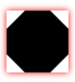
The problem we face is that we can't use box-shadow since it will render a box shadow which won't match the shape of the mask.
The box-shadow doesn't render around the shape
Instead, we will try to emulate it using a drop-shadow filter.
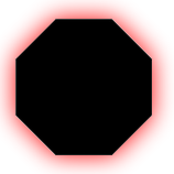
I prefer to wrap the image being masked with a div with the same size and has a background image of the mask image. This is what it will look like.
HTML
<div class="image-container">
    <img class="wrap-image" src="<Original Image URL>" id="wrap-image">
</div>
CSS
.image-container {
    width: <Original Image Width>;
    height: <Original Image Width>;
    background-size: 100%;
    background-image: url(URL of Mask Image);
    -webkit-filter: drop-shadow(1px 1px 4px rgba(0,0,0,0.75));
    -moz-filter: drop-shadow(1px 1px 4px rgba(0,0,0,0.75));
    -ms-filter: drop-shadow(1px 1px 4px rgba(0,0,0,0.75));
    -o-filter: drop-shadow(1px 1px 4px rgba(0,0,0,0.75));
}

#wrap-image {
    mask: url("URL of Mask Image");
    -webkit-mask-box-image: url("URL of Mask Image");
}
Here's a JSFiddle.
171
If you love us? You can donate to us via Paypal or buy me a coffee so we can maintain and grow! Thank you!
Donate Us With

