 Menu
Menu
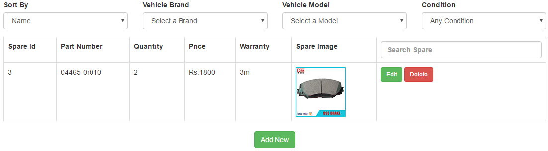
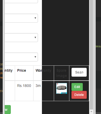
I have a table which fills data from database. Though i had use the bootstrap when i kept on decreasing the width of the browser, from one point onward the table is going outside the container. How can i make this responsive ? Following are the attached images
 <table  class="table table-responsive table-bordered">


            <tr>
                <th>Spare Id</th>
                <th>Part Number</th>
                <th>Quantity</th>
                <th>Price</th>
                <th>Warranty</th>
                {{--<th>Description</th>--}}
                <th>Spare Image</th>

                <th>


                    <input   type="text" class="form-control" id="search" placeholder="Search Spare">
                </th>


            </tr>
            <tbody id="tableModel">
            <?php
            foreach($spares as $spare){

            ?>
            <tr>
                <td ><?php echo $spare->id;?></td>
                <td ><?php echo $spare->partNumber;?></td>
                <td ><?php echo $spare->quantity;?></td>
                <td ><?php echo 'Rs.'. $spare->price;?></td>
                <td ><?php echo $spare->warranty;?></td>


                <td><?php echo '<img  class="img-responsive"  src="data:image/jpeg;base64,'.base64_encode( $spare->image ).'"/>';?></td>
                <td>

                    <a class=" btn btn-success btn-sm" data-toggle="modal" data-target="#modalEdit" onclick="EditBrand('<?php echo $brand->brandName;?>','<?php echo $brand->id;?>')" >Edit </a>

                    <a onclick="DeleteBrand(<?php echo $brand->id;?>)" style="" class=" btn btn-danger btn-sm"  >Delete </a>

                </td>

            </tr>

            <?php }?>
            </tbody>


        </table>
 736
736
If you use bootstrap. Wrap your table in a div with table-responsive class.
 <div class="table-responsive">
    <table class="table">
       ...
    </table>
 </div>
That should work if bootstrap is correctly integrated. Please show your code. Many more people would help you.
You can find this specific information here: https://getbootstrap.com/docs/5.0/content/tables/#responsive-tables
118
If you love us? You can donate to us via Paypal or buy me a coffee so we can maintain and grow! Thank you!
Donate Us With

