 Menu
Menu
I'm trying to learn bootstrap but however i'm facing problem with multi-browser support. standard inverse navbar looks fine on firefox but search form splits on chrome. I tried using col-sm-* but was no help? Why i'm facing this issue?Is there anyway to solve this problem without custom css?? I checked this question too Bootstrap navbar-form width issue on chrome
This is somewhat similar issue but in my case search icon goes to rightmost corner of nav and input field on leftmost corner. Here is my html for navbar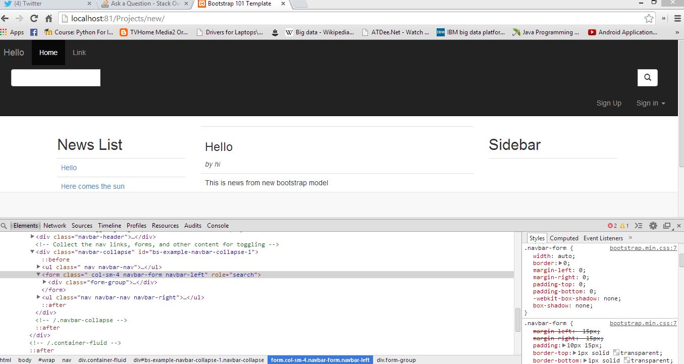
<nav class="navbar navbar-inverse navbar-static-top" role="navigation" style="padding-right: 10px;">
  <div class="container-fluid">
    <!-- Brand and toggle get grouped for better mobile display -->
    <div class="navbar-header">

      <a class="navbar-brand" href="#">Hello</a>
    </div>

    <!-- Collect the nav links, forms, and other content for toggling -->
    <div class="navbar-collapse" id="bs-example-navbar-collapse-1">
      <ul class=" nav navbar-nav">
        <li class="active"><a href="#">Home</a></li>
        <li><a href="#">Link</a></li>

        <li class="dropdown">
        </li>
      </ul>
        <form class="navbar-form navbar-left" role="search">
        <div class="form-group">
            <div class="input-group">
                  <input type="text" class="form-control">
                  <span class="input-group-btn">
                    <button class="btn btn-default" type="button"><span class='glyphicon glyphicon-search'></span></button>
                  </span>
            </div>
       </div>
      </form>
      <ul class="nav navbar-nav navbar-right">

      </ul>
    </div><!-- /.navbar-collapse -->
  </div><!-- /.container-fluid -->
</nav>
 936
936
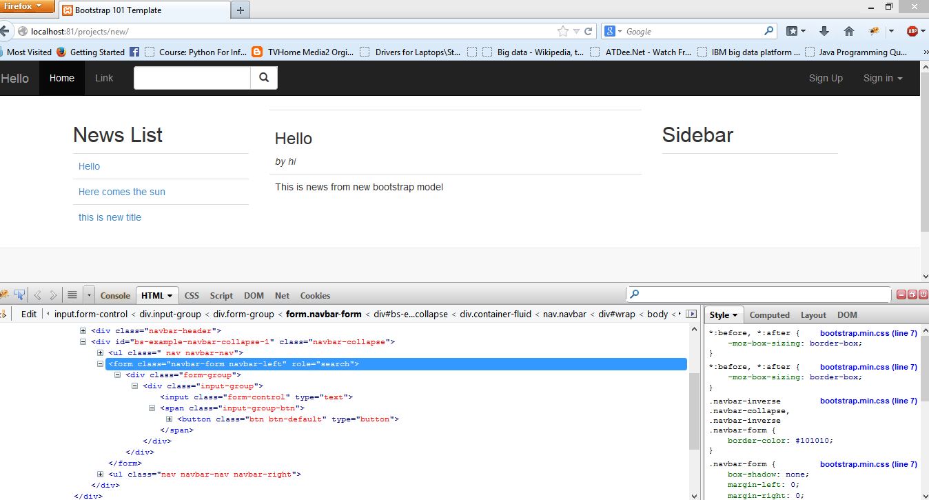
It looks like you need to:
So:
<form class="navbar-form navbar-left" role="search">
<div class="form-group">
Make it:
<form class="navbar-form" role="search">
<div>
If you love us? You can donate to us via Paypal or buy me a coffee so we can maintain and grow! Thank you!
Donate Us With