 Menu
Menu
My bootstrap grid container is not full width. See image:
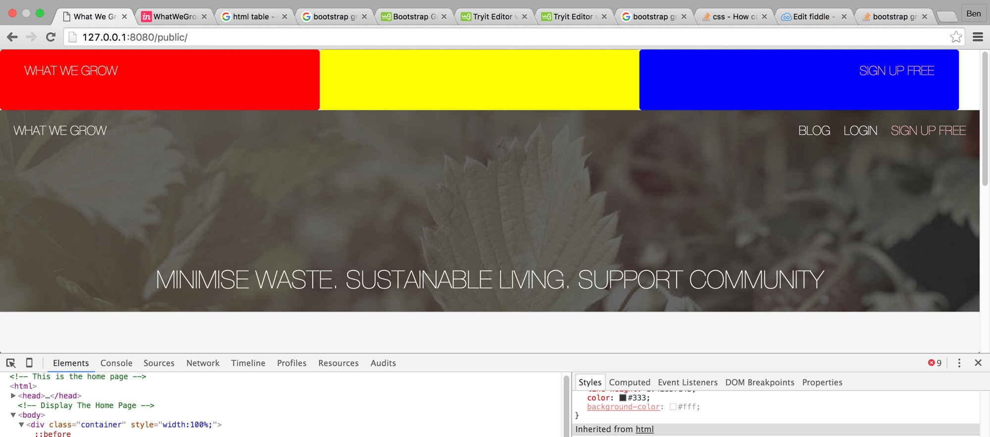
The container is only the bit at the top.
here is the code:
HTML:
<div class="container" style="width:100%">
    <div id="my-row" class="row" style="width:100%">
        <div class="col-sm-4 panel" style="background-color: red">
            <h4 class="white light" style="margin-top:0px; padding: 20px 0px 0px 20px; float: left;">WHAT WE GROW</h4>
        </div>
        <div class="col-sm-4 panel " style="background-color: yellow ">
        </div>
        <div class="col-sm-4 panel " style="background-color: blue ">
            <h4 class="white light " style="margin-top:0px; padding: 20px 20px 0px 0px; float: right; color: pink; ">SIGN UP FREE</h4>
        </div>
    </div>
</div>
CSS:
#my-row {
    display: table;
    height:20%;
}

#my-row .panel {
    float: none;
    display: table-cell;
    vertical-align: top;
}
How do I make the container go the full width?
 562
562
First of all use: .container-fluid for full width, no need to add style="width:100%" if you use it.
Second, remove margin and add full width to row:
#my-row {
    display: table;
    height:20%;
    width: 100%;
    margin: 0;
}
Remove padding from container-fluid:
.no-padding {
    padding: 0 !important;
}
Answer:
<div class="container-fluid no-padding">

</div>
You just have to remove width:100% from the #my-row element.
29
If you love us? You can donate to us via Paypal or buy me a coffee so we can maintain and grow! Thank you!
Donate Us With