 Menu
Menu
I have dynamically generated content formed into 3 bootstrap columns like this...
<div class="col-md-4">
  <div class="article">
  content goes here
  </div>
</div>
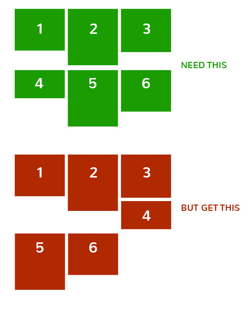
The problem is, when columns have different content, the different heights ruin the layout.
How can I force a clear row to be started after every 3 items to avoid this?
So basically...
 323
323
You should be using a custom selector for one and two the tables styles should not be applied to [class*='col-'] that have defined widths. This method should ONLY be used if you want equal height AND equal width columns. It is not meant for any other layouts and is NOT responsive.
Either clearfix approach (HTML or CSS) will work to clear the float:left and fix the uneven grid wrapping height problem.
You just have to use class="row-eq-height" with your class="row" to get equal height columns for previous bootstrap versions.
How can I force a clear row to be started after every 3 items to avoid this
Add a class and try .your-class:nth-child(3n) {clear: left;}
89
You can also try using display:flex; to add a uniform height to divs in a row as shown in this bootply: http://www.bootply.com/126437
HTML:
    <div class="container">
      <div class="row row-flex row-flex-wrap">
        <div class="col-md-4">
          <div class="article flex-col">
              content goes here
          </div>
        </div>
        <div class="col-md-4">
          <div class="article flex-col">
              content goes here
          </div>
        </div>
        <div class="col-md-4">
          <div class="article flex-col">
              content goes here
          </div>
        </div>
      </div>
    </div>
CSS:
.row-flex, .row-flex > div[class*='col-'] {
    display: -webkit-box;
    display: -moz-box;
    display: -ms-flexbox;
    display: -webkit-flex;
    display: flex;
    flex:1 1 auto;
}

.row-flex-wrap {
    -webkit-flex-flow: row wrap;
    align-content: flex-start;
    flex:0;
}

.row-flex > div[class*='col-'], .container-flex > div[class*='col-'] {
     margin:-.2px; /* hack adjust for wrapping */
}

.container-flex > div[class*='col-'] div,.row-flex > div[class*='col-'] div {
    width:100%;
}


.flex-col {
    display: flex;
    display: -webkit-flex;
    flex: 1 100%;
    flex-flow: column nowrap;
}
If you love us? You can donate to us via Paypal or buy me a coffee so we can maintain and grow! Thank you!
Donate Us With