 Menu
Menu
I want to have the following design for small, medium and large screen sizes::
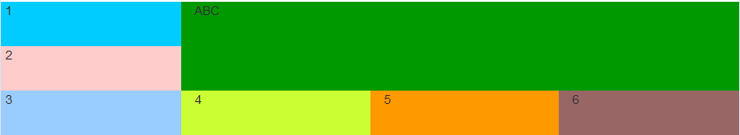
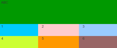
For extra small screens I want it as:
Here is my code:
.one {
  background-color: #00CCFF;
}
.two {
  background-color: #FFCCCC;
}
.three {
  background-color: #99CCFF;
}
.four {
  background-color: #CCFF33;
}
.five {
  background-color: #FF9900;
}
.six {
  background-color: #996666;
}
.mytab {
  height: 50px;
}
.abc {
  height: 100px;
  background-color: #090;
}
<link href="https://maxcdn.bootstrapcdn.com/bootstrap/3.3.5/css/bootstrap.min.css" rel="stylesheet"/>
<div class="row">
<div class="col-xs-12 col-sm-9 col-sm-push-3 abc">ABC</div>
<div class="col-xs-12 col-sm-3 col-sm-pull-9">
<div class="row">
<div class="col-xs-4 col-sm-12 one mytab">1</div>
<div class="col-xs-4 col-sm-12 two mytab">2</div>
<div class="col-xs-4 col-sm-12 three mytab">3</div>
</div>
</div>
<div class="col-xs-12 col-sm-9 col-sm-push-3">
<div class="row">
<div class="col-xs-4 four mytab">4</div>
<div class="col-xs-4 five mytab">5</div>
<div class="col-xs-4 six mytab">6</div>
</div>
</div>
</div>
<!-- row -->The above code only results in the correct layout for the extra small size. For all the other sizes, I get the following result:
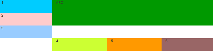
I do not need the white space. There may be something I am doing incorrectly with push/pull. Any advice/code change suggestions will be really helpful.
 390
390
You don't need to use the push and pull classes to achieve your desired output. Make the following changes to CSS:
div, remove .col-sm-push-3 and add .pull-right to float the div to the right
div containing, 1, 2 and 3, remove .col-sm-pull-9
div containing, 4, 5 and 6, remove .col-sm-push-3
.one {
  background-color: #00CCFF;
}
.two {
  background-color: #FFCCCC;
}
.three {
  background-color: #99CCFF;
}
.four {
  background-color: #CCFF33;
}
.five {
  background-color: #FF9900;
}
.six {
  background-color: #996666;
}
.mytab {
  height: 50px;
}
.abc {
  height: 100px;
  background-color: #090;
}
<link href="https://maxcdn.bootstrapcdn.com/bootstrap/3.3.5/css/bootstrap.min.css" rel="stylesheet"/>
<div class="row">
<div class="col-xs-12 col-sm-9 pull-right abc">ABC</div>
<div class="col-xs-12 col-sm-3">
<div class="row">
<div class="col-xs-4 col-sm-12 one mytab">1</div>
<div class="col-xs-4 col-sm-12 two mytab">2</div>
<div class="col-xs-4 col-sm-12 three mytab">3</div>
</div>
</div>
<div class="col-xs-12 col-sm-9">
<div class="row">
<div class="col-xs-4 four mytab">4</div>
<div class="col-xs-4 five mytab">5</div>
<div class="col-xs-4 six mytab">6</div>
</div>
</div>
</div>Why is this happening?
left floated elements should stack next to each other when there is enough space for them to fit. Although it appears that this should happen in your original example, it is deceptive because you have used relative positioning to move the boxes into the desired location.
In effect, the div containing 1, 2 and 3 is actually at the right edge of the parent div (it appears at the left because it is pushed to the left by 25%) so there is no room for the 4, 5 and 6 div to fit and so it is pushed onto a new line.
130
You can use the float hack to occupy the space above. New class .align-top added with floating property. Alternatively, in-built pull-right class has the same property as the new class I added. It is better to use it.
.one {
  background-color: #00CCFF;
}
.two {
  background-color: #FFCCCC;
}
.three {
  background-color: #99CCFF;
}
.four {
  background-color: #CCFF33;
}
.five {
  background-color: #FF9900;
}
.six {
  background-color: #996666;
}
.mytab {
  height: 50px;
}
.abc {
  height: 100px;
  background-color: #090;
}
/* Below class is equivalent to pull-right of Bootstrap builtin code */
.align-top {
  float: right !important;
}
<link href="https://cdnjs.cloudflare.com/ajax/libs/twitter-bootstrap/3.3.5/css/bootstrap.min.css" rel="stylesheet" />
<div class="row">
<div class="col-xs-12 col-sm-9 col-sm-push-3 abc">ABC</div>
<div class="col-xs-12 col-sm-3 col-sm-pull-9 align-top pull-right">
<div class="row">
<div class="col-xs-4 col-sm-12 one mytab">1</div>
<div class="col-xs-4 col-sm-12 two mytab">2</div>
<div class="col-xs-4 col-sm-12 three mytab">3</div>
</div>
</div>
<div class="col-xs-12 col-sm-9 col-sm-push-3">
<div class="row">
<div class="col-xs-4 four mytab">4</div>
<div class="col-xs-4 five mytab">5</div>
<div class="col-xs-4 six mytab">6</div>
</div>
</div>If you love us? You can donate to us via Paypal or buy me a coffee so we can maintain and grow! Thank you!
Donate Us With