 Menu
Menu
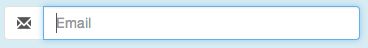
In Bootstrap, when you :focus on an input it adds a blue border and box shadow to indicate the focus.
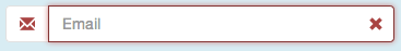
For validation states (error, warning, success), it adds a red, yellow, and green border to the input respectively.
However, if you have placed an input-group-addon to the input field, the addon does not focus. Creating a somewhat weird effect:
How can I add the focus to the addon?
 950
950
Here is how I managed to do this just by CSS
.input-group:focus-within .input-group-prepend .input-group-text,
.form-control:focus ~ .input-group-append .input-group-text {
  border-color: #06f;
}
Unfortunately, I couldn't figure out a way to do it without javascript. But here's a solution.
Add this CSS:
.input-group-focus {
  border-radius:4px;
  -webkit-transition: box-shadow ease-in-out .15s;
          transition: box-shadow ease-in-out .15s;
}
.input-group-addon {
  -webkit-transition: border-color ease-in-out .15s;
          transition: border-color ease-in-out .15s;
}
.input-group.input-group-focus {
  -webkit-box-shadow: inset 0 1px 1px rgba(0,0,0,.075), 0 0 8px rgba(102, 175, 233, .6) !important;
          box-shadow: inset 0 1px 1px rgba(0,0,0,.075), 0 0 8px rgba(102, 175, 233, .6) !important;
}
.has-error.input-group.input-group-focus,
.has-error .input-group.input-group-focus {
  -webkit-box-shadow: inset 0 1px 1px rgba(0, 0, 0, .075), 0 0 6px #ce8483 !important;
          box-shadow: inset 0 1px 1px rgba(0, 0, 0, .075), 0 0 6px #ce8483 !important;
}
.has-warning.input-group.input-group-focus,
.has-warning .input-group.input-group-focus {
  -webkit-box-shadow: inset 0 1px 1px rgba(0, 0, 0, .075), 0 0 6px #67b168 !important;
          box-shadow: inset 0 1px 1px rgba(0, 0, 0, .075), 0 0 6px #67b168 !important;
}
.has-success .input-group.input-group-focus,
.has-success .input-group.input-group-focus {
  -webkit-box-shadow: inset 0 1px 1px rgba(0, 0, 0, .075), 0 0 6px #c0a16b !important;
          box-shadow: inset 0 1px 1px rgba(0, 0, 0, .075), 0 0 6px #c0a16b !important;
}
.input-group-focus input:focus {
  -webkit-box-shadow: none !important;
          box-shadow: none !important;
}
.input-group-focus .input-group-addon {
  border-color: #66afe9 !important;
}
.has-error .input-group-addon {
  border-color: #843534 !important;
}
.has-success .input-group-addon {
  border-color: #2b542c !important;
}
.has-warning .input-group-addon {
  border-color: #66512c !important;
}
The !important's may or may not be necessary for your implementation, so I decided to leave them there. I don't think there's a scenario where something is more important than your focus state, so it should be okay.
And the JS (uses jQuery):
$(document).ready(function() {
    $(".input-group > input").focus(function(e){
        $(this).parent().addClass("input-group-focus");
    }).blur(function(e){
        $(this).parent().removeClass("input-group-focus");
    });
});
This will work whether you add validation states to the .input-group parent or the .form-group parent.
The resulting effect:

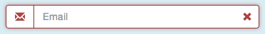
21
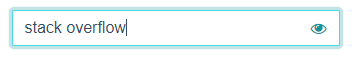
Depicted above, my solution (using Bootstrap 4) is to overlap the input-group-addon on top of the input with absolute positioning and z-index. I add some right padding to the input to make room for the addon. Here's my SCSS and markup:
.input-group.input-group-seamless-append {
    > input {
        width: 100%;
        padding-right: 52px;
    }
    > .input-group-append {
        position: absolute;
        right: 1px;
        top: 1px;
        bottom: 1px;
        z-index: 4;
    }
}
<div class="input-group input-group-seamless-append">
<input autocomplete="off" class="form-control rounded"
aria-describedby="button-addon"
[attr.type]="showPassword ? 'text' : 'password'">
<div class="input-group-append">
<button type="button" id="button-addon"
class="btn btn-light shadow-none border-0 bg-transparent text-primary">
<i class="fa fa-eye" *ngIf="showPassword"
(click)="showPassword = !showPassword"></i>
<i class="fa fa-eye-slash" *ngIf="!showPassword"
(click)="showPassword = !showPassword"></i>
</button>
</div>
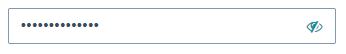
</div>You can see this special UX is activated by adding the class input-group-seamless-append to my input-group, so I can control specific places it is applied.
If you're not using Angular you'll need to remove the (click), *ngIf, and [attr] bindings, those are specific to show/hide password functionality.
Here's what it ends up looking like:
Unfocused:
Focused:
35
If you love us? You can donate to us via Paypal or buy me a coffee so we can maintain and grow! Thank you!
Donate Us With