 Menu
Menu
I am trying to split my webpage into two vertical columns which can be clicked on to take you to the right pages. I've gotten this far.
HTML
<!-- Choices -->
<div class="container-fluid">
<div class="row">
<div class="col-md-6 col-xs-12 vertical-center webd">
<h1 class="text-muted text-center">Web Design</h1>
</div>
<div class="col-md-6 col-xs-12 vertical-center circ">
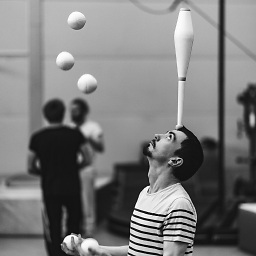
<h1 class="text-muted text-center">Circus</h1>
</div>
</div>
</div>
CSS
.vertical-center {
    min-height: 100%;
    min-height: 100vh;
    display: flex;
    align-items: center;
}

.webd {
    background-image: url('webd.jpg');
}

.circ {
    background-image: url(circ.JPG);
}
My issue is, no matter where I put the text-center class. My <h1>s stay left aligned on the page. Can anybody help?
 447
447
It is because you have added display flex to the parent container. This means the children are not full width anymore.
If you add the following style, it will fix your error:
.vertical-center > .text-center
{
    flex-grow: 1;
}
Example bootply
If you don't want to grow the children, you can just add the following to your vertical center: justify-content: center;
Example bootply 2
162
If you love us? You can donate to us via Paypal or buy me a coffee so we can maintain and grow! Thank you!
Donate Us With