 Menu
Menu
I try to have something like this with bootstrap 4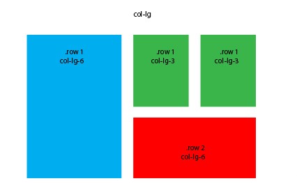
with equal size in the height of green rows and red row
<link href="https://cdnjs.cloudflare.com/ajax/libs/twitter-bootstrap/4.0.0-alpha.6/css/bootstrap.css" rel="stylesheet"/> <div class="container"> <div class="row"> <div class="col-md-8 col-lg-6 B"><div class="card card-inverse" style="background-color: #333; border-color: #333;"> <img src="http://lorempicsum.com/rio/800/500/4" class="img-fluid" alt="Responsive image"> </div></div> <div class="col-md-4 col-lg-3 G"> <div class="row"> <div class="col-md-6 col-lg-6 B"><div class="card card-inverse" style="background-color: #333; border-color: #333;"> <img src="http://lorempicsum.com/rio/800/500/4" class="img-fluid" alt="Responsive image"> </div></div> <div class="col-md-6 col-lg-6 B"><div class="card card-inverse" style="background-color: #333; border-color: #333;"> <img src="http://lorempicsum.com/rio/800/500/4" class="img-fluid" alt="Responsive image"> </div></div> <div class="col-md-12"><div class="card card-inverse" style="background-color: #333; border-color: #333;"> <img src="http://lorempicsum.com/rio/800/500/3" class="img-fluid" alt="Responsive image"> </div></div> </div> </div> </div> </div> 215
215
Bootstrap's grid system allows up to 12 columns across the page.
the numbers (1-12) represent a portion of the total width of any div. all divs are divided into 12 columns. so, col-*-6 spans 6 of 12 columns (half the width), col-*-12 spans 12 of 12 columns (the entire width), etc.
Use the sizing utility classes...
h-50 = height 50%h-100 = height 100%http://www.codeply.com/go/Y3nG0io2uE
<div class="container"> <div class="row"> <div class="col-md-8 col-lg-6 B"> <div class="card card-inverse card-primary"> <img src="http://lorempicsum.com/rio/800/500/4" class="img-fluid" alt="Responsive image"> </div> </div> <div class="col-md-4 col-lg-3 G"> <div class="row h-100"> <div class="col-md-6 col-lg-6 B h-50 pb-3"> <div class="card card-inverse card-success h-100"> </div> </div> <div class="col-md-6 col-lg-6 B h-50 pb-3"> <div class="card card-inverse bg-success h-100"> </div> </div> <div class="col-md-12 h-50"> <div class="card card-inverse bg-danger h-100"> </div> </div> </div> </div> </div> </div> Or, for an unknown number of child columns, use flexbox and the cols will fill height. See the d-flex flex-column on the row, and h-100 on the child cols.
<div class="container"> <div class="row"> <div class="col-md-8 col-lg-6 B"> <div class="card card-inverse card-primary"> <img src="http://lorempicsum.com/rio/800/500/4" class="img-fluid" alt="Responsive image"> </div> </div> <div class="col-md-4 col-lg-3 G "> <div class="row d-flex flex-column h-100"> <div class="col-md-6 col-lg-6 B h-100"> <div class="card bg-success h-100"> </div> </div> <div class="col-md-6 col-lg-6 B h-100"> <div class="card bg-success h-100"> </div> </div> <div class="col-md-12 h-100"> <div class="card bg-danger h-100"> </div> </div> </div> </div> </div> </div> https://www.codeply.com/go/tgzFAH8vaW
78
If you love us? You can donate to us via Paypal or buy me a coffee so we can maintain and grow! Thank you!
Donate Us With

