 Menu
Menu
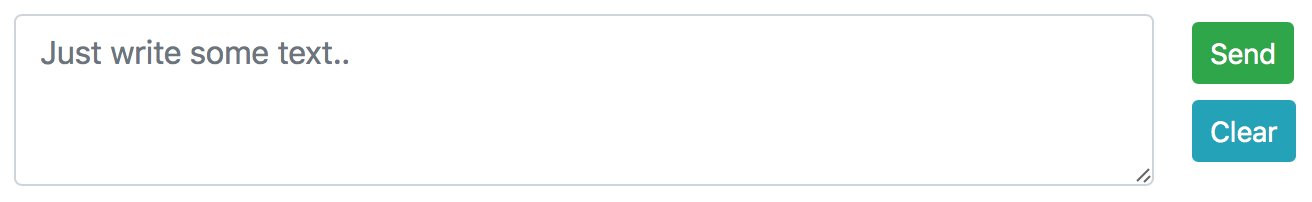
I've started to explore Bootstrap 4 and HTML5/CSS in general. I want to create a text area with two buttons on the side (centered horizontally to each other) :
The code I got is the following:
<link rel="stylesheet" href="https://maxcdn.bootstrapcdn.com/bootstrap/4.1.0/css/bootstrap.min.css">


<div class="container mt-2">
  <div class="row">
    <div class="col-10">
      <textarea class="form-control" rows="3" id="sent_text" placeholder="Just write some text.."></textarea>
    </div>
    <div class="col-2">
      <div class="row">
        <button class="btn btn-success btn-sm m-1" type="button">Send</button>
      </div>
      <div class="row">
        <button class="btn btn-info btn-sm m-1" type="button">Clear</button>
      </div>
    </div>
  </div>
</div>
I've created a row with 2 columns in it. The second column contains two rows. Is that correct way to go?
Thanks
 833
833
A better way of doing it with justify-content-around d-flex flex-column on the buttons column. There was no need of additional row element in the col-2 div.
<link rel="stylesheet" href="https://maxcdn.bootstrapcdn.com/bootstrap/4.1.0/css/bootstrap.min.css">

<div class="container mt-2">
  <div class="row">
    <div class="col-10">
      <textarea class="form-control" rows="3" id="sent_text" placeholder="Just write some text.."></textarea>
    </div>
    <div class="col-2 justify-content-around d-flex flex-column">
      <div>
        <button class="btn btn-success btn-sm" type="button">Send</button>
      </div>
      <div>
        <button class="btn btn-info btn-sm" type="button">Clear</button>
      </div>
    </div>
</div>col for the textarea column so that it takes all the available space.col-auto for the buttons column so that it takes as much as space as it needs. And then use d-flex flex-column to change its direction. <link rel="stylesheet" href="https://maxcdn.bootstrapcdn.com/bootstrap/4.1.0/css/bootstrap.min.css">
<div class="container mt-2">
<div class="row">
<div class="col">
<textarea class="form-control" rows="3" id="sent_text" placeholder="Just write some text.."></textarea>
</div>
<div class="col-auto d-flex flex-column">
<button class="btn btn-success btn-sm m-1" type="button">Send</button>
<button class="btn btn-info btn-sm m-1" type="button">Clear</button>
</div>
</div>
</div>If you love us? You can donate to us via Paypal or buy me a coffee so we can maintain and grow! Thank you!
Donate Us With

