 Menu
Menu
I want to use the Bootstrap 3 default navbar with an image logo instead of text branding. What's the proper way of doing this without causing any issues with different screen sizes? I assume this a common requirement, but I haven't yet seen a good code sample. A key requirement other than having acceptable display on all screen sizes is the menu collapsibility on smaller screens.
I tried just putting an IMG tag inside the A tag that has the navbar-brand class, but that caused the menu not to function properly on my android phone. I also tried increasing the height of the navbar class, but that screwed things up even more.
By the way, my logo image is larger than the height of the navbar.
 765
765
Why is everyone trying to do it the hard way? Sure, some of these approaches will work, but they're more complicated than is necessary.
OK, first - you need an image that will fit within your navbar. You can adjust your image via css height attribute (allowing width to scale) or you can just use an appropriately sized image. Whatever you decide to do - the way this looks will depend on how well you size your image.
For some reason, everyone wants to stick the image inside of an anchor with navbar-brand, and this isn't necessary. navbar-brand applies text styles that aren't necessary to an image, as well as the navbar-left class (just like pull-left, but for use in a navbar). All you really need is to add navbar-left.
<a href="#" class="navbar-left"><img src="/path/to/image.png"></a>
You can even follow this with a navbar-brand item, which will appear to the right of the image.
139
<div class="navbar-header">
    <button type="button" class="navbar-toggle" data-toggle="collapse"
            data-target=".navbar-ex1-collapse">
        <span class="sr-only">Toggle navigation</span>
        <span class="icon-bar"></span>
        <span class="icon-bar"></span>
        <span class="icon-bar"></span>
    </button>
    <a class="navbar-brand" rel="home" href="#" title="Buy Sell Rent Everyting">
        <img style="max-width:100px; margin-top: -7px;"
             src="/img/transparent-white-logo.png">
    </a>
</div>
There is currently a bug in Mozilla I discovered that breaks the navbar on certain browser widths with MANY DEMOS ON THIS PAGE. Basically the mozilla bug is including the left and right padding on the navbar brand link as part of the image width. However, this can be fixed easily and I've tested this out and I fairly sure it's the most stable working example on this page. It will resize automatically and works on all browsers.
Just add this to your css and use navbar-brand the same way you would .img-responsive. Your logo will automatically fit
.navbar-brand {
  padding: 0px; /* firefox bug fix */
}
.navbar-brand>img {
  height: 100%;
  padding: 15px; /* firefox bug fix */
  width: auto;
}
Another option is to use a background image. Use an image of any size and then just set the desired width:
.navbar-brand {
  background: url(http://disputebills.com/site/uploads/2015/10/dispute.png) center / contain no-repeat;
  width: 200px;
}
People seem to forget about object-fit a lot. Personally I think it's the easiest one to work with because the image automatically adjusts to the menu size. If you just use object fit on the image it will auto resize to the menus height.
    .navbar-brand > img {
      max-height: 100%;
      height: 100%;
      -o-object-fit: contain;
      object-fit: contain;
    }
It was pointed out that this does not work in IE "yet". There is a polyfill, but that might be excessive if you don't plan on using it for anything else. It does look like object-fit is being planned for a future release of IE so once that happens this will work in all browsers.
However, if you notice the .img-responsive class in bootstrap the max-width is assuming you are putting these images in columns or something that has an explicit with set. This would mean that 100% specifically means 100% width of the parent element.
    .img-responsive
        max-width: 100%;
        height: auto;
    }
The reason we can't use that with the navbar is because the parent (.navbar-brand) has a fixed height of 50px, but the width is not set.
If we take that logic and reverse it to be responsive based on the height we can have a responsive image that scales to the .navbar-brand height and by adding and auto set width it will adjust to proportion.
max-height: 100%;
width: auto;
Usually we would have to add display:block; to the scenario, but since navbar-brand already has float:left; applied to it, it automatically acts as a block element.
You may run into the rare situation where your logo is too small. The img-responsive approach does not take this into account, but we will. By also adding the "height" attribute to the .navbar-brand > img you can be assured that it will scale up as well as down.
max-height: 100%;
height: 100%;
width: auto;
So to complete this I put them both together and it seems to work perfectly in all browsers.
<style type="text/css">
.navbar-brand>img {
max-height: 100%;
height: 100%;
width: auto;
margin: 0 auto;
/* probably not needed anymore, but doesn't hurt */
-o-object-fit: contain;
object-fit: contain;
}
</style>
<nav class="navbar navbar-default">
<div class="container">
<div class="navbar-header">
<button type="button" class="navbar-toggle collapsed" data-toggle="collapse" data-target="#navbar" aria-expanded="false" aria-controls="navbar">
<span class="sr-only">Toggle navigation</span>
<span class="icon-bar"></span>
<span class="icon-bar"></span>
<span class="icon-bar"></span>
</button>
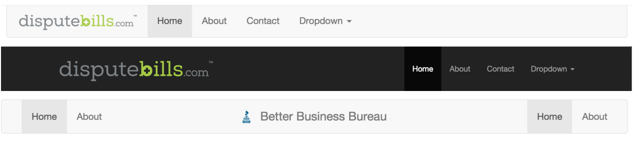
<a class="navbar-brand" href="http://disputebills.com"><img src="http://disputebills.com/site/uploads/2015/10/dispute.png" alt="Dispute Bills"></a>
</div>
<div id="navbar" class="collapse navbar-collapse">
<ul class="nav navbar-nav">
<li class="active"><a href="#">Home</a></li>
<li><a href="#about">About</a></li>
<li><a href="#contact">Contact</a></li>
</ul>
</div>
</div>
</nav>
If you love us? You can donate to us via Paypal or buy me a coffee so we can maintain and grow! Thank you!
Donate Us With