 Menu
Menu
Im using Bootstrap 3 to layout my website with fluid grid, but the boxes in the grid don't line up in a row.
You can see: 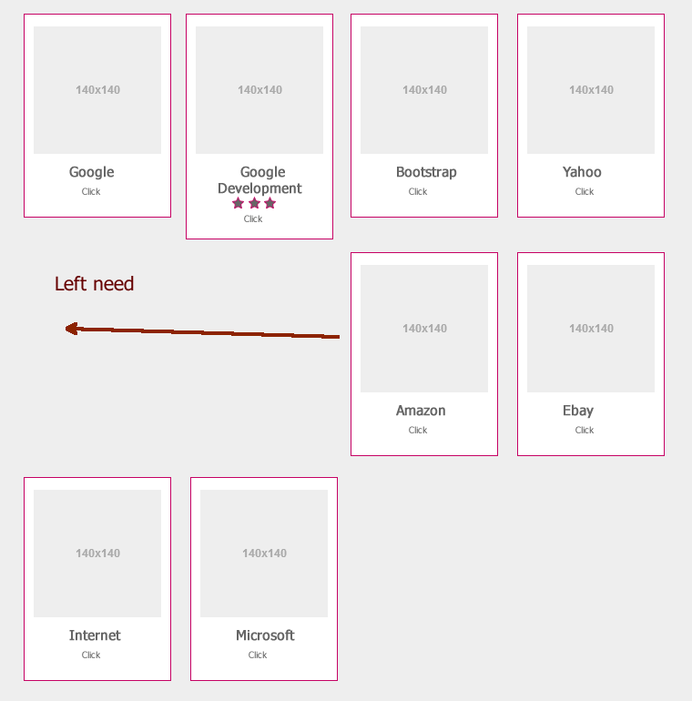
When a box is taller than another, the grid is not left aligned.
How can I fix it with some hack ? Thank for help !
Note : the height of box is auto wrap contents.
My html code
    <div class="row">
     <?php foreach($contens as $content){?>
      <div class="col-xs-12 col-sm-6 col-md-3 col-lg-3">
       <div class="contents-block">
        <div class="image"><img href="<?php echo $content['image'];?>" />
        </div>
            ................ some code .............
       </div>
      </div>
    <?php } ?>
   </div>
 227
227
Enforce a height for each <div> column.
I would give your columns a class name:
<div class="col-xs-12 col-sm-6 col-md-3 col-lg-3 outer">
    ...
</div>
And then do something like this:
.outer {
    height: 200px /* Or whatever the height really is */
}
Your columns are being laid out weird because of the varying heights of the boxes. Enforcing a height of the container element will fix that.
The best part is, this doesn't require you to add random <div>'s that don't have anything to do with the content.
EDIT:
You could also enforce the height only when you're using the 'sm' breakpoints and above.
This would ensure that everything lines up when columns are being used, and that there won't be large gaps in between each one when they're full width (i.e. col-xs-12).
@media (min-width: 768px) {
    .outer {
        height: 200px /* Or whatever */
    }
}
I'm not sure exactly what you're trying to accomplish, but the issue is caused because the content of the columns varies in height. There are 3 overall approaches to fix grid alignment / height issues..
1. A CSS only approach (using CSS3 column width) like this..
http://bootply.com/85737
2. A 'clearfix' approach like this (requires iteration every x columns). This is the approach recommended by Bootstrap known as "responsive resets"..
http://bootply.com/89910 (there is also a CSS-only variation to this approach)
3. Finally you may want to use the Isotope/Masonry plugin. Here is a working example that uses Isotope + Bootstrap..
http://bootply.com/61482
Update 2017
Another option is to make the columns the same height (using flexbox):
Since the issue is caused by the difference in height, you can make columns equal height across each row. Flexbox is the best way to do this, and is natively supported in Bootstrap 4.
.row.display-flex {
  display: flex;
  flex-wrap: wrap;
}
.row.display-flex > [class*='col-'] {
  display: flex;
  flex-direction: column;
}
Flexbox equal height Demo
Bootstrap 4 uses flexbox so columns in each row are the same height by default (without the extra CSS).
More on Bootstrap Variable Height Columns
137
I had a similar problem. I fixed with this script pretty quickly and pain free:
<script>
  $.getScript('//cdn.jsdelivr.net/isotope/1.5.25/jquery.isotope.min.js',function(){
    $('#container').isotope({
      itemSelector : '.items',
      layoutMode : 'fitRows'
    });
  });
</script>
in your case, you will need to add a container ID e.g. '#container' and add the class to each item e.g. '.item'
3
Here's a super simple jQuery solution to get all elements still aligned.
I solved this issue by getting the column with highest height and setting this height to every other columns. Try the snippet below.
setTimeout(function(){
  var maxHeight = 0;
  $('.item').each(function() {if ($(this).height() > maxHeight){maxHeight = $(this).height()}});
  $('.item').each(function() {$(this).height(maxHeight)});
}, 1000);
.item {
border: 1px solid black;
}
.big {
height:50px;
background-color:fuchsia;
}
.normal {
height:40px;
background-color:aqua;
}<link href="https://maxcdn.bootstrapcdn.com/bootstrap/3.3.7/css/bootstrap.min.css" rel="stylesheet" crossorigin="anonymous">
<script src="https://ajax.googleapis.com/ajax/libs/jquery/2.1.1/jquery.min.js"></script>
<div class="row">
<div class="col-xs-4 item big">I am big</div>
<div class="col-xs-4 item normal">I am normal</div>
<div class="col-xs-4 item normal">I am normal</div>
<div class="col-xs-4 item normal">I am normal</div>
<div class="col-xs-4 item normal">I am normal</div>
<div class="col-xs-4 item normal">I am normal</div>
</div>If you love us? You can donate to us via Paypal or buy me a coffee so we can maintain and grow! Thank you!
Donate Us With