 Menu
Menu
I'm trying to make a grid of responsive images using bootstrap 3, but when i try to put them together, one beside one using the code below the last 2 columns goes away down from the other columns :


HTML :
<div class="container-fluid">
    <div class="row">
        <div class="col-md-3">
            <img class="img" src="path/to/image" />
        </div>
    </div>
</div>
CSS :
.row { overflow:hidden; }
.img { min-width:100%; max-width:100%; min-height:100%; max-height:100%; }
.col-md-3 { min-height:100%; max-height:100%; }
NOTE : if i set the max-min/height-width by pixels and i resized the window the columns overlapping each other, so i've to set it by percentage! and still not getting the result that i want.
will appreciate any help.
 478
478
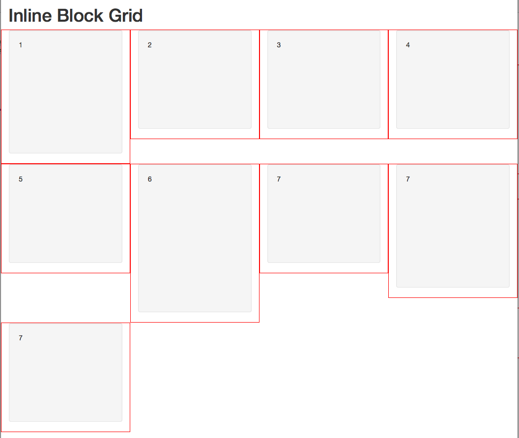
Here's a way to do it by converting the grid, in this instance only, to inline-block. That is the css and html below. Another way is to use a script that sets up the grid like masonry blocks that tuck under each other, you can use jscripts like masonry, mason, isotope, shuffle and a number of other scripts. Here's an example of shuffle https://jsbin.com/vaquci/2
https://jsbin.com/rurap/1/edit?html,css,output
CSS
/* demo */
.col-sm-4 {border:1px solid red;}
.well {height:200px;}
.height1 {height:250px}
.height2 {height:300px}
/* demo */


@media (min-width:768px) {
    .inline-block-row {
        word-spacing: -1em;
        letter-spacing: -1em;
        overflow:hidden;
    }
    .inline-block-row .col-sm-4 {
        word-spacing: normal;
        vertical-align: top;
        letter-spacing: normal;
        display: inline-block;
        float:none;
    }
}
@media (min-width:992px) {
    .inline-block-row .col-md-3 {
        float:none;
    }
}
HTML:
<div class="container-fluid">
   <h1>Inline Block Grid</h1>
   <div class="row inline-block-row">
      <div class="col-sm-4 col-md-3">
         <div class="well height1">1</div>
      </div>
      <div class="col-sm-4 col-md-3">
         <div class="well">2</div>
      </div>
      <div class="col-sm-4 col-md-3">
         <div class="well">3</div>
      </div>
      <div class="col-sm-4 col-md-3">
         <div class="well"> 4</div>
      </div>
      <div class="col-sm-4 col-md-3">
         <div class="well"> 5</div>
      </div>
      <div class="col-sm-4 col-md-3">
         <div class="well height2"> 6</div>
      </div>
      <div class="col-sm-4 col-md-3">
         <div class="well"> 7</div>
      </div>
      <div class="col-sm-4 col-md-3">
         <div class="well height1"> 7</div>
      </div>
      <div class="col-sm-4 col-md-3">
         <div class="well"> 7</div>
      </div>
   </div>
</div>
Simple solution
HTML:
<div class="container-fluid">
    <div class="row">
        <div class="col-md-3">
            <img class="img-responsive" src="path/to/image" />
        </div>
        <div class="col-md-3">
            <img class="img-responsive" src="path/to/image" />
        </div>
        <div class="col-md-3">
            <img class="img-responsive" src="path/to/image" />
        </div>
        <div class="col-md-3">
            <img class="img-responsive" src="path/to/image" />
        </div>

    </div>
    ... more rows
</div>
CSS:
div.row > div {
   padding-bottom: 30%; // This will give height
}
If you love us? You can donate to us via Paypal or buy me a coffee so we can maintain and grow! Thank you!
Donate Us With