 Menu
Menu
These "accordion submenus" work in chrome and firefox, but not on an iphone.
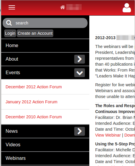
I have built a site which includes an "offcanvas" navigation menu on smaller screens. The user clicks "the hot dog button", and the navigation menu slides onto the screen from the left... that works great so far.
Some of the navigation elements contain submenus. For those, I used bootstrap's accordion markup. The user clicks an arrow, and the "submenu" expands.
The Problem
I develop using chrome on linux. This mechanism works perfectly in chrome, firefox, and every browser I can get my hands on, as well as on my personal android phone. It also works on responsinator.com. However, since I don't have Safari, nor an iPhone, I have not been able to test this functionality directly on an iphone. I am working on getting an iPhone emulator...
Until then, some other people have looked at this on an iPhone, and I am told the "submenus" do not work at all. When the user clicks the arrow, nothing happens...
Here is an excerpt of a "menu item" containing a "sub-menu": please note I am using the 'data-toggle' and 'data-target' attributes:
<div class="panel panel-default"> <!-- The "Trigger" --> <div class="panel-heading"> <h4 class="panel-title"> <a href="view.php?cms_nav_id=1" name="about"> About</a> <a data-toggle="collapse" data-target="#collapse1"> <i class="pull-right icon-chevron-right mobile-nav-icon"></i> </a> </h4> </div> <!-- Populated submenus: --> <div id="collapse1" class="panel-collapse collapse"> <div class="panel-body"> <a href="view.php?cms_nav_id=7" name="ohioimprovementprocess">Ohio Improvement Process</a> </div> <div class="panel-body"> <a href="view.php?cms_nav_id=8" name="org/orgbeliefs">Organization Beliefs</a> </div> </div> </div><!-- /.panel --> I really don't know what to try next: Similar questions have ended with "a css conflict" or iphone problems regarding .click(), but I am not using that: I am using data-toggle/data-target. I am considering abandoning the 'data-target' markup in favor of manually invoking an on('click', ... ) event, but I would rather not...
By the way, I call this at the bottom of my page if that's relevant:
<script src="/assets/dist/js/bootstrap.min.js"></script> Which is 'bootstrap.js v3.0.0' .
Does anyone have any other clues? Any recent direct experience with an issue like this?
Thanks in advance for your help.
 668
668
Just add data-toggle="collapse" and a data-target to the element to automatically assign control of one or more collapsible elements. The data-target attribute accepts a CSS selector to apply the collapse to. Be sure to add the class collapse to the collapsible element.
To create an accordion that is collapsed by default, we need to set the 'active' property of the jQuery Accordion as false. Syntax: $("#demoAccordion"). accordion({ collapsible: true, active: false});
By default, accordion items expand or collapse by clicking the accordion item header or clicking expand/collapse icon in accordion header. You can also expand or collapse the accordion items through external button click.
In Excel 2016 and Excel 2013: On the Analyze tab, in the Show group, click +/- Buttons to show or hide the expand and collapse buttons.
So I think I figured this out: my original markup relied solely on the data-target element, but that is apparently not enough. Safari (on iPhone) seems to also need the href attribute (which really should be there on an <a> anyway. So this works:
<a data-toggle="collapse" data-target="#collapse1" href="#collapse1"> <i class="pull-right icon-chevron-right mobile-nav-icon"></i> </a> But this does not:
<a data-toggle="collapse" data-target="#collapse1"> <i class="pull-right icon-chevron-right mobile-nav-icon"></i> </a> For me, collapse would work on desktop and iphone, but some of my collapses were not working on ipads. It turned out that perfect solution for me was given by @Loris in @Ryan's answer, to add the pointer style to any collapsable trigger (e.g., a div acting as a button). I generalized this to the following CSS:
[data-toggle~="collapse"] { cursor: pointer; } If you love us? You can donate to us via Paypal or buy me a coffee so we can maintain and grow! Thank you!
Donate Us With

