 Menu
Menu
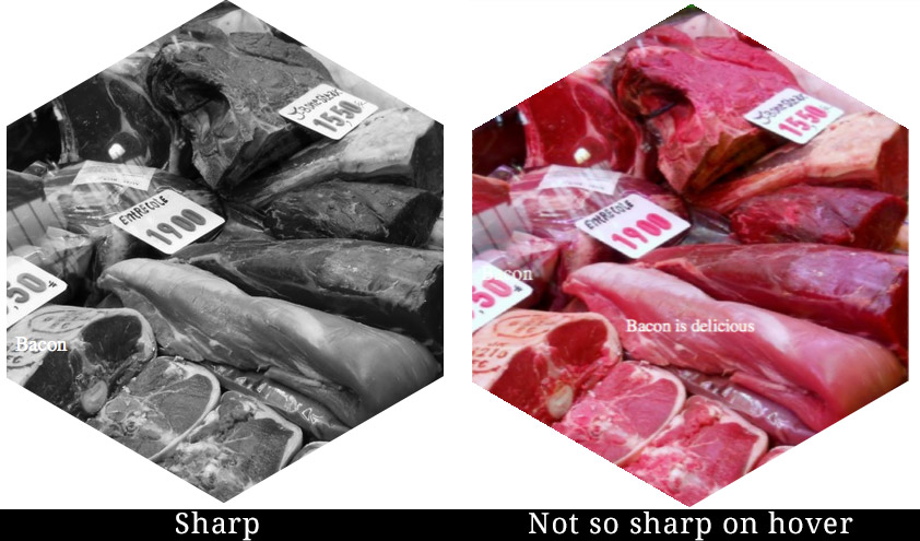
I'm working on a site that uses CSS to create hexagons. This technique uses a transform to rotate a box, clip the edges uses overflow:hidden and then rotates the image inside the opposite direction to appear straight and display the hexagon, here's the codepen I modified to get it working. As you can see the transitions work just fine.
The problem I'm running into is now is that I want to apply a greyscale filter on hover to my design and I'm finding that all my transitions are now blurry. In Firefox Dev Edition I'm seeing the image and text start sharp, go blurry on hover, then go back to sharp. When looking in Chrome everything is blurry, hover or not.
.hexContainer {width:400px;}
#categories {overflow:hidden;width:100%;margin:0 auto; padding:0 0 1em; position: relative;}
#categories .hexBox {position:relative;list-style-type:none;width:100%;padding-bottom:115%;float:left;overflow:hidden;visibility:hidden;-webkit-transform:rotate(-60deg) skewY(30deg);-ms-transform:rotate(-60deg) skewY(30deg);transform:rotate(-60deg) skewY(30deg); z-index: 10;}
#categories .hexBox *{position:absolute;visibility:visible;}
#categories .hexBox>div{width:100%;height:100%;text-align:center;color:#fff;overflow:hidden;-webkit-transform:skewY(-30deg) rotate(60deg);-ms-transform:skewY(-30deg) rotate(60deg);transform:skewY(-30deg) rotate(60deg);-webkit-backface-visibility:hidden;}
#categories .hexBox img{left:-100%;right:-100%;width:auto;height:100%;margin:0 auto;  -webkit-filter: grayscale(100%); filter: grayscale(100%); transition: all 0.25s ease-in-out; -webkit-transition: all 0.25s ease-in-out;-moz-transition: all 0.25s ease-in-out; -webkit-transform: translateZ(0); }
#categories .hexBox h3 {position: absolute; bottom: 25%; left: 2%; font-weight: 300; color: #fff; transition: all 0.25s ease-in-out; -webkit-transition: all 0.25s ease-in-out;-moz-transition: all 0.25s ease-in-out;}
#categories .hexBox h3 strong {font-weight: 700; padding-left:.25em;}
#categories div p{width:90%;padding:0 5%;}
#categories .hexBox p{padding-top:50%;top:110%;padding-bottom:50%;}

/* hovers */
#categories .hexBox div:hover p{top:50%;padding-top:10%;}
#categories .hexBox div:hover img { -webkit-filter: grayscale(0%); filter: grayscale(0%); -webkit-transform: translateZ(0); }
#categories .hexBox div:hover h3 {bottom:40%;}
You can see the issue here http://codepen.io/anon/pen/MwgebO
Any ideas on how I can fix this?
 286
286
Filter blur() The blur function makes an image blurry. To use it, we add a number in pixels inside the parentheses, like 2px .
radius. The radius of the blur, specified as a <length> . It defines the value of the standard deviation to the Gaussian function, i.e., how many pixels on the screen blend into each other; thus, a larger value will create more blur. A value of 0 leaves the input unchanged.
So, here's how to create a background blur using the backdrop-filter CSS property. backdrop-filter: blur(5px); That's it.
I think that I have a solution. It isn't blurred in my system, at least.
codepen
What I have done:
1) Important: the image was being displayed rescaled. Native resolution 500x500, but assigned width 480px. That isn't helping to make display crisp
2) Changed way of getting grayscale. removed filter from the image, and added blend mode
#categories .hexBox img{
    left:-100%;
    right:-100%;
    margin:0 auto;
    mix-blend-mode: luminosity;
    -webkit-transform: translateZ(0);
}
Now, for the blend mode to give results, we need white background in the container
#categories .hexBox>div{
    width:100%;
    height:100%;
    text-align:center;
    background-color: white;
    transition: all 2s ease-in-out;
}
And we set the transition on it.
Now, for the fadeout of the grayscale filter, all we need is to make the container transparent
#categories .hexBox div:hover {
    background-color: transparent;
}
Support for blend modes is more or less equivalent to filters.
161
If you love us? You can donate to us via Paypal or buy me a coffee so we can maintain and grow! Thank you!
Donate Us With

