 Menu
Menu
I need to blend the background colors of 2 elements using CSS
I have been fiddling around with the background-blend-mode:multiply but that works only when I have the 2 colors in the same element.
I need to achieve something like this -
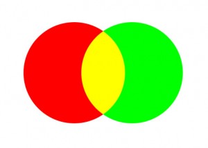
I have been searching a lot but haven't been able to figure it out. Most helpful resource I found was New blending features in CSS which shows how to do it using Canvas. Is it possible to do the same thing using CSS?
EDIT
The circles above were just an example to show what I needed. As I mentioned, I was looking for blending colors for 2 different elements. I have created a fiddle for my actual shapes that I need to blend. http://jsfiddle.net/fmgfsr4o/2/
 929
929
The background-blend-mode CSS property sets how an element's background images should blend with each other and with the element's background color.
You can combine CSS multiple background with radial-gradients to achieve this effect:
CSS
div {
  /* adjust the width of the container to adjust circle's
     overlap size and shape */
  width: 80px;
  height: 50px;
  /* for debug purpose only */
  border: solid blue 1px;

  background:
    /* draw the red circle */
    radial-gradient(red 0%, red 70%, transparent 70%, transparent 100%) 0 0,
    /* draw the green circle */
    radial-gradient(green 0%, green 70%, transparent 70%, transparent 100%) 0 0;
    /* the red on the left, the green on the right */
  background-position: top left, top right;

  /* you can make then bigger or smaller */
  /* but you have to change width size above too */
  background-size: 50px 50px;
  /* You want both circles to appears once only */
  background-repeat: no-repeat;

  /* you can try with other values too */
  /* https://developer.mozilla.org/en-US/docs/Web/CSS/background-blend-mode */
  background-blend-mode: multiply;
}
HTML
<div></div>
I have done a JSFiddle for you to try: http://jsfiddle.net/pomeh/07nLpwwj/
This is the result I get using Firefox 31:

Even if the browser support seems "correct" (see here http://caniuse.com/#feat=css-backgroundblendmode), please note that the background-blend-mode property has the Candidate Recommendation status for now, so be careful when using it (thanks to @Paulie_D for pointing that out).
168
Try this pure CSS3, although you will need to figure out how to position the circles.
html {
height: 100%;
background:
    repeating-radial-gradient(
        circle,
        transparent,
        transparent 3.5em,
        tomato 1em,
        tomato 4.5em
    ),
    repeating-radial-gradient(
        circle,
        transparent,
        transparent 3.5em,
        dodgerblue 3.5em,
        dodgerblue 4.5em
    );

background-blend-mode: multiply;
background-size: 10em 10em;
background-position:
    0 0,
    5em 5em,
    10em 5em;
}
JSFiddle
41
If you love us? You can donate to us via Paypal or buy me a coffee so we can maintain and grow! Thank you!
Donate Us With