 Menu
Menu
I'm trying to create a Navbar with Bootstrap 3 that doesn't collapse or wrap the text. I'd like the text to simply be cut off (or ellipses) instead of wrapping - so the Navbar remains on a single line without expanding vertically. (this Navbar will be used to display the current view location with a single right-aligned menu)
Something like this:
<div class="navbar navbar-fixed-top navbar-inverse">
<div class="navbar-header pull-left">
<p class="navbar-text" style="overflow: hidden; white-space: nowrap;">
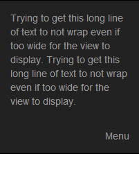
Trying to get this long line of text to not wrap even if too wide for the view to display. Trying to get this long line of text to not wrap even if too wide for the view to display.
</p>
</div>
<div class="navbar-header pull-right">
<p class="navbar-text">Menu</p>
</div>
</div>
As shown, I've been fooling with CSS float, overflow, whitespace settings and can't seem to get the right combination. Also, I'm using two navbar-header elements to avoid collapsing, but I'm open to other options if there is a better way.
Thanks for the help.
 240
240
For navbars that never collapse, add the .navbar-expand class on the navbar. For navbars that always collapse, don't add any .navbar-expand class.
Navbar Toggle Label Bootstrap Navbar component is designed for mobile first approach. Therefore, the navbar renders as collapsed on mobile devices. It can be toggled by a hamburger button. Unfortunately, hamburger icons are proved to be less efficient and not very usable. Navbar Toggle component extends the default .
To create a collapsible navigation bar, use a button with class="navbar-toggler", data-toggle="collapse" and data-target="#thetarget" . Then wrap the navbar content (links, etc) inside a div element with class="collapse navbar-collapse" , followed by an id that matches the data-target of the button: "thetarget".
http://jsbin.com/elezawA/1/
Here's a fixed version that works great: http://jsbin.com/elezawA/2
 body {
 padding-top: 50px;
}

.overflow {
  position:absolute;
  top:0;
  left:0;
  display: block;
  text-overflow: ellipsis;
  white-space: nowrap;
  overflow: hidden;
  margin-top: 0;
  color:#ccc;
  max-width:90%;
}

  .overflow p {color:#ccc;line-height:50px;padding:0 10px;margin:0;display:inline;}


 <div class="navbar navbar-fixed-top navbar-inverse">

    <div class="navbar-header">
      <span class="overflow">
       <p>
        Trying to get this long line of text to not wrap even if too wide for the view to display. Trying to get this long line of text to not wrap even if too wide for the view to display.
         </p>
     </span>
   </div>

   <div class="navbar-header pull-right">
       <p class="navbar-text">Menu</p>
    </div>

 </div>
Going to have to fiddle with the percentage on the smaller widths to allow for the menu area. Do a min-width on this one and you'll figure it out. Perhaps add some padding to get it to not cover up. I will see later on today or tomorrow about this.
170
If you allow javascript / jquery; add the overflow header to your .pull-left div too; <div class="navbar-header pull-left" style="overflow: hidden;">
and use this:
$(function() {
  $('.pull-left').css('max-width', ($( window ).width() - $('.pull-right').width()) + 'px');
});
See: http://bootply.com/98610 Note you will have to do recalculation on screen size changes using this solution.
If you could give your right nav a fixed width and allow ccs3 required you can do the same with:
.pull-left
{
/* Firefox */
max-width: -moz-calc(100% - 60px);
/* WebKit */
max-width: -webkit-calc(100% - 60px);
/* Opera */
max-width: -o-calc(100% - 60px);
/* Standard */
max-width: calc(100% - 60px);
}
.pull-right{width:60px;}
Also see: https://stackoverflow.com/a/14101451/1596547
20
Remove .navbar-text inline CSS, and use white-space: normal :
<div class="navbar navbar-fixed-top navbar-inverse">

    <div class="navbar-header pull-left">
        <p class="navbar-text">
            Trying to get this long line of text to not wrap even if too wide for the view to display. Trying to get this long line of text to not wrap even if too wide for the view to display.
        </p>
    </div>

    <div class="navbar-header pull-right">
        <p class="navbar-text">Menu</p>
    </div>

</div>
.navbar-text {
    margin-right: 15px;
    margin-left: 15px;
    white-space: normal
}
Bootply
1
If you love us? You can donate to us via Paypal or buy me a coffee so we can maintain and grow! Thank you!
Donate Us With


