 Menu
Menu
I'm using bootstrap 3 and I try to have a specific grid alignment for article on desktop.
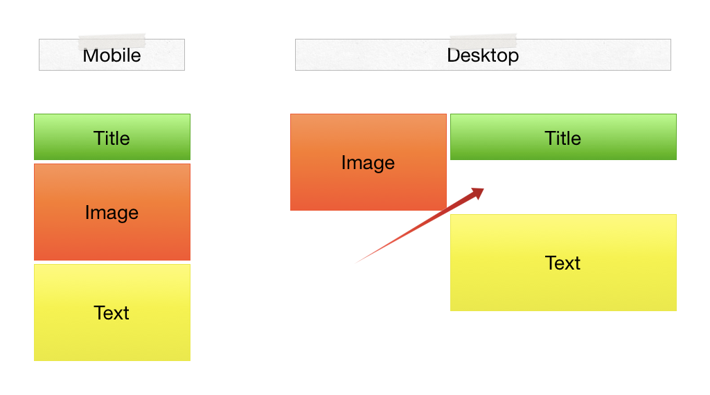
On mobile I want to order content of the article like that :
On desktop, I want the image on the left and the title and content on the right.

Here is my code
<article class="row">
    <header class="col-md-8 col-md-push-4">
        <a href="#">
            <h2>Title</h2>
        </a>
    </header>
    <div class="col-md-4 col-md-pull-8">
        <figure>
            <a class="thumbnail" href="#">
        <img src="..." alt="4x3 Image" class="img-responsive">
                <figcaption>Caption</figcaption>
            </a>
        </figure>
    </div>
    <div class="col-md-8 col-md-push-4">
        <p>Content</p>
    </div>
</article>
But with this code, the content is on the right but under the image.
Is there a simple way to get what I want ?
 979
979
Based on Possible to achieve this Mobile/Desktop layout using Bootstrap? (or other grid)
css:
.floatright{float:right;}
@media (max-width: 768px)
{
    .floatright{float:none;}
}
html:
<div class="container" style="background-color:green">
<article class="row">
    <header class="col-md-8 floatright">
        <a href="#">
            <h2>Title</h2>
        </a>
    </header>
    <div class="col-md-4">
        <figure>
            <a class="thumbnail" href="#">
        <img src="..." alt="4x3 Image" class="img-responsive">
                <figcaption>Caption</figcaption>
            </a>
        </figure>
    </div>
    <div class="col-md-8 floatright">
        <p>Content</p>
    </div>
</article>
</div>
it's your columns class:
md:
4 (image) - 8 (title) => 1st row (max 12 columns)
8 (content) => new row
that's will make a new row, the 2nd row placed below image/title column
so you must use this columns setting (using hidden class) like this:
md:
2 (image) - 5 (title) - 5 (hidden-xs hidden-sm)
5 (content)
just try this code:
CSS:
<style>
        .col-md-2{
            height: 300px;
            background-color: blue;
            color: white;
            border: 2px solid red;
        }
        .col-md-4{
            height: 100px;
        }
        .col-md-5{
            height: 100px;
            background-color: red;
            color: white;
            border: 2px solid black;
        }
</style>
HTML:
    <article class="row">
        <header class="col-md-5 col-md-push-2">
            <a href="#">
                <h2>Title</h2>
            </a>
        </header>
        <div class="col-md-2 col-md-pull-5">
            <figure>
                <a class="thumbnail" href="#">
                    <img src="" alt="4x3 Image" class="img-responsive">
                    <figcaption>Caption</figcaption>
                </a>
            </figure>
        </div>
        <div class="hidden-xs hidden-sm">
            <div class="col-md-4"></div>
        </div>
        <div class="col-md-5 col-md-pull-5">
            <p>Content</p>
        </div>
    </article>
maybe it's not solve the problem. but you can use this trick.
sorry for my bad english
36
If you love us? You can donate to us via Paypal or buy me a coffee so we can maintain and grow! Thank you!
Donate Us With


