 Menu
Menu
I am starting to use React/Material-UI, and also new to CSS etc... I have a simple page layout with an APPBar. Unfortunately this AppBar overlaps the elements which are meant to go below it.
I have found this answer: AppBar Material UI questions
But this feels completely wrong. What if my AppBar has a variable height, depending on the icons, display modes etc...?
I have tried to create a vertical grid, to wrap the elements in different items, made the top container a flex one and play with flex settings, nothing seems to work, the app bar always sits on top of the text.
The code is very simple:
import React from 'react';
import { AppBar, Typography, Box } from '@material-ui/core';

function App() {
    return (
        <div>
            <AppBar>
                <Typography variant='h3'>
                    AppBar
                </Typography>
            </AppBar>
            <Box>
                <Typography variant='h1' style={{ border: '1px solid black' }}>
                    Hello
                </Typography>
            </Box>
        </div>
    )
}

export default App;
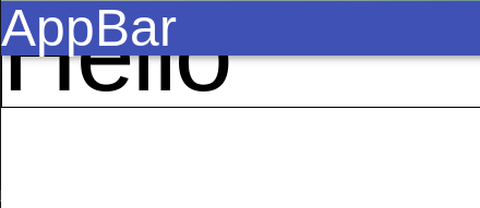
The "Hello" text chunk is only half visible:
 559
559
This is happening because the MaterialUI App Bar defaults to position="fixed". This separates it from the standard DOM's layout to allow content to scroll beneath it, but as a result no space is made for it on the page.
You can get around this by wrapping all content below it in a div and specifying enough margin, or by changing the position property of <AppBar> so it's no longer "fixed". In your example, you could also just apply the styles to <Box> if that's the only content below the <AppBar>.
e.g.
import React from 'react';
import { AppBar, Typography, Box } from '@material-ui/core';

function App() {
    return (
        <div>
            <AppBar>
                <Typography variant='h3'>
                    AppBar
                </Typography>
            </AppBar>
            <div style={{marginTop: 80}}>
                <Box>
                    <Typography variant='h1' style={{ border: '1px solid black' }}>
                        Hello
                    </Typography>
                </Box>
            </div>
        </div>
    )
}

export default App;
MaterialUI provides a theme mixin for the AppBar that can help. Not sure if you're using the recomended JSS setup, but you can do something like this:
import withStyles from '@material-ui/core/styles/withStyles';
const styles = theme => ({
  appBarSpacer: theme.mixins.toolbar
});

const style = withStyles(styles)

function MyScreen ({ classes }) {
  <AppBar></AppBar>
    <div className={classes.appBarSpacer}></div>
  <Box></Box>
}

export default style(MyScreen)
The mixin will give that div the same height as your AppBar, pushing down the other content.
36
According to Material-ui, there are 3 solutions to this problem.
https://material-ui.com/components/app-bar/#fixed-placement
- You can use position="sticky" instead of fixed. ⚠️ sticky is not supported by IE 11.
- You can render a second component
- You can use theme.mixins.toolbar CSS
I personally enjoy using the 2nd solution like this.
  return (
    <>
      <AppBar position="fixed">
        <Toolbar>{/* content */}</Toolbar>
      </AppBar>
      <Toolbar />
    </>
  );
I think having a good app setup is opinianted, but I would recommend the following
import React from "react";
import ReactDOM from "react-dom";
import {
  AppBar,
  Typography,
  Box,
  CssBaseline,
  makeStyles,
  Container,
  Grid,
  Toolbar
} from "@material-ui/core";

const useStyles = makeStyles(theme => ({
  content: {
    flexGrow: 1,
    height: "100vh",
    overflow: "auto"
  },
  appBarSpacer: theme.mixins.toolbar,
  title: {
    flexGrow: 1
  },
  container: {
    paddingTop: theme.spacing(4),
    paddingBottom: theme.spacing(4)
  }
}));

function App() {
  const classes = useStyles();
  return (
    <div className={classes.root}>
      <CssBaseline />
      <AppBar position="absolute">
        <Toolbar className={classes.toolbar}>
          <Typography
            component="h1"
            variant="h6"
            color="inherit"
            noWrap
            className={classes.title}
          >
            AppBar
          </Typography>
        </Toolbar>
      </AppBar>
      <main className={classes.content}>
        <div className={classes.appBarSpacer} />
        <Container maxWidth="lg" className={classes.container}>
          <Grid container spacing={3}>
            <Grid item xs={12}>
              <Box>
                <Typography variant="h1" style={{ border: "1px solid black" }}>
                  Hello
                </Typography>
              </Box>
            </Grid>
          </Grid>
        </Container>
      </main>
    </div>
  );
}
44
If you love us? You can donate to us via Paypal or buy me a coffee so we can maintain and grow! Thank you!
Donate Us With