 Menu
Menu
I am attempting to animate the horizontal lines in the navbar to an 'X' when the page is reduced in size.
My navbar code is as follows:
<nav class="navbar navbar-default navbar-fixed-top" role="navigation">
        <div class="container">
            <!-- Brand and toggle get grouped for better mobile display -->
            <div class="navbar-header">
                <button type="button" class="navbar-toggle" data-toggle="collapse" data-target="#bs-example-navbar-collapse-1">
                    <span class="sr-only">Toggle navigation</span>
                    <span class="icon-bar"></span>
                    <span class="icon-bar"></span>
                    <span class="icon-bar"></span>
                </button>
                <a class="navbar-brand" href="index.html">Company</a>
            </div>
            <!-- Collect the nav links, forms, and other content for toggling -->
            <div class="collapse navbar-collapse" id="bs-example-navbar-collapse-1">
                <ul class="nav navbar-nav navbar-right">
                    <li class="dropdown">
                        <a href="#" class="dropdown-toggle" data-toggle="dropdown">About<b class="caret"></b></a>
                        <ul class="dropdown-menu">
                            <li>
                                <a href="about.html">About Us</a>
                            </li>
                            <li>
                                <a href="certification.html">Certification</a>
                            </li>
                            <li>
                                <a href="downloads.html">Download PDF</a>
                            </li>
                        </ul>
                    </li>
                    <li>
                        <a href="products.html">Products</a>
                    </li>
                    <li>
                        <a href="inquiry.html">Inquiry</a>
                    </li>
                    <li>
                        <a href="events.html">Events</a>
                    </li>
                    <li>
                        <a href="contact.html">Contact</a>
                    </li>
                    <li>
                        <a href="#">Login</a>
                    </li>
                </ul>
            </div>
            <!-- /.navbar-collapse -->
        </div>
        <!-- /.container -->
    </nav>
When I attempt to use the CSS shown here it does not work. Is there something I need to modify for my navbar specifically? I also notice that when I add the css, the :
 &:hover {
    background: transparent !important;
  }
the closing curly brace does not recognize the opening one. What am i missing?
 543
543
This worked for me
CSS provides all the necessary animation tools. Basically what's happening is this:
The X will be taller an more narrow than the hamburger lines, so:
/* Define the shape and color of the hamburger lines */
.navbar-toggler span {
    display: block;
    background-color: #4f4f4f;
    height: 3px;
    width: 25px;
    margin-top: 5px;
    margin-bottom: 5px;
    position: relative;
    left: 0;
    opacity: 1;
    transition: all 0.35s ease-out;
    transform-origin: center left;
}


/* top line needs a little padding */
.navbar-toggler span:nth-child(1) {
    margin-top: 0.3em;
}

/**
 * Animate collapse into X.
 */

/* top line rotates 45 degrees clockwise and moves up and in a bit to close the center of the X in the center of the button */
.navbar-toggler:not(.collapsed) span:nth-child(1) {
    transform: translate(15%, -33%) rotate(45deg);
}
/* center line goes transparent */
.navbar-toggler:not(.collapsed) span:nth-child(2) {
    opacity: 0;
}
/* bottom line rotates 45 degrees counter clockwise, in, and down a bit to close the center of the X in the center of the button  */
.navbar-toggler:not(.collapsed) span:nth-child(3) {
    transform: translate(15%, 33%) rotate(-45deg) ;
}


/**
 * Animate collapse open into hamburger menu
 */

/* top line moves back to initial position and rotates back to 0 degrees */
.navbar-toggler span:nth-child(1) {
    transform: translate(0%, 0%) rotate(0deg) ;
}
/* middle line goes back to regular color and opacity */
.navbar-toggler span:nth-child(2) {
    opacity: 1;
}
/* bottom line goes back to initial position and rotates back to 0 degrees */
.navbar-toggler span:nth-child(3) {
    transform: translate(0%, 0%) rotate(0deg) ;
}
<script src="https://code.jquery.com/jquery-3.5.1.slim.min.js"></script>
<script src="https://stackpath.bootstrapcdn.com/bootstrap/4.5.2/js/bootstrap.min.js"></script>
<link href="https://stackpath.bootstrapcdn.com/bootstrap/4.5.2/css/bootstrap.min.css" rel="stylesheet"/>
<!-- Bootstrap Navigation -->
<nav class="navbar bg-light">
<a class="navbar-toggler collapsed border-0" type="button" data-toggle="collapse" data-target="#collapsingNavbar">
<span> </span>
<span> </span>
<span> </span>
</a>
<a class="navbar-brand" href="./">
Brand
</a>
<div class="collapse navbar-collapse" id="collapsingNavbar">
<ul class="nav navbar-nav">
<li class="nav-item">
<a class="nav-link" href="#">About</a>
</li>
<li class="nav-item">
<a class="nav-link" href="#">Contact</a>
</li>
</ul>
</div>
</nav>
<main class="container">
<h1>Content Here</h1>
<p>Shrink the viewport if to expose the hamburger menu.</p>
</main>Specifically, since the top and bottom lines rotate by 45 degrees to form the X, their center lines take up 70% of the width, so they must move in by 15%. This can be calculated using pythagorean theorem.

As it happens, our hamburger menu is 26x21 px, or 24% wider than it is tall, but the X ends up being 20x20 square when you move the lines into place and you take into account the height of the lines (here defined as 3px).
In this particular implementation, we are defining the point of rotation of each line as being the center-left. This affects how much we move the lines up, since the lines are about 3px tall, they each add about (2.1/2)=1.05px to the height of the X, or about 33% of the height of the X.
Therefore 33% is how much they must move out vertically out so the two lines meet at the center of the X and form a 20x20px square.
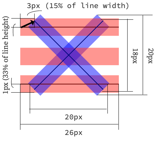
The X will always make a square, so to find out how much to move them by, you just need to know the width and height of your <span> bars and the height of the resulting hamburger icon.
Plug those numbers into this equation:
Or in code:
const line_width = 26; // px
const line_height = 3; // px
const hamburger_height = 21; // px

const x_width = x_height = 0.8 * line_width;
const line_move_y_percent = 100 * (line_width - x_width) / (2 * line_height)
const line_move_right_percent = 100 * (x_height - hamburger_height) / (2 * line_height)
It's because the tutorial is using Less, a CSS pre-processor, extending the CSS language.
However, you just have to use the compiled CSS, and make a few changes.
In your html, add some classes to the bars in order to distinguish each of them :
<span class="icon-bar top-bar"></span>
<span class="icon-bar middle-bar"></span>
<span class="icon-bar bottom-bar"></span>
Also, init your button with the class collapsed, or it will first render as a 'X'.
Then add the CSS compiled :
.navbar-toggle {
  border: none;
  background: transparent !important;
}
.navbar-toggle:hover {
  background: transparent !important;
}
.navbar-toggle .icon-bar {
  width: 22px;
  transition: all 0.2s;
}
.navbar-toggle .top-bar {
  transform: rotate(45deg);
  transform-origin: 10% 10%;
}
.navbar-toggle .middle-bar {
  opacity: 0;
}
.navbar-toggle .bottom-bar {
  transform: rotate(-45deg);
  transform-origin: 10% 90%;
}
.navbar-toggle.collapsed .top-bar {
  transform: rotate(0);
}
.navbar-toggle.collapsed .middle-bar {
  opacity: 1;
}
.navbar-toggle.collapsed .bottom-bar {
  transform: rotate(0);
}
And now it should work like a charm.
Here's a JsFiddle : Demo
15
I managed to adopt Adonis' excellent answer (go and upvote) to work on one of Bootstrap 5's navbar examples with some notable changes:
navbar-toggler-icon span, there only needs to be two extra spans for the icon bars, not threecollapsed class in order to avoid initialising as an X instead of the menuWith those changes in mind, here is the reflected markup for an animated hamburger menu animation in Bootstrap 5:
<nav class="navbar navbar-expand-lg navbar-light bg-light collapsed" aria-label="Eighth navbar example">
    <div class="container">
        <a class="navbar-brand me-6 me-xl-7" href="#">Brand</a>
        <button class="navbar-toggler collapsed" type="button" data-bs-toggle="collapse" data-bs-target="navbarsExample07" aria-controls="navbarsExample07" aria-expanded="false" aria-label="Toggle navigation">
            <span class="navbar-toggler-icon"></span>
            <span></span>
            <span></span>
        </button>

        <div class="collapse navbar-collapse" id="navbar-home">
            <ul class="navbar-nav me-auto mb-2 mb-lg-0">
                <li class="nav-item mx-sm-1 mx-lg-2 mx-xl-3">
                    <a class="nav-link active" aria-current="page" href="#">Home</a>
                </li>
                <li class="nav-item mx-sm-1 mx-lg-2 mx-xl-3">
                    <a class="nav-link" href="#">Find My Car</a>
                </li>
                <li class="nav-item mx-sm-1 mx-lg-2 mx-xl-3">
                    <a class="nav-link" href="#">Frequently Asked Questions</a>
                </li>
                <li class="nav-item mx-sm-1 mx-lg-2 mx-xl-3">
                    <a class="nav-link" href="#">Testimonials</a>
                </li>
                <li class="nav-item mx-sm-1 mx-lg-2 mx-xl-3">
                    <a class="nav-link" href="#">Contact Us</a>
                </li>
            </ul>
        </div>
    </div>
</nav>
And the CSS:
.navbar-toggler span {
    display: block;
    background-color: #000;
    height: 3px;
    width: 25px;
    margin-top: 5px;
    margin-bottom: 5px;
    position: relative;
    left: 0;
    opacity: 1;
    transition: all 0.2s ease-out;
    transform-origin: center left;
}

.navbar-toggler span:nth-child(1) {
    margin-top: 0.3em;
}

.navbar-toggler:not(.collapsed) span:nth-child(1) {
    transform: translate(15%, -33%) rotate(45deg);
}

.navbar-toggler:not(.collapsed) span:nth-child(2) {
    opacity: 0;
}

.navbar-toggler:not(.collapsed) span:nth-child(3) {
    transform: translate(15%, 33%) rotate(-45deg) ;
}

.navbar-toggler span:nth-child(1) {
    transform: translate(0%, 0%) rotate(0deg) ;
}

.navbar-toggler span:nth-child(2) {
    opacity: 1;
}
.navbar-toggler span:nth-child(3) {
    transform: translate(0%, 0%) rotate(0deg) ;
}
If you love us? You can donate to us via Paypal or buy me a coffee so we can maintain and grow! Thank you!
Donate Us With