 Menu
Menu
I'm working with a client who would like part of their interface to have a somewhat customized method of scrolling. They don't want the usual scrollbars to be visible; they want desktop / laptop users to scroll with their mouse wheel / touchpad and they want mobile users to scroll with their finger. They also want graphics of an up arrow and a down arrow to provide an alternate method of scrolling and also to make it obvious to the user that scrolling is possible (since the actual scrollbars are hidden). The client is set on this method of scrolling.
I put together some code that works on all device / browser combinations that I've tried it on except for Android's stock browser. I have confirmed this issue with the following configurations:
This issue is not present on Android 4.4.2 (emulator), though.
In order to keep things simple for this question, I'm not including the graphics of the up and down arrows and the accompanying logic.
Here's the code (jsFiddle demo):
<!DOCTYPE html>
<html lang="en">
  <head>
    <meta charset="utf-8">
    <title>Demo</title>
    <style>
      #side_nav, .category {
        position: absolute;
      }

      #side_nav {
        -webkit-user-select: none;
      }

      .category {
        display: none; /* Will be shown when user clicks on an option */
        top: 0;
        left: 150px;
      }

      .ul_wrapper, .ul_wrapper ul {
        width: 125px;
        height: 242px;
      }

      .ul_wrapper {
        background: #ccc;
        border: 3px solid #000;
        border-radius: 6px;
        text-align: center;
        overflow: hidden;
      }

      ul {
        margin: 0;
        padding: 0;
        list-style: none;
        overflow-y: scroll;
      }

      li {
        padding-top: 10px;
      }

      li:last-child {
        padding-bottom: 10px;
      }

      span {
        display: inline-block;
        width: 100px;
        height: 100px;
        border: 3px solid #999;
        border-radius: 6px;
        cursor: pointer;
      }

      #chosen_option {
        float: left;
        margin-left: 150px;
      }
    </style>
  </head>
  <body>
    <div id="side_nav">
      <div class="ul_wrapper">
        <ul>
          <li>
            <span>Option 1</span>
            <div class="category">
              <div class="ul_wrapper">
                <ul>
                  <li><span>Option 1a</span></li>
                  <li><span>Option 1b</span></li>
                  <li><span>Option 1c</span></li>
                </ul>
              </div>
            </div>
          </li>
          <li>
            <span>Option 2</span>
            <div class="category">
              <div class="ul_wrapper">
                <ul>
                  <li><span>Option 2a</span></li>
                  <li><span>Option 2b</span></li>
                </ul>
              </div>
            </div>
          </li>
          <li>
            <span>Option 3</span>
            <div class="category">
              <div class="ul_wrapper">
                <ul>
                  <li><span>Option 3a</span></li>
                </ul>
              </div>
            </div>
          </li>
        </ul>
      </div>
    </div>

    <div id="chosen_option"></div>

    <script src="http://ajax.googleapis.com/ajax/libs/jquery/1.9.1/jquery.min.js"></script>
    <script>
      function get_scrollbar_width() {
        var div, body, W = window.browserScrollbarWidth;
        if (W === undefined) {
          body = document.body, div = document.createElement('div');
          div.innerHTML = '<div style="width: 50px; height: 50px; position: absolute; left: -100px; top: -100px; overflow: auto;"><div style="width: 1px; height: 100px;"></div></div>';
          div = div.firstChild;
          body.appendChild(div);
          W = window.browserScrollbarWidth = div.offsetWidth - div.clientWidth;
          body.removeChild(div);
        }
        return W;
      }

      var scrollbar_width = get_scrollbar_width();

      $('#side_nav ul').css({
        'padding-right': scrollbar_width,
        'margin-left': scrollbar_width / 2
      });

      $('span').on('click', function(event) {
        event.stopPropagation(); // Prevent $('html').click(); from triggering

        var parent_li = $(this).parent();
        var child_category = parent_li.children('.category');

        if (child_category.length) {
          var show_div = false;

          if (child_category.is(':hidden')) {
            show_div = true;
          }

          parent_li.siblings().find('.category:visible').fadeOut();

          if (show_div) {
            child_category.fadeIn();
          }
          else {
            parent_li.find('.category:visible').fadeOut();
          }
        }
        else {
          $('#chosen_option').html('You chose ' + $(this).html().toLowerCase());
          $('.category:visible').fadeOut();
        }
      });

      $('html').click(function() {
        $('.category:visible').fadeOut();
      });
    </script>
  </body>
</html>
When you tap on any of the three options, a second list of options should appear to the right. However, it never appears on Android's stock browser unless you remove overflow-y: scroll; from the ul CSS rules, but then you can no longer scroll.
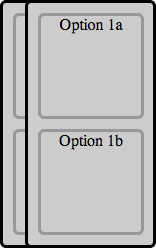
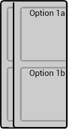
The problem is best illustrated by replacing left: 150px; with left: 25px; in the .category CSS rules. When I do that, this is what it looks like in a working browser:
And this is what it looks like in Android's stock browser:
One other thing I should note is that it works in Chrome for Android.
Is there a way that I can make this work in Android's stock browser?
 273
273
To change this, set the min-width or min-height property.” This means that a flex item with a long word won't shrink below its minimum content size. To fix this, we can either use an overflow value other than visible , or we can set min-width: 0 on the flex item.
Viewed in a desktop browser, the black menu bar properly extends only to edge of the window, since the body has overflow-x:hidden . In any mobile browser, whether Android or iOS, the black menu bar displays its full width, which brings whitespace on the right of the page.
Set the div with a width or height, (otherwise it won't know whether something is overflowing). Then, add the overflow:hidden; CSS property-value pair.
CSS Overflow Inherit If the parent element has no overflow value specified, then the default value (overflow visible) is taken.
I've had issues with the stock Gingerbread Android browser. It does not handle the overflow CSS property well at all. In order to enable scrolling on this browser I had to apply the overflow ("scroll" or "auto") to the BODY container only.
116
If you love us? You can donate to us via Paypal or buy me a coffee so we can maintain and grow! Thank you!
Donate Us With

