 Menu
Menu
Im trying to customize the actionbar sherlock tabs so they display the tab text below the tab icon. After searching and reading about the subject, I'm still not having much luck.
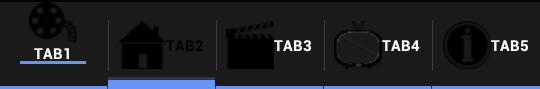
Here are the results I'm getting:
Custom tab1 selected
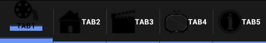
Custom tab1 not selected, standard tab2 selected
This is what I have so far:
Created my own styles.xml where I change some of the actionbar settings:
<style name="SkoletubeTheme" parent="Theme.Sherlock">
    <item name="actionBarSize">@dimen/st__action_bar_default_height</item>
    <item name="actionBarTabStyle">@style/Skoletube.TabView</item>
    <item name="actionBarTabTextStyle">@style/Skoletube.Tab.Text</item>
</style>

<style name="Skoletube.TabView" parent="Widget.Sherlock.ActionBar.TabView">
    <item name="android:background">@drawable/abs__tab_indicator_holo</item>
    <item name="android:paddingLeft">6dp</item>
    <item name="android:paddingRight">6dp</item>
</style>

<style name="Skoletube.Tab.Text" parent="Widget.Sherlock.ActionBar.TabText">
    <item name="android:textAppearance">@android:style/TextAppearance.Medium</item>
    <item name="android:textColor">@android:color/primary_text_dark</item>
    <item name="android:textSize">10sp</item>
</style>
Created an xml ressource where I change and owerwrite some textsettings for the actionbar. Here I have increased the height of the actionbar, which in turn increases the height of the tabs. I also decreased the size of the text in order to make room for fitting icon and text in the tab
<?xml version="1.0" encoding="utf-8"?>
<resources>
<!-- Default height of an action bar. -->
<dimen name="st__action_bar_default_height">58dip</dimen>
<!-- Text size for action bar titles -->
<dimen name="ab__action_bar_title_text_size">10dp</dimen>
<!-- Text size for action bar subtitles -->
<dimen name="ab__action_bar_subtitle_text_size">6dp</dimen>
<!-- Top margin for action bar subtitles -->
<dimen name="ab__action_bar_subtitle_top_margin">-3dp</dimen>
<!-- Bottom margin for action bar subtitles -->
<dimen name="ab__action_bar_subtitle_bottom_margin">5dip</dimen>
</resources>
Then I've defined a custom layout for the tabs to use, where I place the text below the icon:
<?xml version="1.0" encoding="utf-8"?>
<RelativeLayout xmlns:android="http://schemas.android.com/apk/res/android"
android:id="@+id/customTabLayout"
android:layout_width="wrap_content"
android:layout_height="fill_parent"
android:orientation="vertical"
android:layout_weight="1"
android:focusable="true"
android:gravity="center"
style="?attr/actionBarTabStyle"
>
<ImageView
    android:id="@+id/sk_abs__tab_icon"
    android:layout_width="wrap_content"
    android:layout_height="wrap_content"
    android:layout_centerHorizontal="true"
    android:background="@android:color/transparent"
    />
<com.actionbarsherlock.internal.widget.ScrollingTextView
    android:id="@+id/sk_abs__tab_txt"
    android:layout_width="wrap_content"
    android:layout_height="wrap_content"
    android:layout_below="@id/sk_abs__tab_icon"
    android:layout_alignWithParentIfMissing="true"
    android:layout_weight="1"
    android:layout_centerHorizontal="true"
    android:lines="1"
    android:scrollHorizontally="true"
    android:ellipsize="marquee"
    android:marqueeRepeatLimit="marquee_forever"
    style="@style/Skoletube.Tab.Text"
    />
<FrameLayout
    android:id="@+id/abs__tab_custom"
    android:layout_width="wrap_content"
    android:layout_height="fill_parent"
    android:padding="5dip"
    android:layout_weight="1"
    android:visibility="gone"
    />
Just for the record the attribute passed as the style for the relative layout points to this:
<style name="Widget.Sherlock.ActionBar.TabBar" parent="android:Widget"></style>
Then I've applied these changes to my app as follows, the first tab has my customized implementation, the second tab has the standard implementation:
final ActionBar actionBar;
    actionBar = getSupportActionBar();
    actionBar.setDisplayHomeAsUpEnabled(false);
    actionBar.setDisplayUseLogoEnabled(true);
    // Set up tabs

    myMediaTab = actionBar.newTab();
    myMediaTab.setCustomView(R.layout.skoletube_tab_layout);
    ImageView myMediaImg = (ImageView) myMediaTab.getCustomView().findViewById(R.id.sk_abs__tab_icon);
    myMediaImg.setImageResource(R.drawable.tab_mymedia);
    ScrollingTextView myMediaText = (ScrollingTextView) myMediaTab.getCustomView().findViewById(R.id.sk_abs__tab_txt);
    myMediaText.setText("Tab1");
    myMediaTab.setTabListener(this);
    myMediaTab.setTag("MyMediaTab");
    actionBar.addTab(myMediaTab);

    myChannelsTab = actionBar.newTab();
    myChannelsTab.setIcon(drawable.tab_mychannels);
    myChannelsTab.setText("Tab2");
    myChannelsTab.setTabListener(this);
    myChannelsTab.setTag("myChannelsTab");
    actionBar.addTab(myChannelsTab);
While I think I'm close to the solution, I think I've missed a step somewhere.
Obviously the blue bar behind the text/below the image needs to not be there, but I also haven't seemed to find out where I can set the focused image(I want the img to change color when a tab is selected) andtext color. Do I need to make the imageview focusable and handle it through that or?
I'm still fairly new at this, so the approach I have taken here might be wrong if there is a better/smarter way to go about doing this please do say.
Appreciate any suggestions and ideas.
 682
682
 asked Mar 24 '12 16:03
I have solved that by using a compound drawable:
tv = new TextView(this);
tv.setText(R.string.tab_movies);
tv.setCompoundDrawablesWithIntrinsicBounds(0, R.drawable.nav_movies, 0, 0);

mBar.addTab(mBar
    .newTab()
    .setCustomView(tv)
    .setTabListener(
    new TabListenerImpl<TheatersTabActivity>(this, "theaters",
        TheatersTabActivity.class)));
In order to deal with the selected or not selected image, I am using a selector:
<?xml version="1.0" encoding="utf-8"?>
<selector xmlns:android="http://schemas.android.com/apk/res/android" >
    <item
        android:state_selected="true"
        android:drawable="@drawable/nav_movies_on"/>
    <item
        android:state_selected="false"
        android:drawable="@drawable/nav_movies_off"/>
</selector>
I don't know if you have found an answer for this or not yet but one solution could be to modify the tab image to include the text, with GIMP or photoshop something, and then just set those images in the tabs, instead of images and text. It is a bit of an awkward way of doing it but it would work.
Hope this helps!
39
If you love us? You can donate to us via Paypal or buy me a coffee so we can maintain and grow! Thank you!
Donate Us With
