 Menu
Menu
I'm trying to change the background color to the menu item when it is pressed. Change the background color but not the color when pressed.
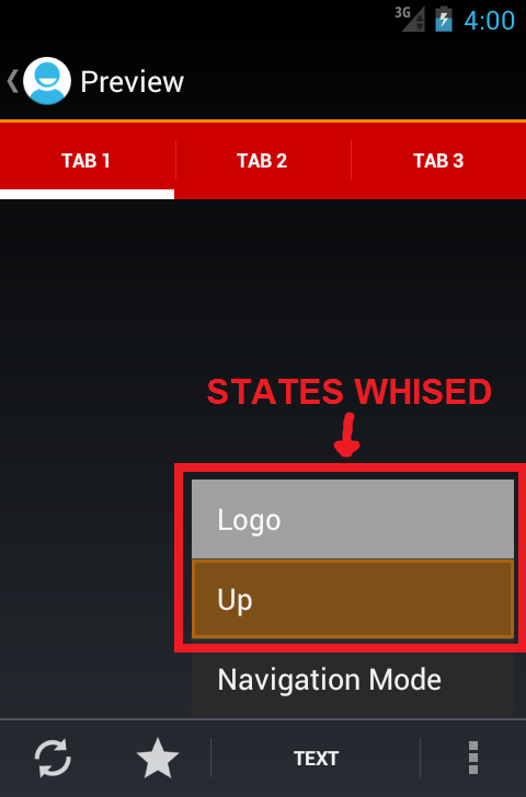
WHISED:
OBTAINED:
What I can do? Thanks
Styles.xml
<style name="AppTheme2" parent="android:Theme.Holo">
    <item name="android:popupMenuStyle">@style/MyApp.PopupMenu</item>
</style>

<style name="MyApp.PopupMenu" parent="android:Widget.Holo.ListPopupWindow">
    <item name="android:popupBackground">@drawable/menu_item_selector</item>
</style>
menu_item_selector.xml
<selector xmlns:android="http://schemas.android.com/apk/res/android">

<item android:drawable="@drawable/menu_item_fondo_pressed" android:state_focused="true"/>
<item android:drawable="@drawable/menu_item_fondo_pressed" android:state_pressed="true"/>
<item android:drawable="@drawable/menu_item_fondo"/>

</selector>
 710
710
Little late answer, but found solution for the problem.
In styles.xml where You have your AppTheme:
<style name="AppTheme" parent="AppBaseTheme">
    <item name="android:dropDownListViewStyle">@style/ListViewStyle</item>
    <item name="dropDownListViewStyle">@style/ListViewStyle</item>
    <item name="popupMenuStyle">@style/PopupMenu</item>
    <item name="textAppearanceLargePopupMenu">@style/PopupMenuTextAppearanceLarge</item>
    <item name="textAppearanceSmallPopupMenu">@style/PopupMenuTextAppearanceSmall</item>
    <item name="android:textAppearanceLargePopupMenu">@style/PopupMenuTextAppearanceLarge</item>
    <item name="android:textAppearanceSmallPopupMenu">@style/PopupMenuTextAppearanceSmall</item>
</style>
The popupMenuStyle is for popupMenu itself, in this case we can change there unselected background in popupBackground item, like this (but You already know that):
<style name="PopupMenu" parent="@android:style/Widget.PopupMenu">
    <item name="android:popupBackground">@drawable/selector_popup_menu_bg</item>
    <item name="android:textColor">@color/text_color_white</item>
    <item name="android:dropDownSelector">@drawable/selector_popup_menu_dropdown</item>
</style>
There are also textColor and dropDownSelector items, which aren't doing anything on devices I have tested, but I change these here too just in case, because parent (Widget.PopupMenu) uses them too.
The way to properly change these items is to change them in AppTheme like I've shown above in AppTheme code. I won't show code for textAppearances, because it is not the subject.
The reason I've added each of these items twice (with and without "android:" prefix) is to make it work both on 5.0 and pre-lollipop devices. The only exception is popupMenuStyle with only needs item without "android:” prefix, if you’re using the framework version of Popup, but if you use the support.v7 version, then you need android:popupMenuStyle (see this StackOverflow answer for more info).
So to have different background of item selected we simply change it in dropDownListViewStyle (I have additionaly added divider):
<style name="ListViewStyle" parent="@android:style/Widget.ListView">
    <item name="android:listSelector">@drawable/selector_popup_menu_dropdown</item>
    <item name="android:divider">@color/text_color_white</item>
    <item name="android:dividerHeight">1dp</item>
</style>
The interesting part is listSelector, which is the background of selected item. If we would add there only @color then selected item wouldn't be properly invalidated (it will stay selected even if you move selection out of it), to make it properly instead of color, selector needs to be used:
selector_popup_menu_dropdown.xml
<?xml version="1.0" encoding="utf-8"?>
<item android:state_window_focused="false" android:drawable="@android:color/transparent" />

<!-- Even though these two point to the same resource, have two states so the drawable will invalidate itself when coming out of pressed state. -->
<item android:state_focused="true"  android:state_enabled="false" android:state_pressed="true" android:drawable="@color/gray_btn_bg_color" />
<item android:state_focused="true"  android:state_enabled="false"                              android:drawable="@color/gray_btn_bg_color" />
<item android:state_focused="true"                                android:state_pressed="true" android:drawable="@color/gray_btn_bg_color" />
<item android:state_focused="false"                               android:state_pressed="true" android:drawable="@color/gray_btn_bg_color" />
<item android:state_focused="true"                                                             android:drawable="@color/gray_btn_bg_color" />
A little too long explaination for such trival thing, but we made it till the end. Yaay!
126
If you love us? You can donate to us via Paypal or buy me a coffee so we can maintain and grow! Thank you!
Donate Us With

